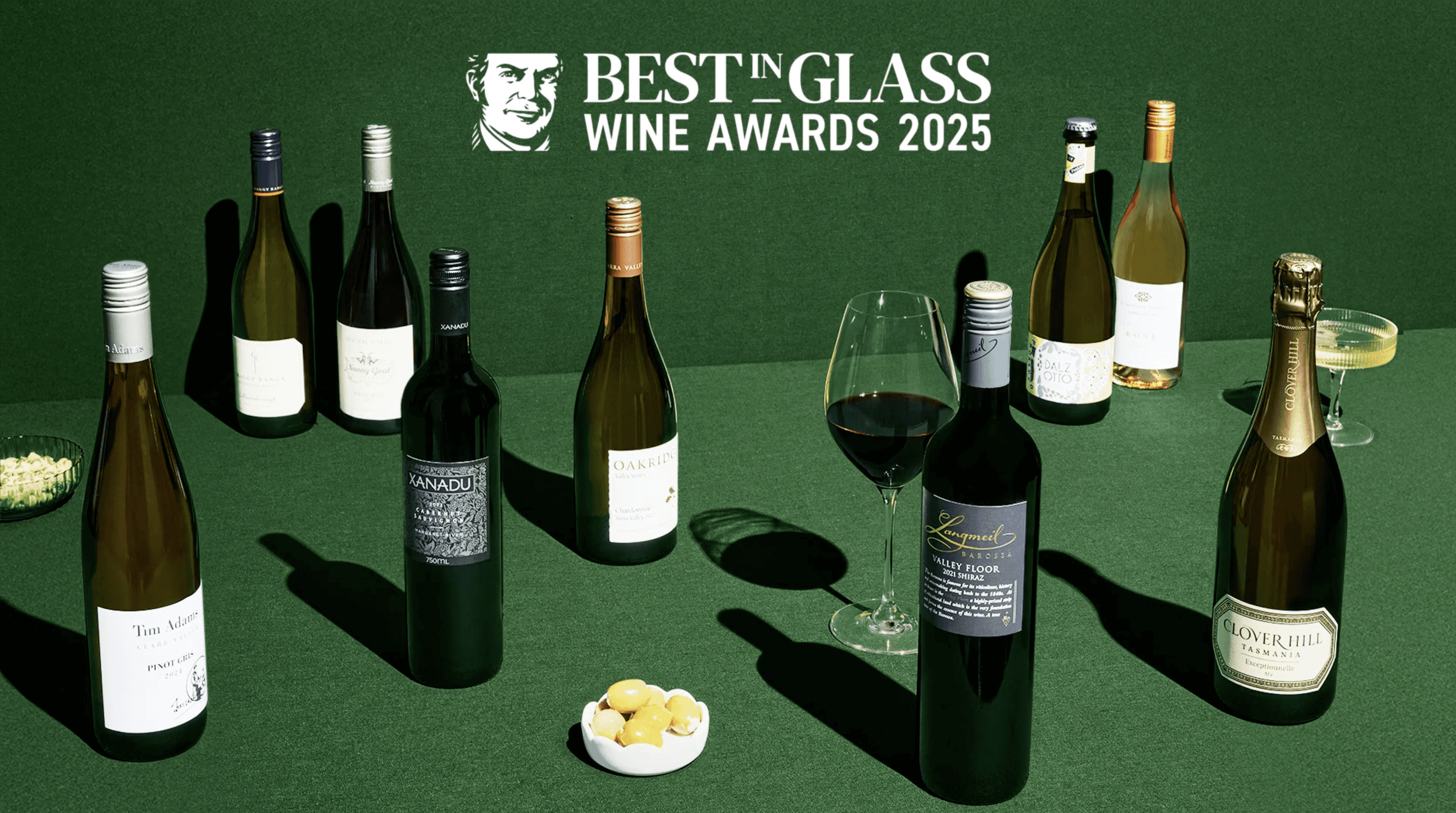
Wine Awards 2025
Dan Murphy

High conversion through simple design - helping customers choose award-winning wines with ease.
Company
Client
Role
Timeframe
The 2025 Wine Awards campaign set out to make wine more accessible and appealing (particularly for Gen Z and Millennial audiences) by simplifying the category and breaking down wine jargon. The goal was to help customers confidently choose award-winning wines at great value, while encouraging them to add just one more bottle to their basket.
Through simple, user-friendly design and clear value messaging, the campaign delivered exceptional results:
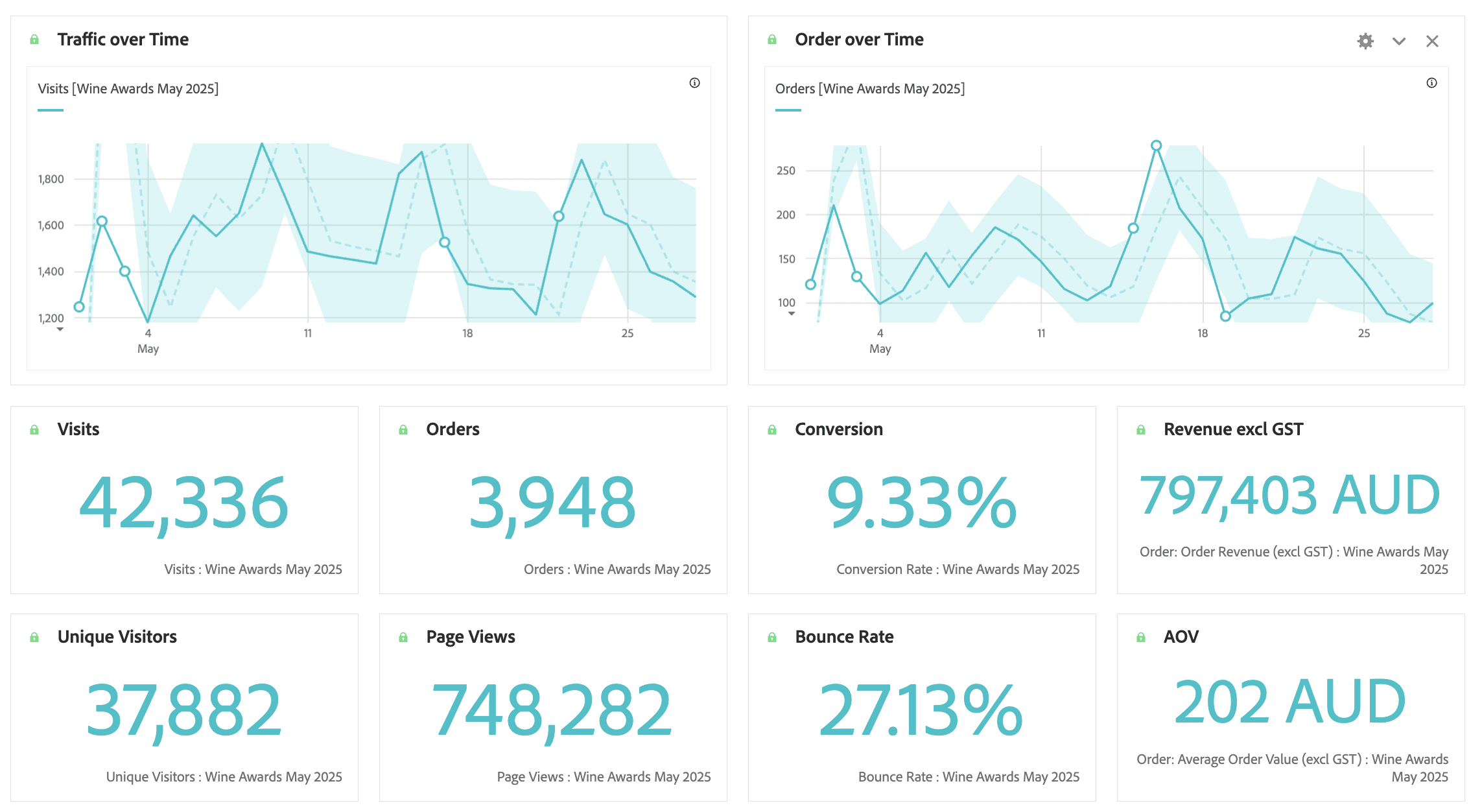
Conversion rate jumped from 5.8% to 9.3%
Revenue grew by 46% year-on-year
Orders increased by 58%
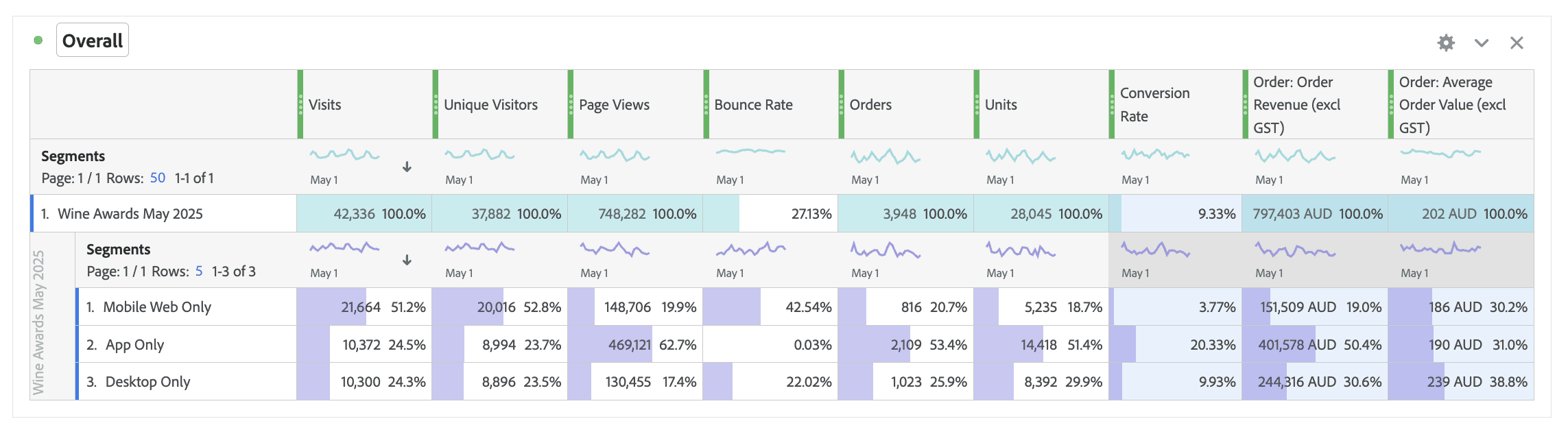
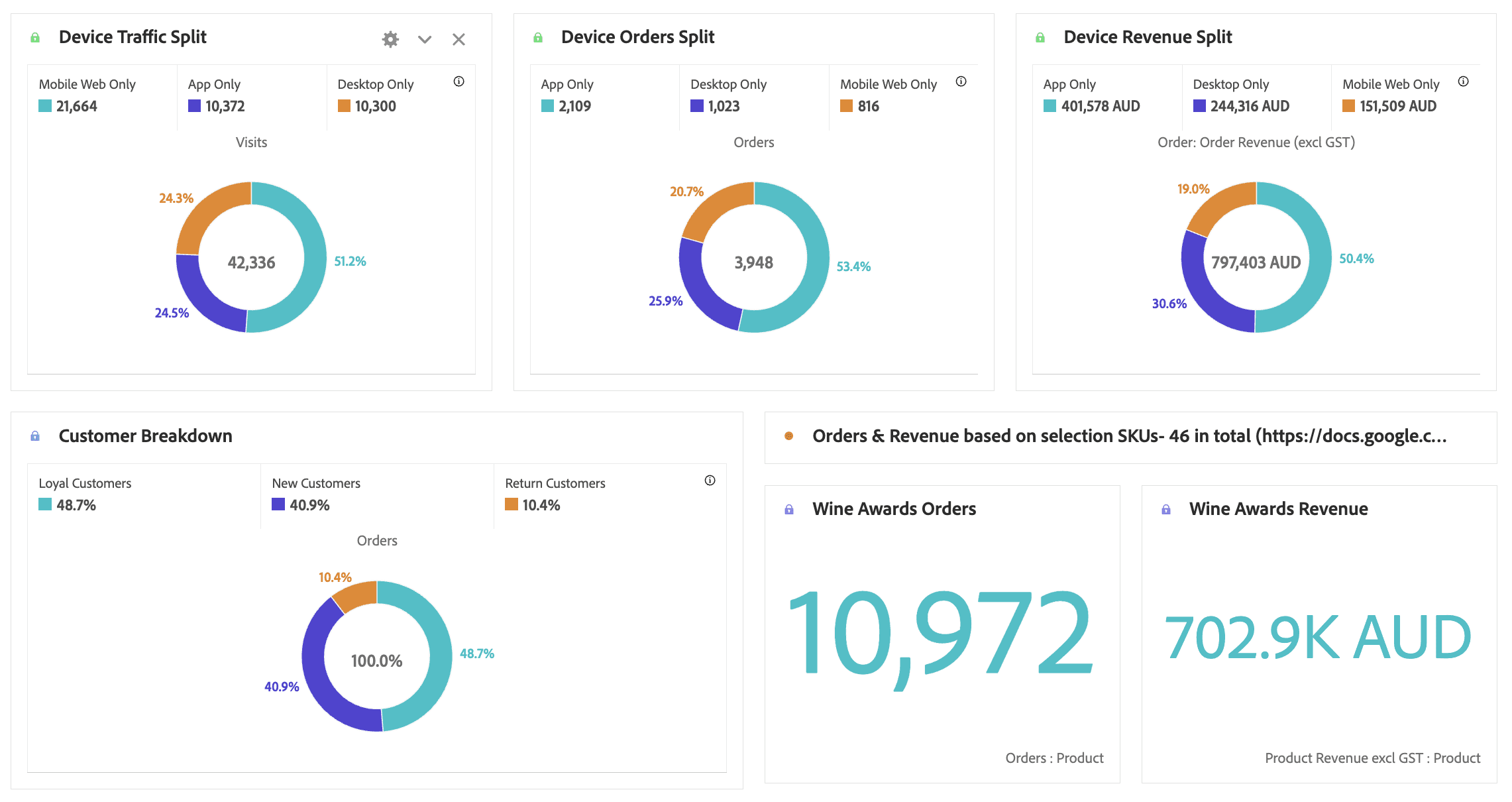
The campaign on the Dan Murphy’s app also played a major role in this uplift:
Traffic up 22%
Orders up 248%
Revenue up 282% compared to the Decoded campaign
The app now drove over 50% of all orders and revenue, up from just 20%
By blending clarity, simplicity, and credibility, the 2025 Wine Awards became one of the most successful campaign experiences to date.
As the Lead UX Designer for the Wine Awards 2025 campaign, I was responsible for driving the end-to-end UX strategy and execution for the squad. My key responsibilities included:
Campaign Ownership: Led UX design for the campaign, collaborating across product, marketing, analytics and development teams to align on direction and delivery.
Performance Analysis: Reviewed previous campaign results, including heatmaps, analytics and performance data from Wine Awards 2024 and related campaigns (e.g. Decoded Spirits/Wines) to uncover opportunities and friction points.
Business & Customer Understanding: Aligned the design strategy with business goals, target customer behaviours and the marketing team's product selection priorities.
Industry Benchmarking: Researched comparable wine and alcohol campaigns across retail and digital to inform experience strategy and content structure.
Stakeholder Co-Design: Facilitated co-design sessions and blue sky ideation workshops with stakeholders to explore innovative directions and mission-led content ideas.
Wireframing & Iteration: Created low-fidelity wireframes and ran internal critique sessions to test rapid iterations. Used quick guerrilla testing to validate early ideas and identify which variations resonated best with users.
Mid-Fidelity Design: Delivered refined mid-fidelity prototypes aligned to brand and technical feasibility.
Presentation & Handoff: Presented final designs to stakeholders for alignment, incorporating feedback and setting the foundation for handoff to development.
Figma, Miro, Adobe Analytics, Full Story (Heat Map), AEM
The Process
Problem Statement
The wine category is often seen as overwhelming, especially by Gen Z and Millennial shoppers, who struggle with complex jargon, unclear value and decision fatigue.
Despite the credibility of Dan Murphy’s Wine Awards, the 2024 campaign revealed friction points: low conversion, underutilised app channels and a missed opportunity to guide customers confidently through the wine-buying journey.
The challenge for 2025 was to create a simple, mobile-first experience that broke down wine jargon, made award-winning selections more accessible, and encouraged customers to find the best-value bottles with ease.
The experience also needed to drive business outcomes: boost conversion, feature award-winning wines, and inspire customers to add at least one more bottle to their basket—all while elevating the app as a primary channel for discovery and purchase.
Discovery and Research
When briefed with this piece of work from my ecommerce squad team - I started with an analysis of the current state and the performance of the pages previously.
Performance Analysis
An analysis of past campaigns like Decoded Wines and Decoded Spirits Awards revealed critical UX and engagement issues:
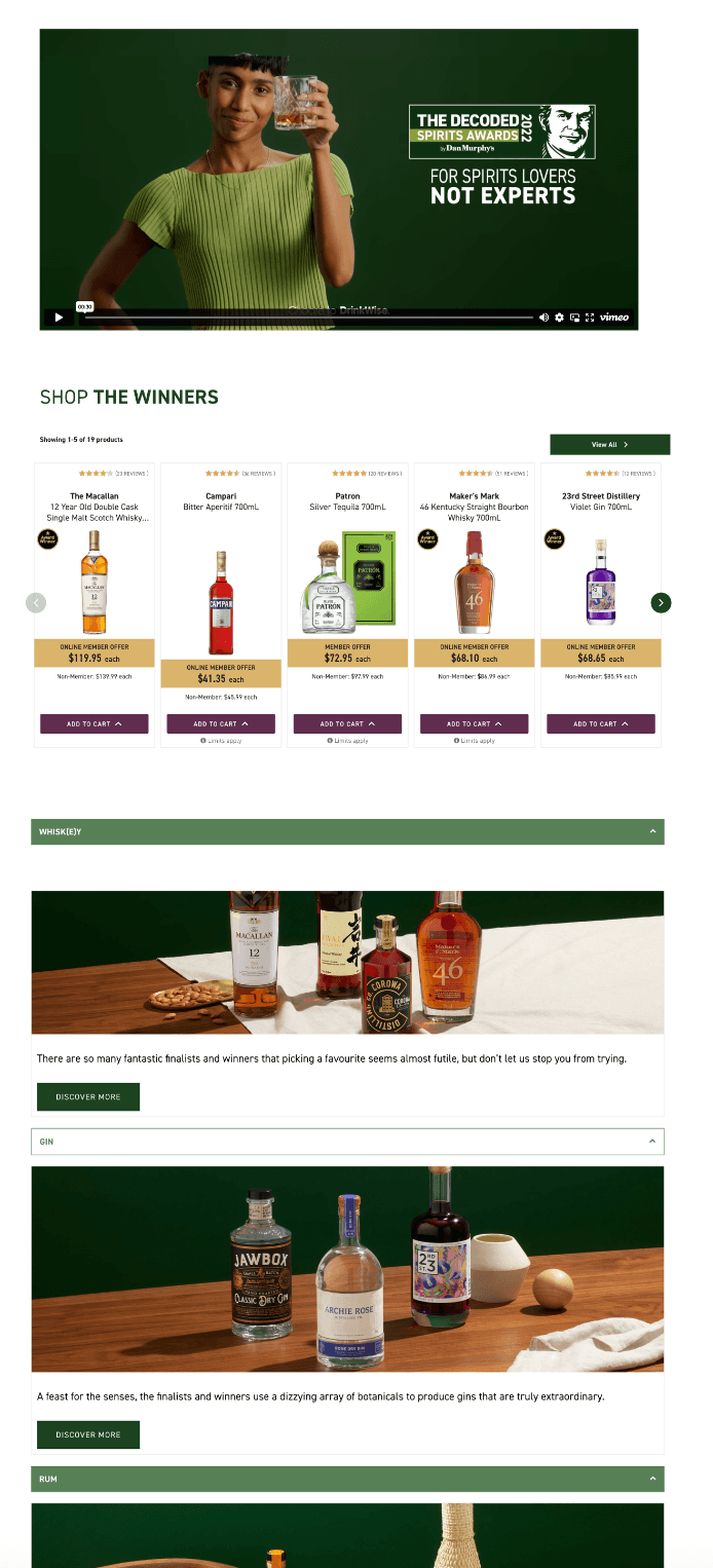
Video-first layouts and accordion components high on the page hierarchy made it difficult for users to quickly view the full list of award-winning products.
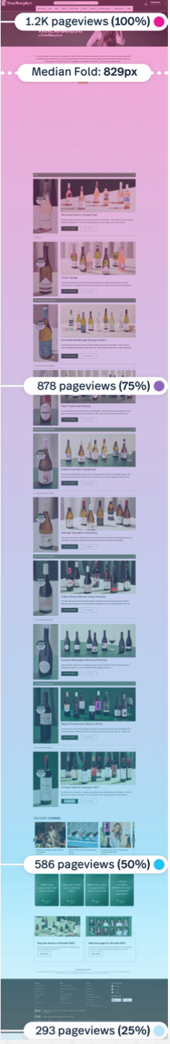
Heatmaps showed that only 57% of users reached the bottom of the page, with most engagement limited to the hero banner at the top.
This created unnecessary friction for users wanting to browse and compare awards quickly.
Flippy card components, used in prior campaigns, were designed with desktop interactions in mind (e.g. hover states).
However, with the majority of Dan Murphy’s traffic coming from mobile devices, these components required an extra tap to reveal information - leading to reduced engagement and a poor mobile experience.
These findings highlighted the need for a simplified, scroll-friendly layout that prioritises clarity, accessibility, and product visibility, especially on mobile devices.
Target Audience + Pain Points
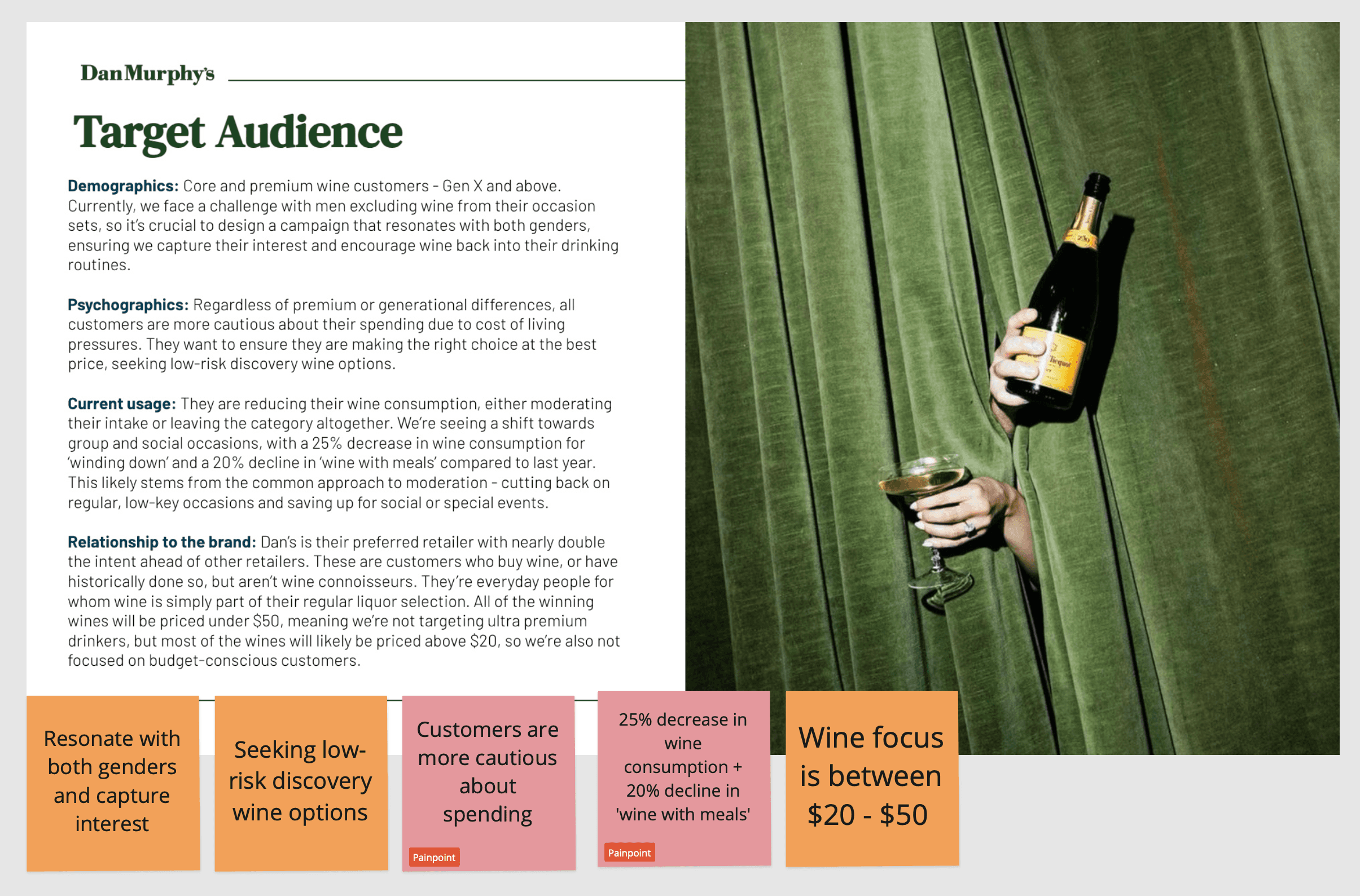
As part of the Wine Awards 2025 campaign, we needed to re-engage wine shoppers across a wide spectrum of confidence levels, digital behaviours, and value expectations.
Who We Designed For
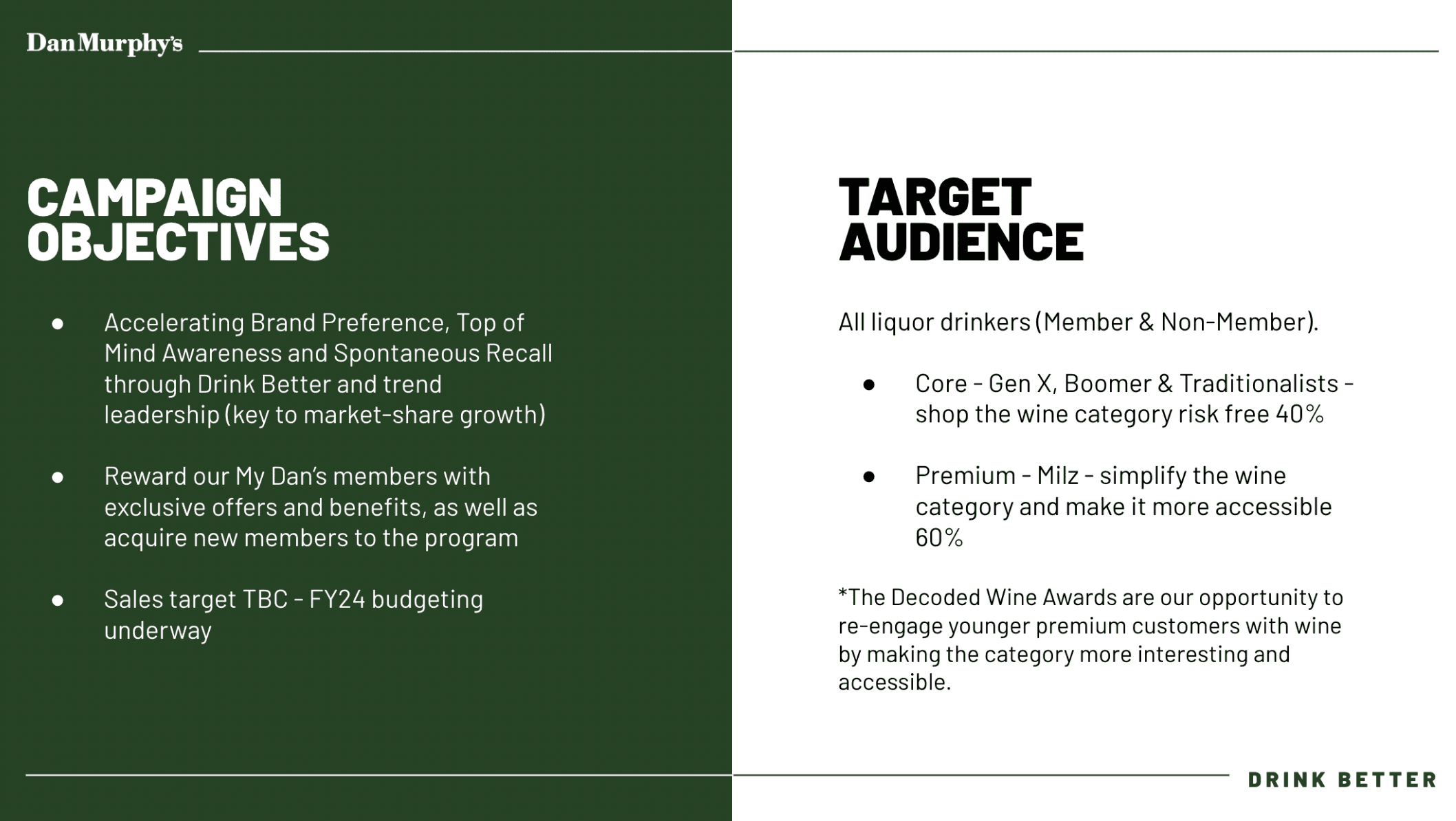
Core & Premium Wine Buyers (Gen X, Boomers, Traditionalists)
Customers who frequently shop the wine category but are becoming more cautious with spending.Emerging Premium Shoppers (Millennials & Gen Z)
Less confident navigating wine, easily overwhelmed by jargon, and more likely to engage through mobile-first experiences.Mobile-Heavy, Budget-Conscious Users
The majority of traffic now comes through the Dan Murphy’s app and mobile web, with users expecting quick, value-led experiences.
Pain Points
It was also clear that in the past campaigns there was:
Overwhelming Category Complexity
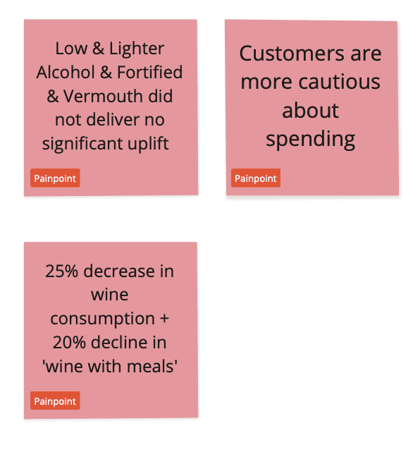
Customers unfamiliar with wine terminology found it difficult to know where to start or what to trust.Spending Caution Due to Cost of Living
Customers were cutting back, with a 25% decrease in wine used for “winding down” and a 20% drop in “wine with meals.” They were only buying for social events or special occasions.Lack of Clear Value Cues
Customers wanted award-winning wines that felt like a good deal. Business decisions decided that we needed to focus the price range to $20–$50, meaning we weren’t targeting ultra-premium shoppers but rather those looking for affordable credibility.
Industry Benchmarking
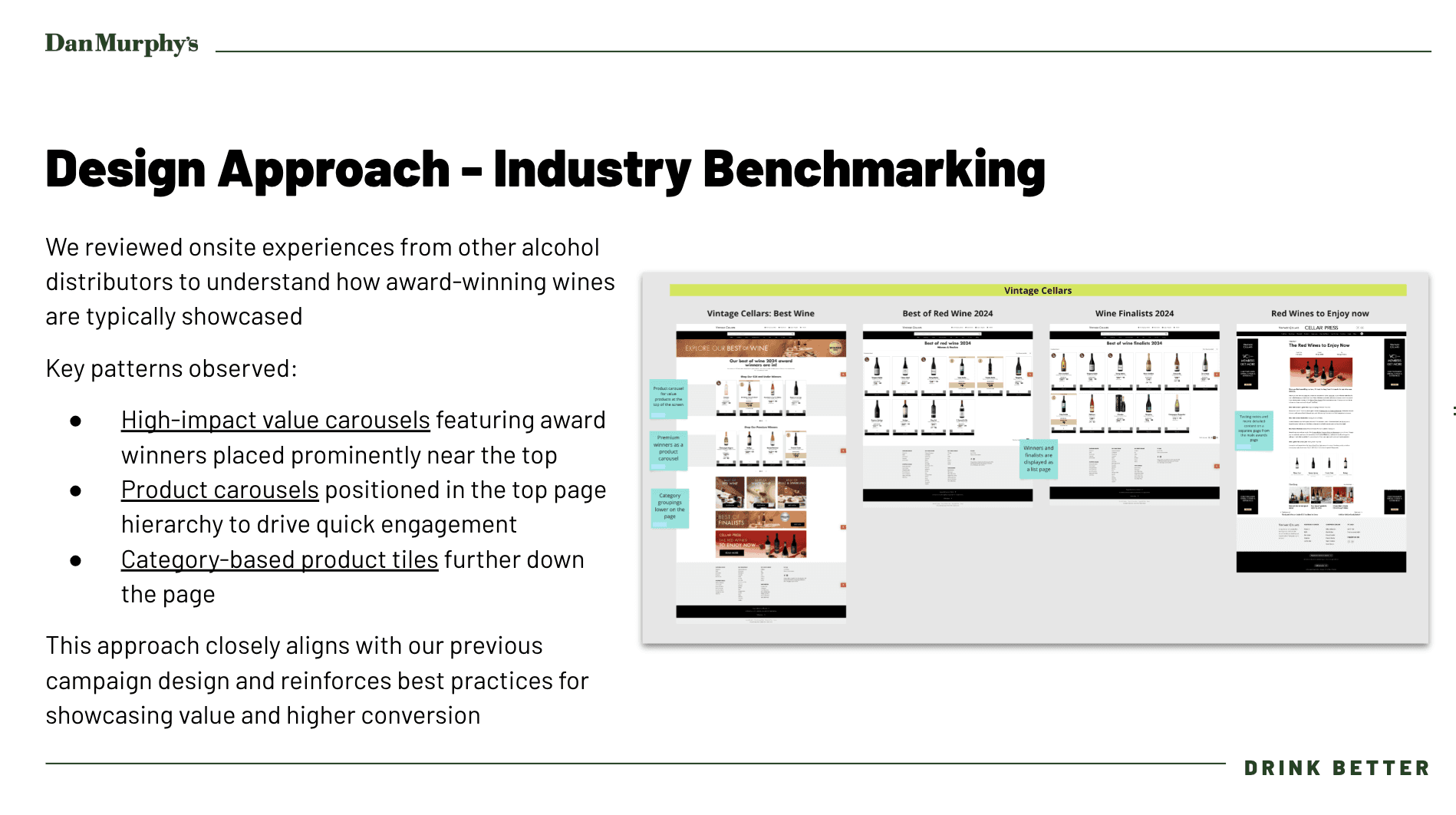
I then reviewed onsite experiences from other alcohol distributors such as Vintage Cellars and First Choice to understand how award-winning wines are typically showcased.
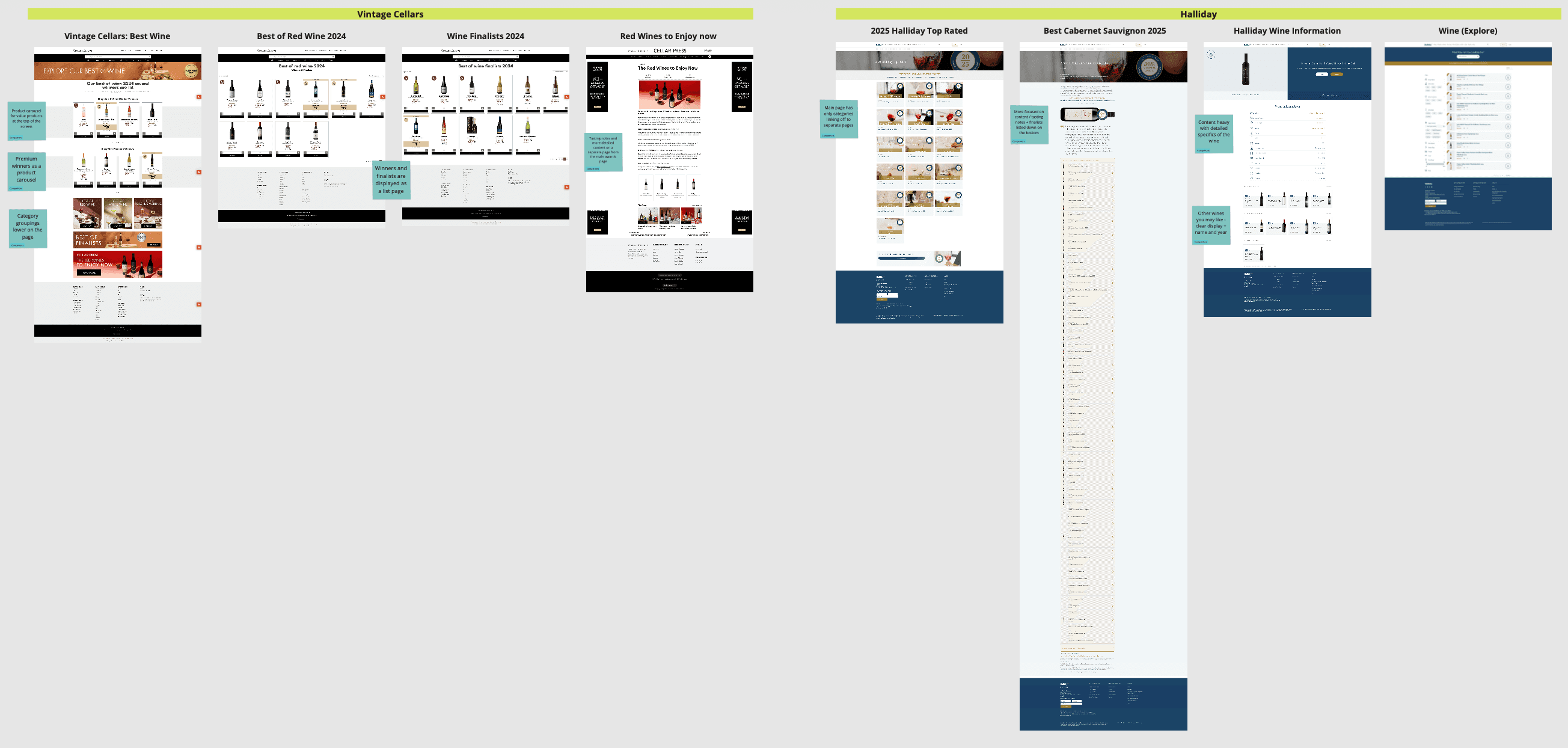
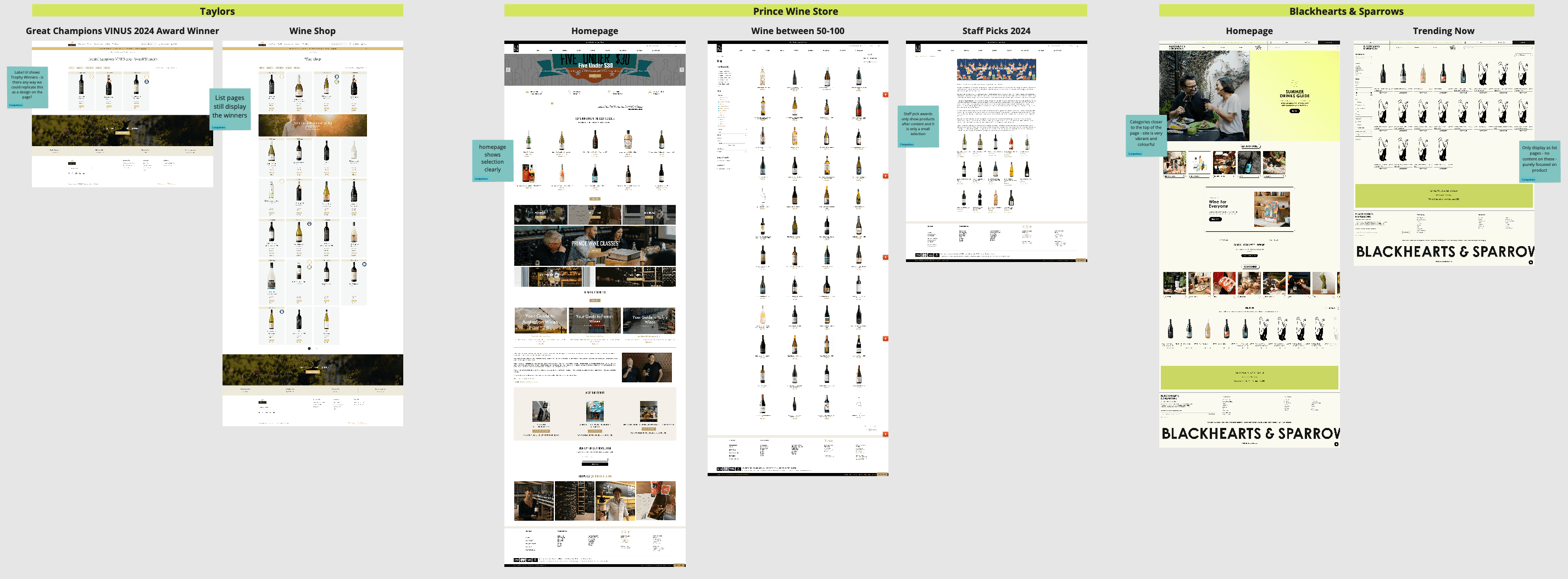
Key patterns observed:
High-impact value carousels featuring award winners placed prominently near the top
Product carousels positioned in the top page hierarchy to drive quick engagement
Category-based product tiles further down the page
This reinforces best practices for showcasing value and higher conversion.
Define
Balancing business objectives and needs
While designing for the customer, I also needed to ensure the experience clearly reflected the business and marketing priorities.
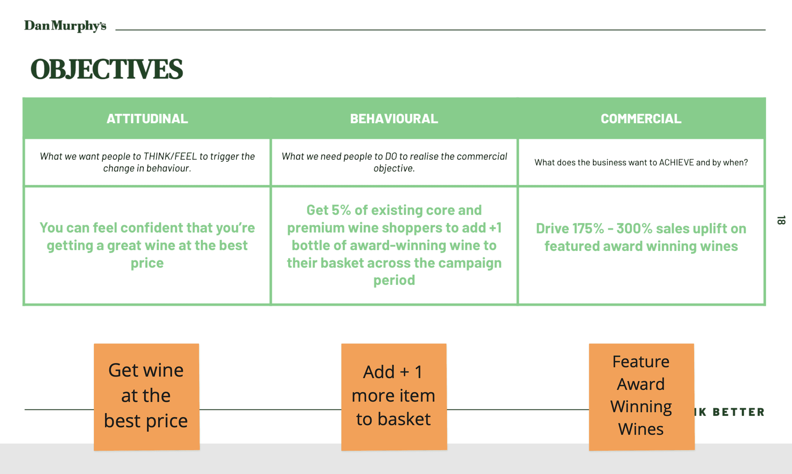
Strategic Objectives
The 2025 Wine Awards campaign was backed by strong commercial, behavioural, and attitudinal goals:
Attitudinal: Help customers feel confident they’re getting award-winning wine at the best price.
Behavioural: Encourage 5% of core and premium wine customers to add +1 bottle of award-winning wine to their basket.
Commercial: Drive a 175–300% uplift in sales of featured wines.
Key Messaging on the page
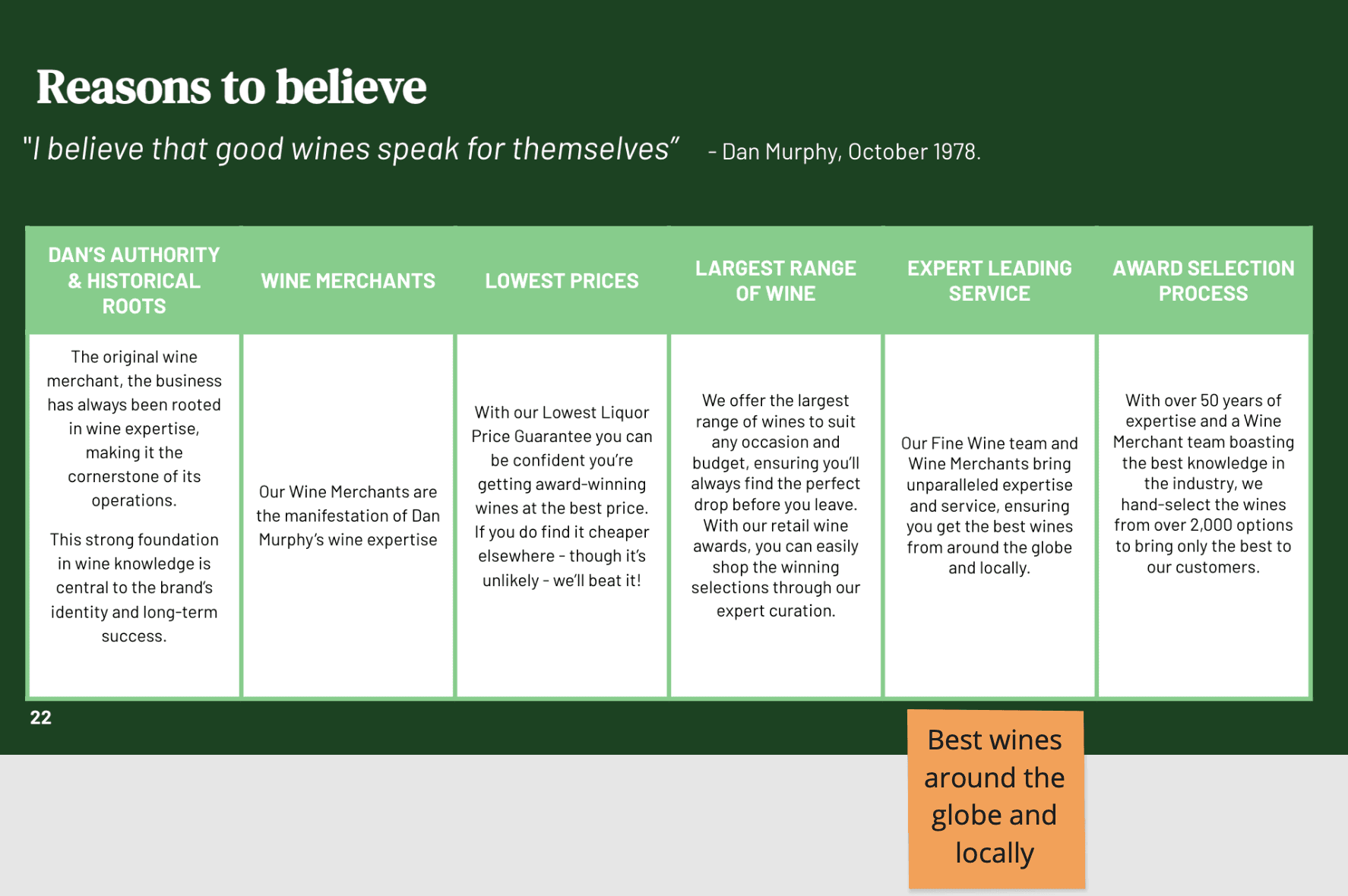
It was essential that the campaign page not only looked good but communicated credibility and trust. I integrated messaging across the experience that:
Emphasised Dan Murphy’s lowest liquor price guarantee.
Showcased expert wine selection – hand-picked by merchants from over 2,000 wines globally and locally.
Positioned Dan Murphy’s as the most knowledgeable and reliable retailer for great-value, award-winning wines.
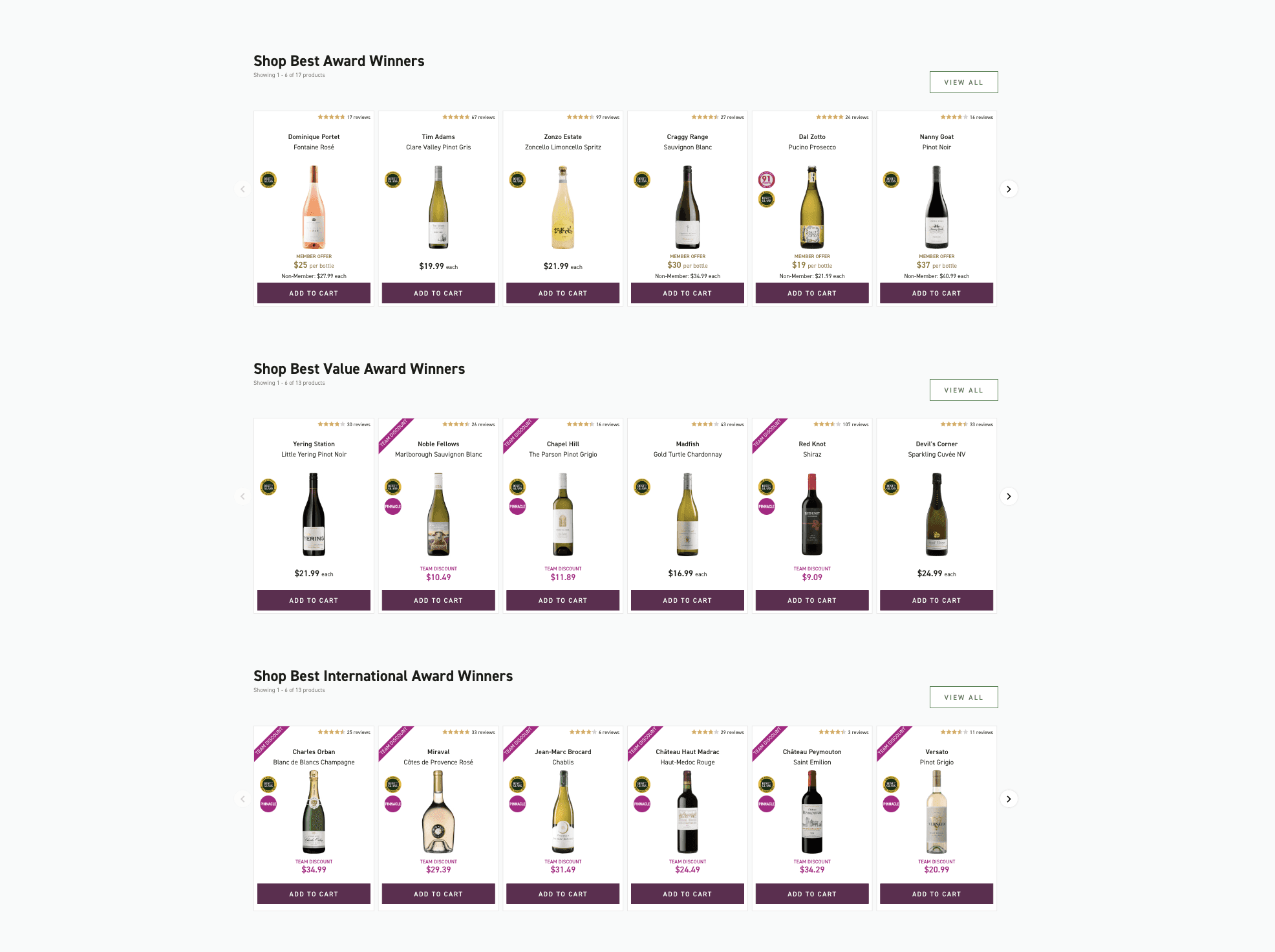
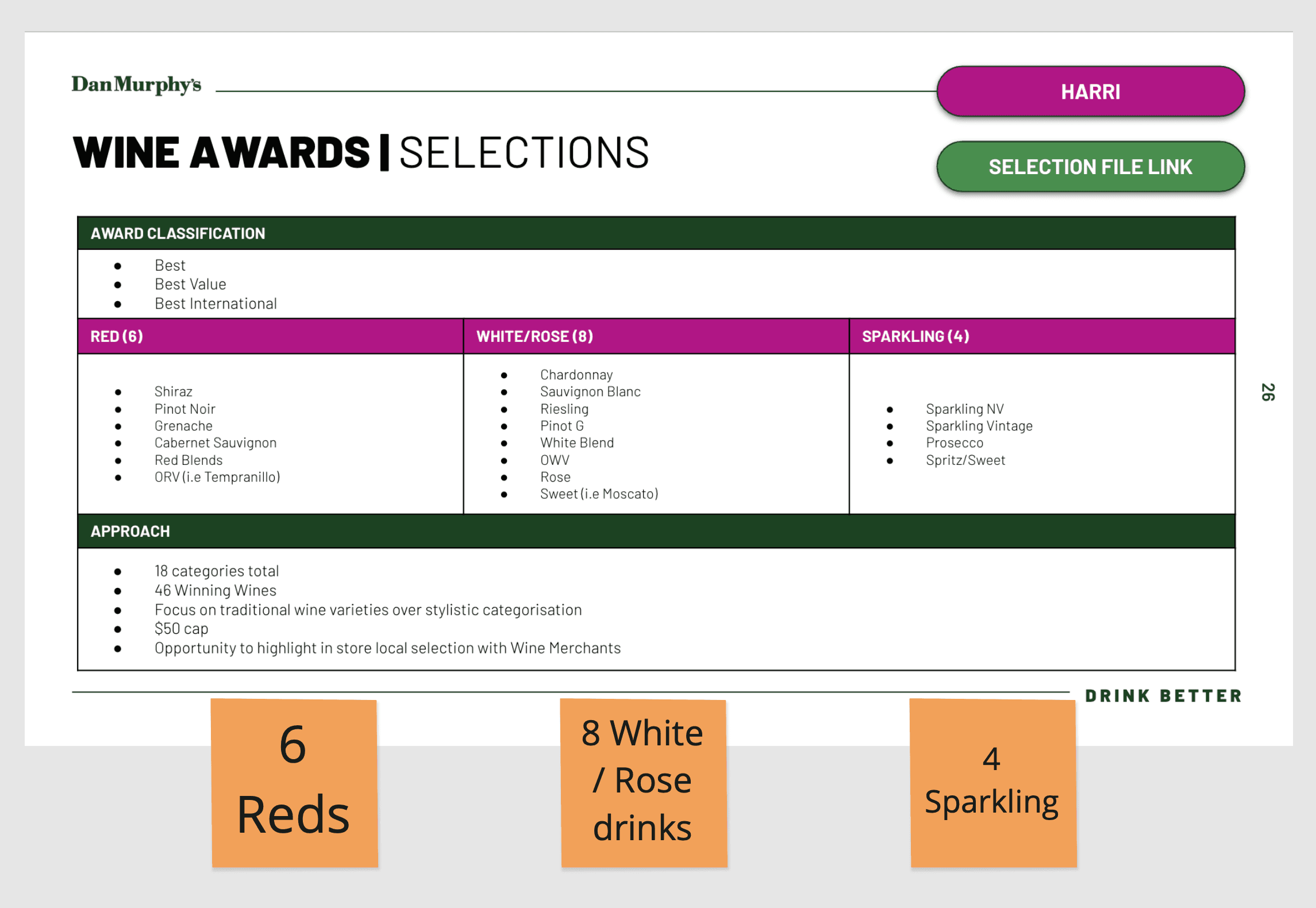
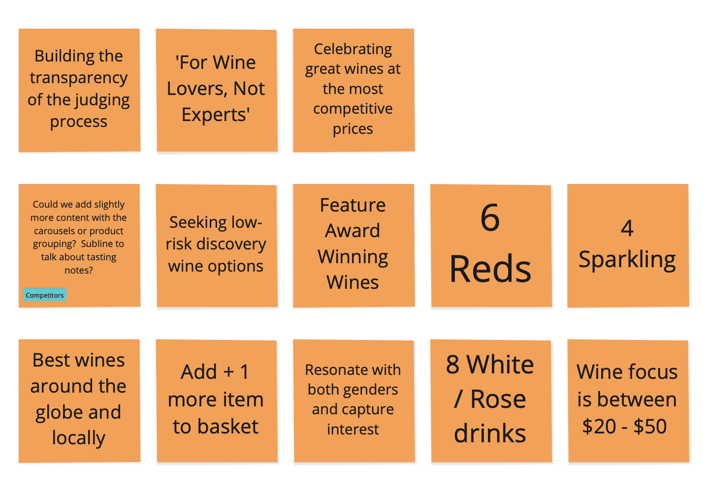
Product Selections and Categories
To align with marketing messaging, the campaign needed to showcase:
Best of the Awards
Best Value Wines
Best International Wines
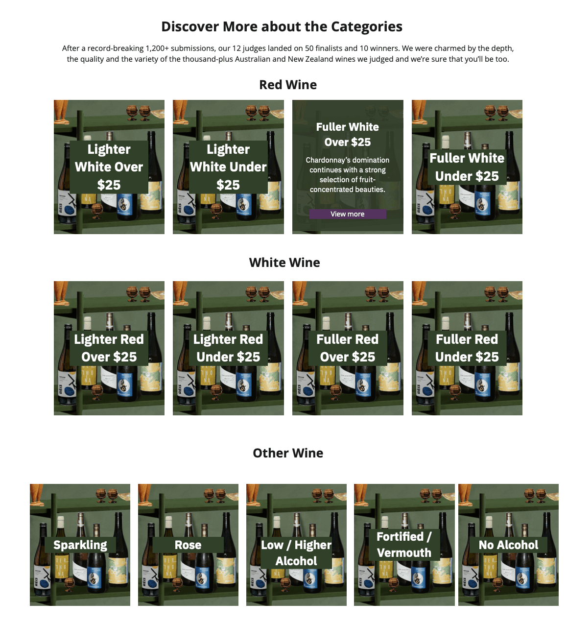
The product selection strategy also required clear separation across traditional wine categories:
6 Red Varieties: e.g. Shiraz, Pinot Noir, Cabernet Sauvignon
8 White & Rosé: e.g. Sauvignon Blanc, Chardonnay, Riesling, Moscato
4 Sparkling Wines: e.g. Prosecco, Sparkling NV
This structure helped simplify browsing and supported the objective to demystify the wine category for budget-conscious and casual wine shoppers.
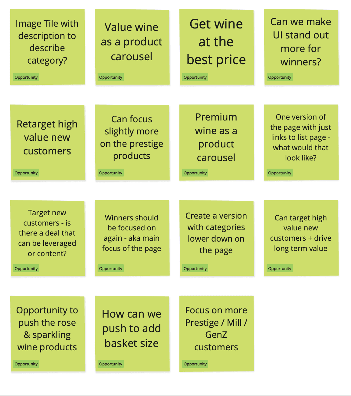
Ideate
In the Ideate stage of the Wine Awards 2025 campaign, I mapped out key opportunity areas by synthesising previous campaign learnings, business objectives, and customer pain points.
Early Ideate Session Facilitation and Kick Off with Stakeholders
I facilitated an early kickoff session with cross-functional stakeholders including PMs, the eCommerce Manager, developers and CRO analysts, to validate these insights, ensure alignment, and uncover any blind spots.
This session helped shape a shared understanding of what success looked like and informed the direction for experience concepts that would meet both user needs and business goals.
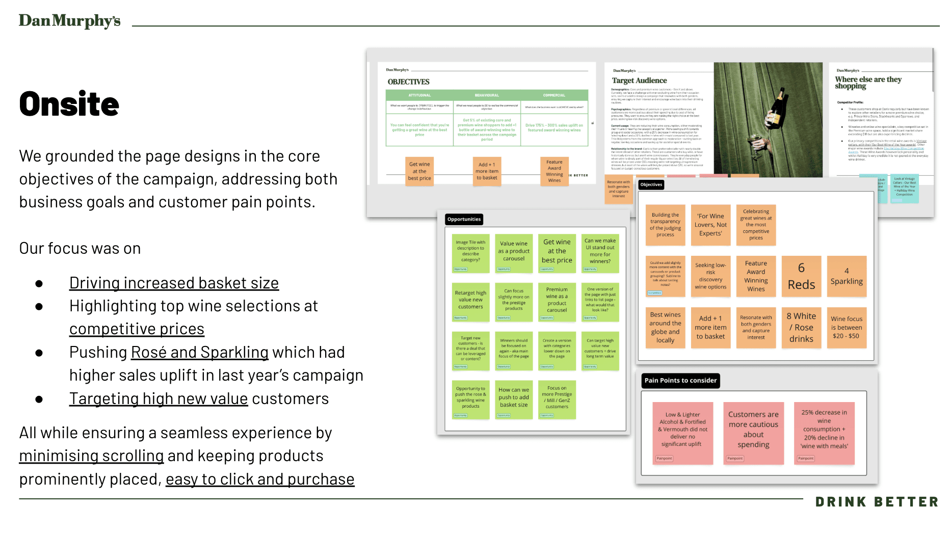
Design
I grounded the page designs in the core objectives of the campaign, addressing both business goals and customer pain points.
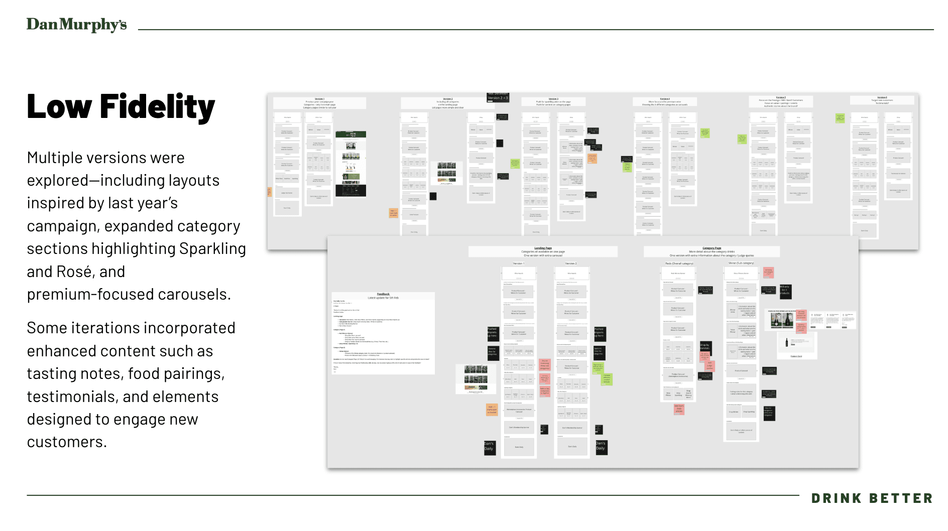
Initial Low-Fidelity Wireframing
My focus for the design was on:
Driving increased basket size
Highlighting top wine selections at competitive prices
Enabled at-a-glance browsing of all the categories or winners
Applied consistent layouts and labels to reduce decision fatigue.
Reducing any jargon to demystify the wine category for the budget-conscious and casual wine shoppers
Ensure the design reinforced value messaging and award credibility
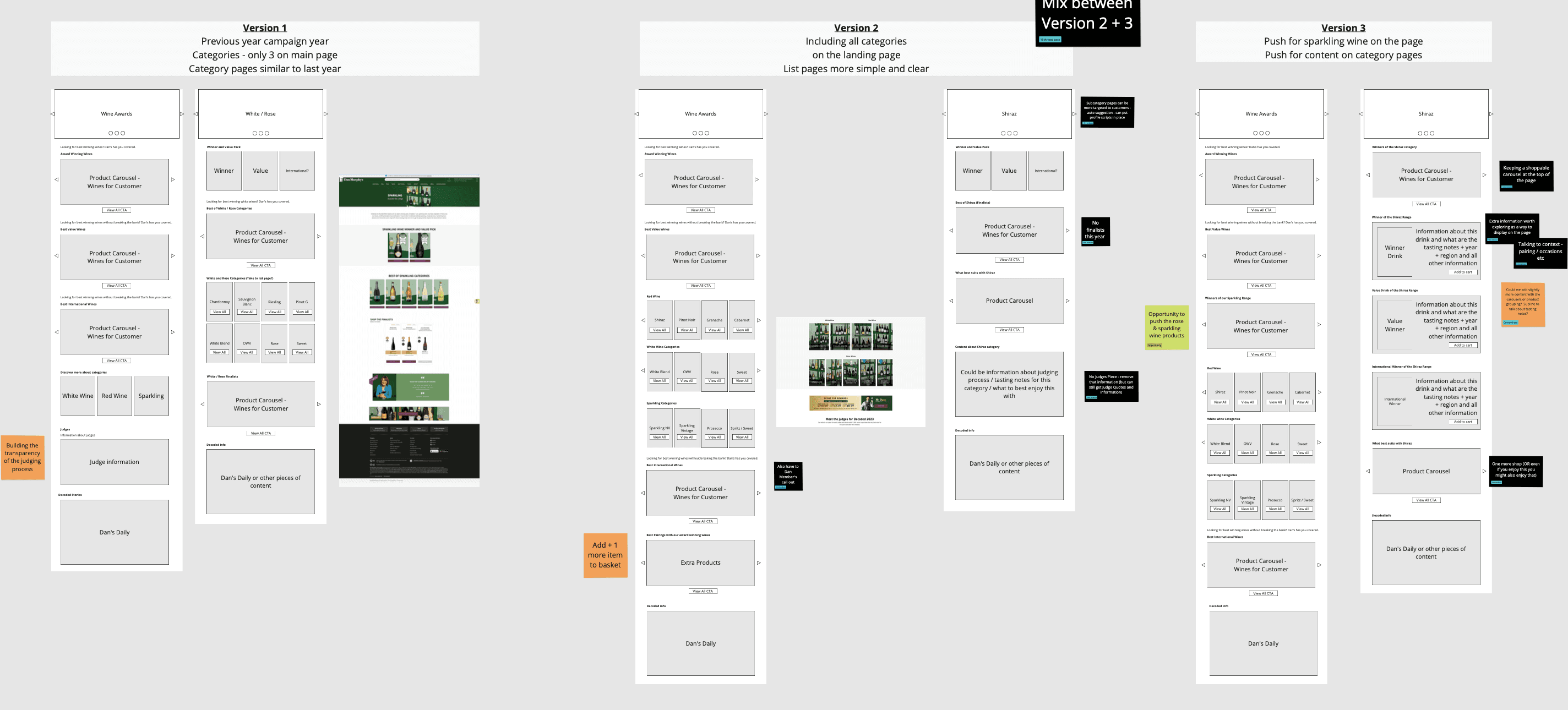
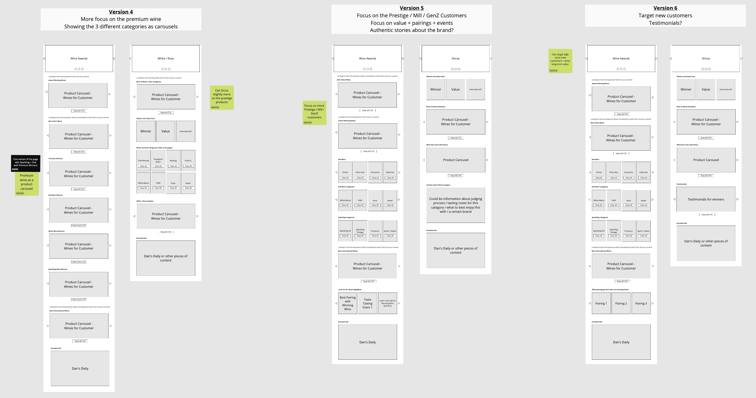
I explored multiple design directions, starting with layouts inspired by the previous year’s campaign and evolving them based on new performance insights.
This included expanded category sections that spotlighted Sparkling and Rosé, which had higher engagement previously, as well as premium-focused carousels to support price-based discovery.
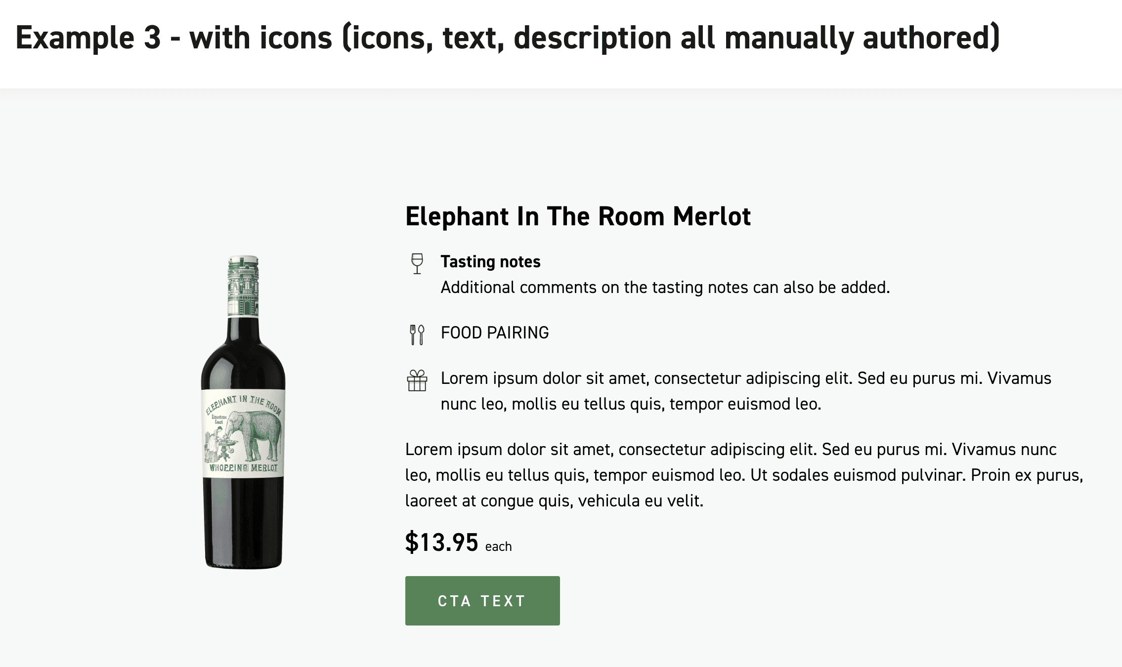
I experimented with rich content components such as:
Tasting notes
Food pairings
Testimonials
Engagement tiles aimed at new or hesitant wine shoppers
While these additions supported storytelling and education, stakeholder alignment and CRO insights led us to pivot.
The final decision was to strip back complexity and focus on a clean, product-led experience that prioritised ease of navigation, fast product discovery and conversion, which was especially important for our mobile-dominant audience.
Co-Design and Iterative Wireframing
Throughout the design phase, I facilitated co-design sessions with PMs, developers, CRO, and marketing to respond to shifting priorities and product group changes.
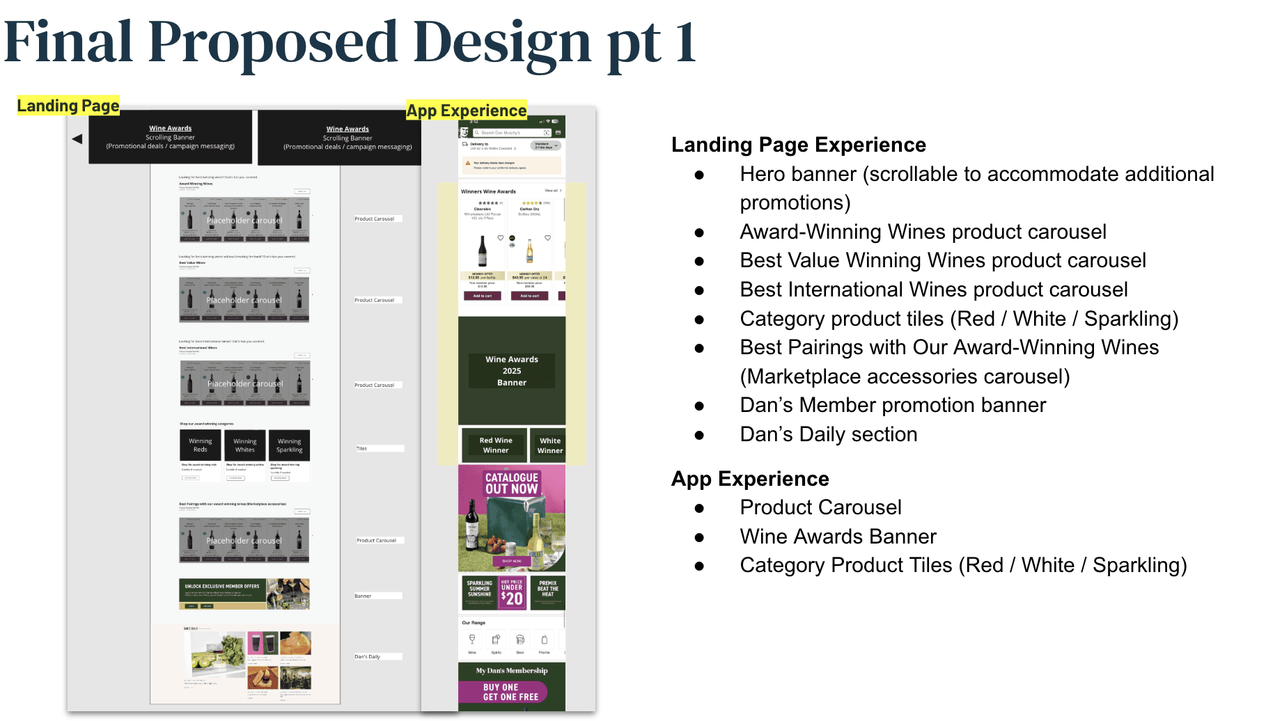
As one of the early goals was to ensure award-winning wines were visible and accessible, I kept the main winners, value champions, and international highlights placed at the top of the landing page.
In early iterations, we explored:
A/B testing ideas with CRO to determine if category winners (Red/White/Sparkling) should live on the landing page or within subpages.
Expanded varietal sections (e.g. Shiraz, Pinot Noir, Red Blends) and rich content like tasting notes and award explanations.
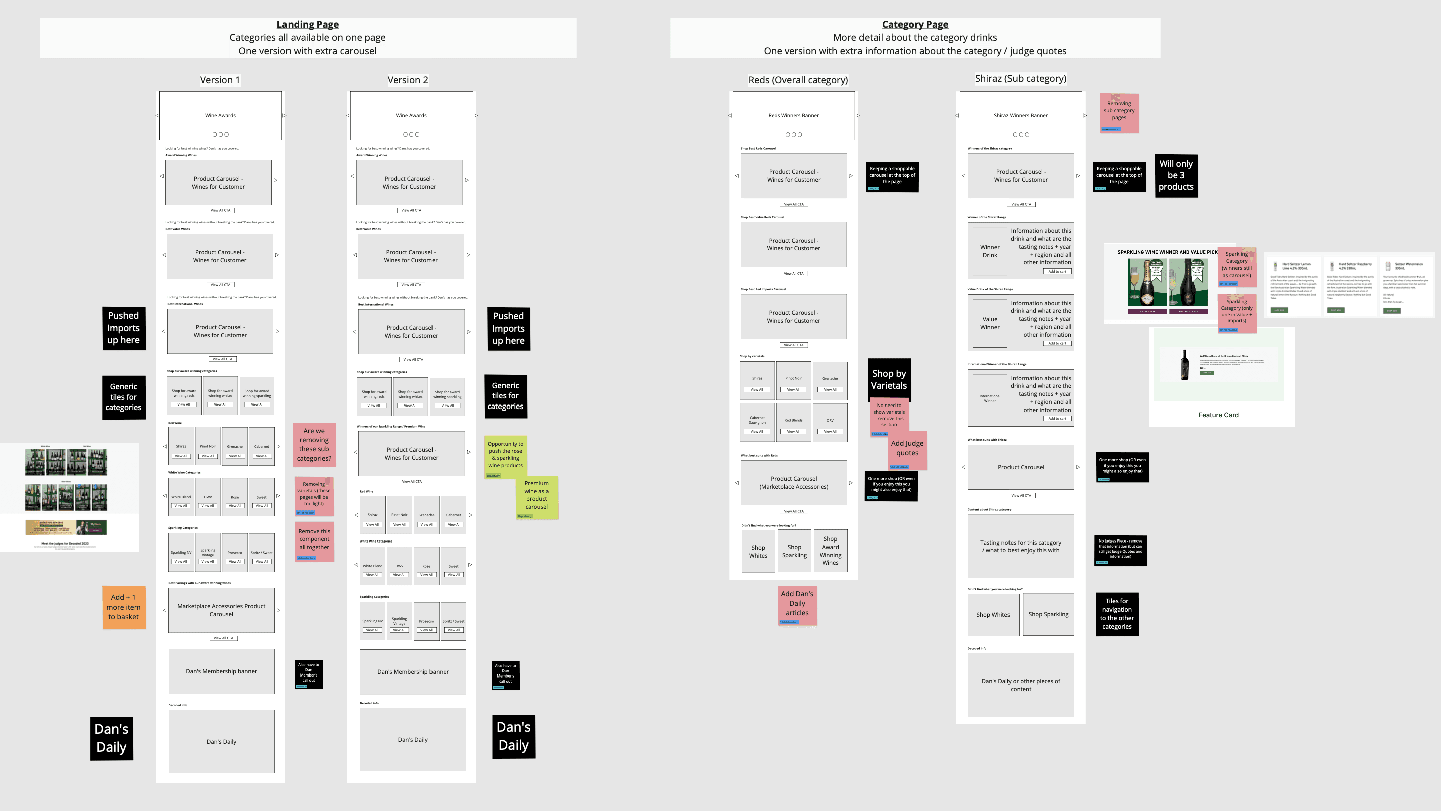
However, this approach was quickly identified as overwhelming. In response, we simplified:
Collapsing varietals into Red / White / Sparkling only.
Featuring category winners clearly on the landing page.
Adding a marketplace carousel to support upsell opportunities.
Keeping the experience clean and mobile-friendly by prioritising clarity and hierarchy.
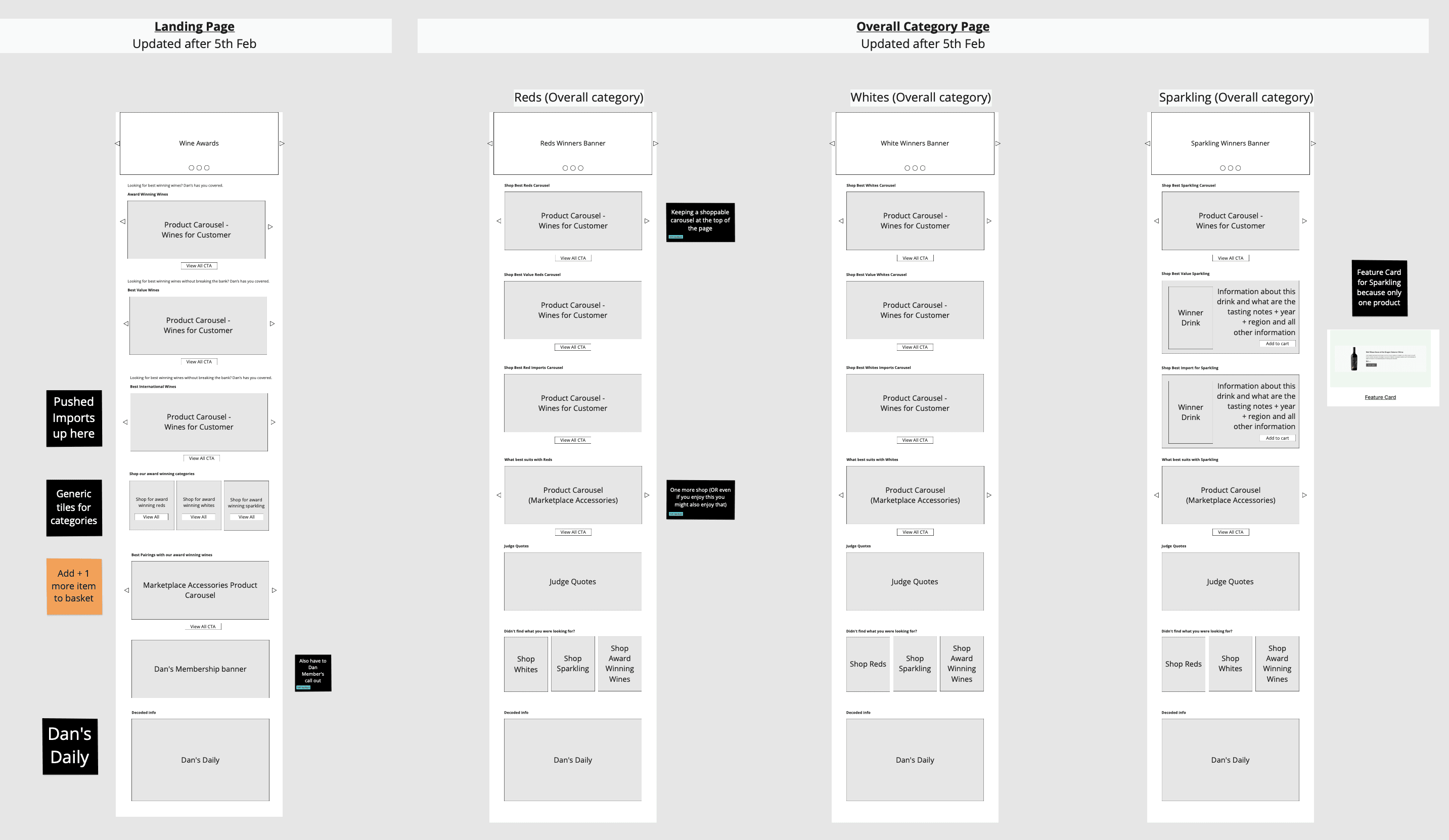
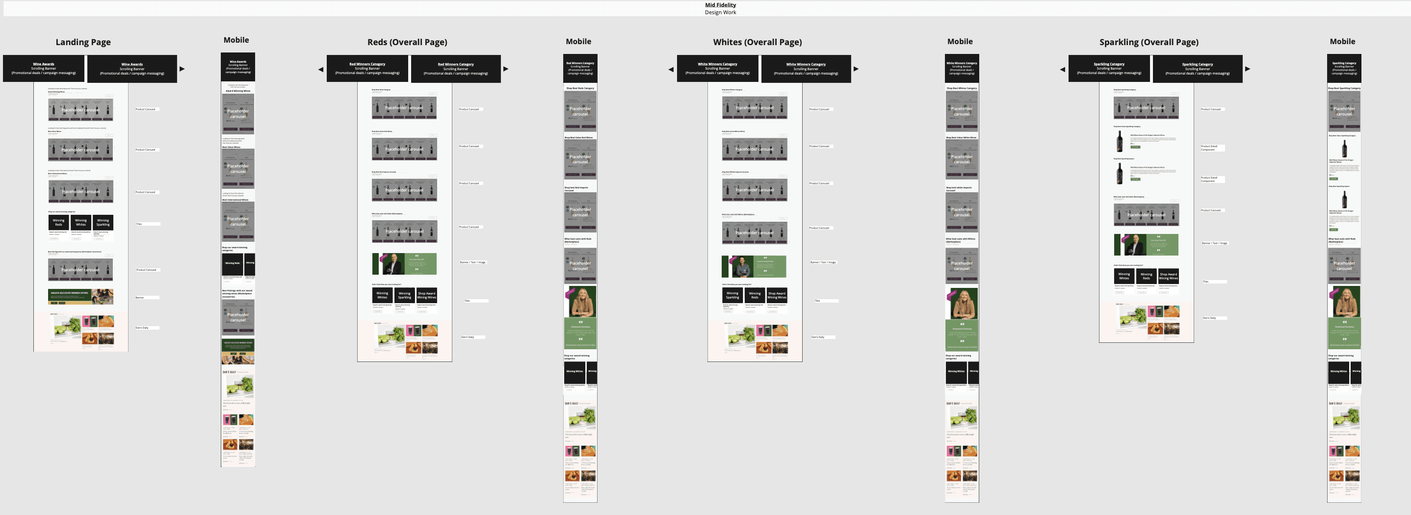
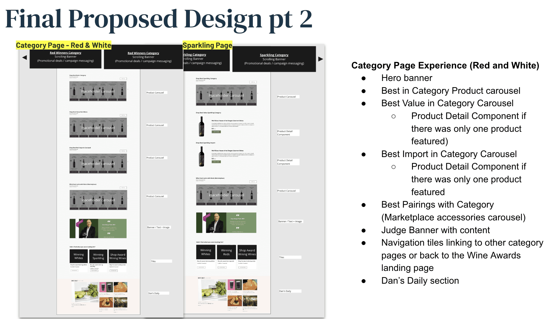
Category pages followed this simplified structure:
Best of Category
Best Value
Best Import
Marketplace Carousel (for “one more shop”)
Judge Quotes for storytelling
Navigation tiles for easy movement across the campaign
For Sparkling, which had fewer awardees, I adapted the layout using feature cards instead of product carousels to give each product more visual weight.
The result was a streamlined and intuitive campaign that made product discovery and wine awards more accessible to everyday shoppers, while still aligning with business goals.
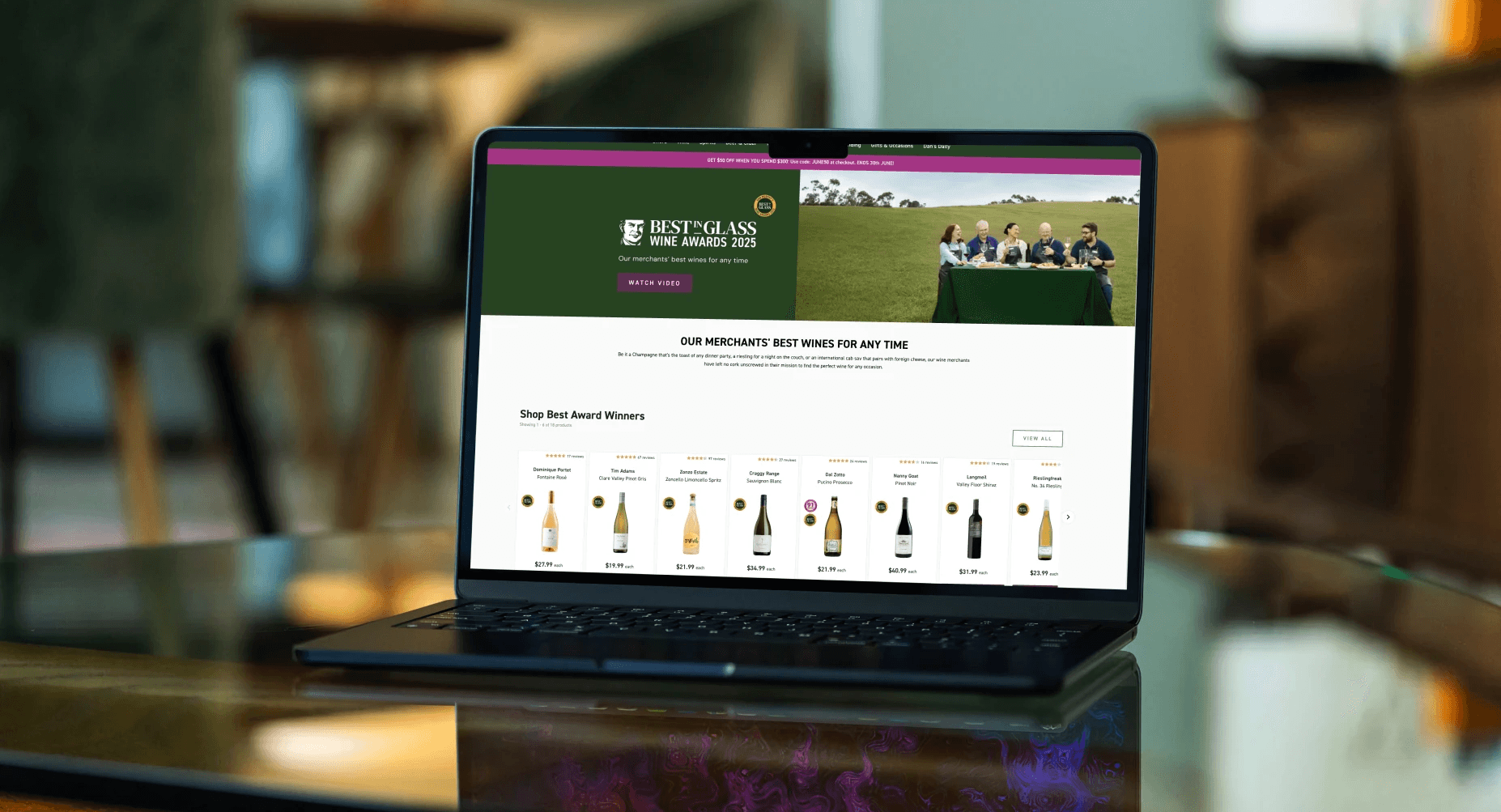
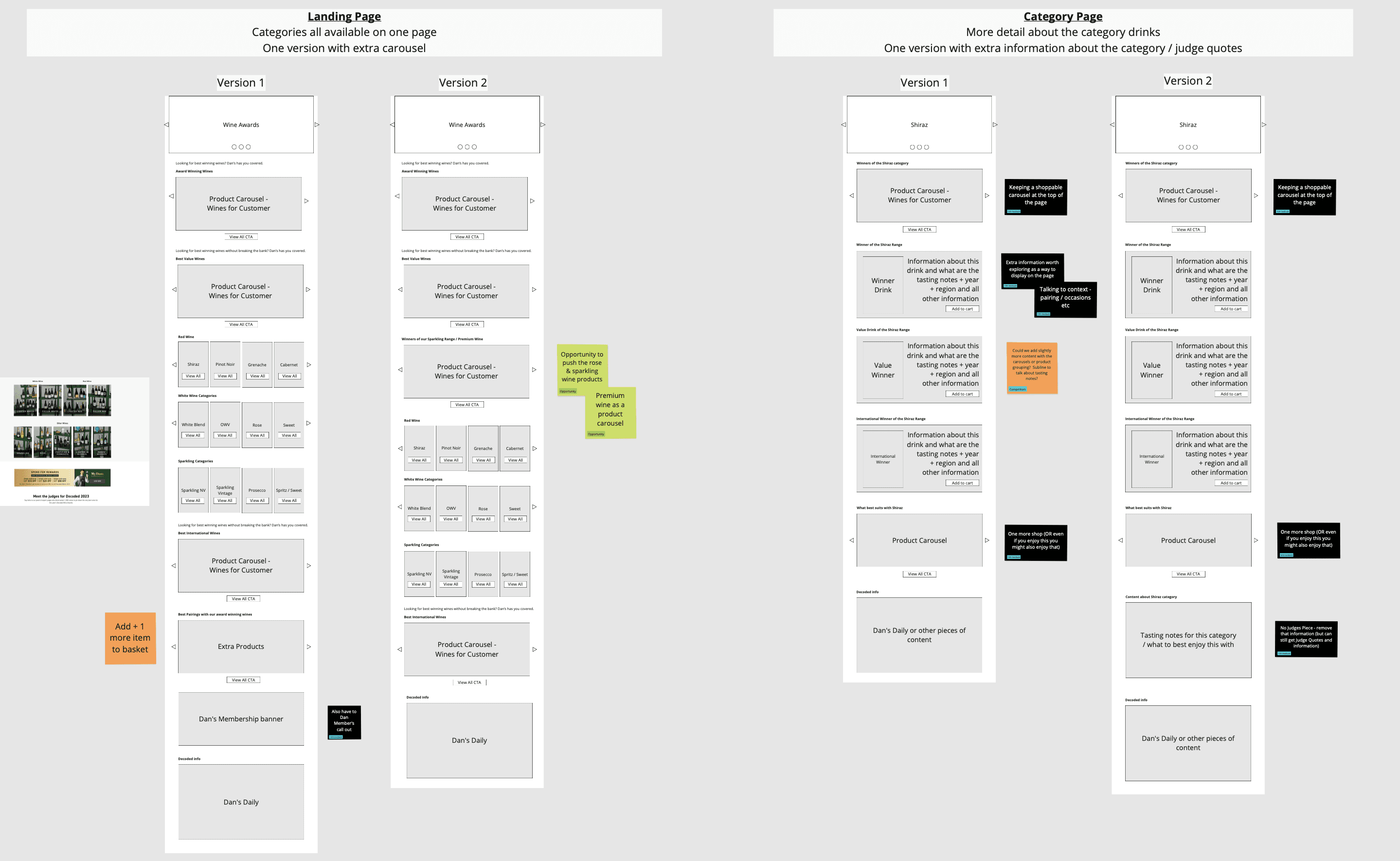
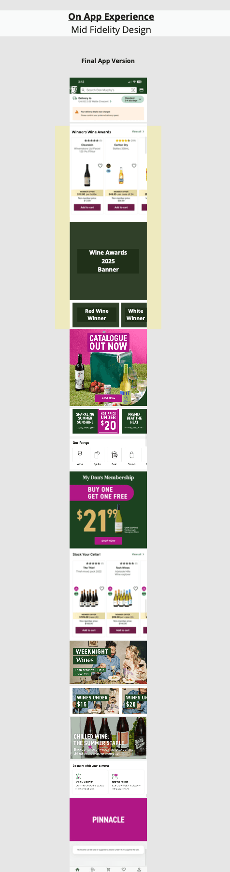
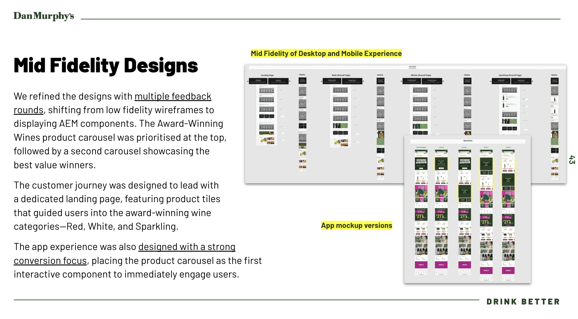
Mid Fidelity Design
Building on the agreed low-fidelity direction, I developed mid-fidelity designs using Dan Murphy’s existing AEM component library to ensure consistency with the live site. This allowed for a seamless transition to development, ensuring designs were not only visually aligned but also technically feasible and easily authorable by the dev team.
The mid fidelity designs mocked up including mobile view of what the campaign pages will look like:
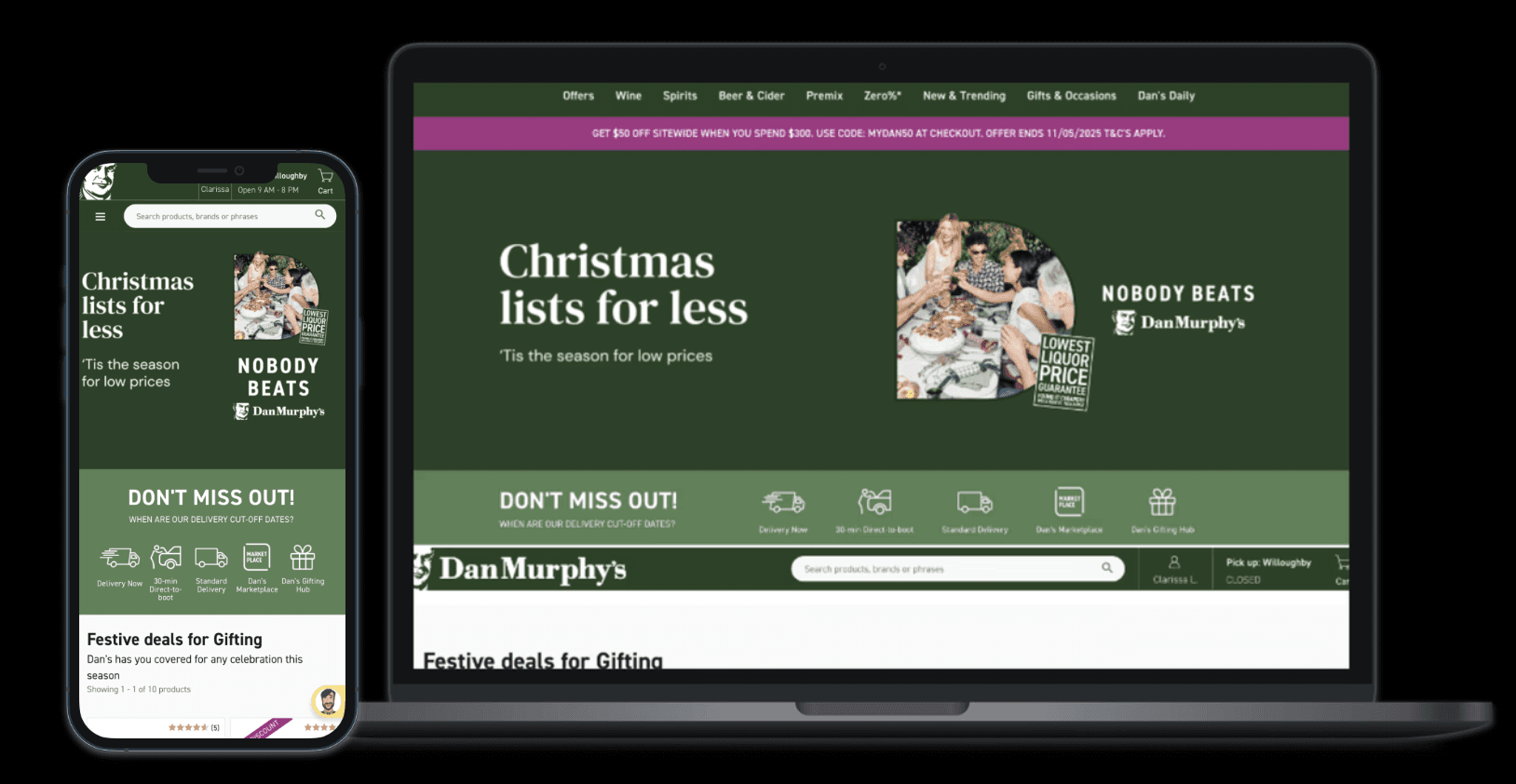
App Landing Page Design
In addition to the web experience, I designed the mobile app landing experience to guide users toward the Wine Awards product list.
Unlike the website, the Dan Murphy’s app doesn’t support a dedicated landing page, so I crafted an experience optimised for mobile constraints.
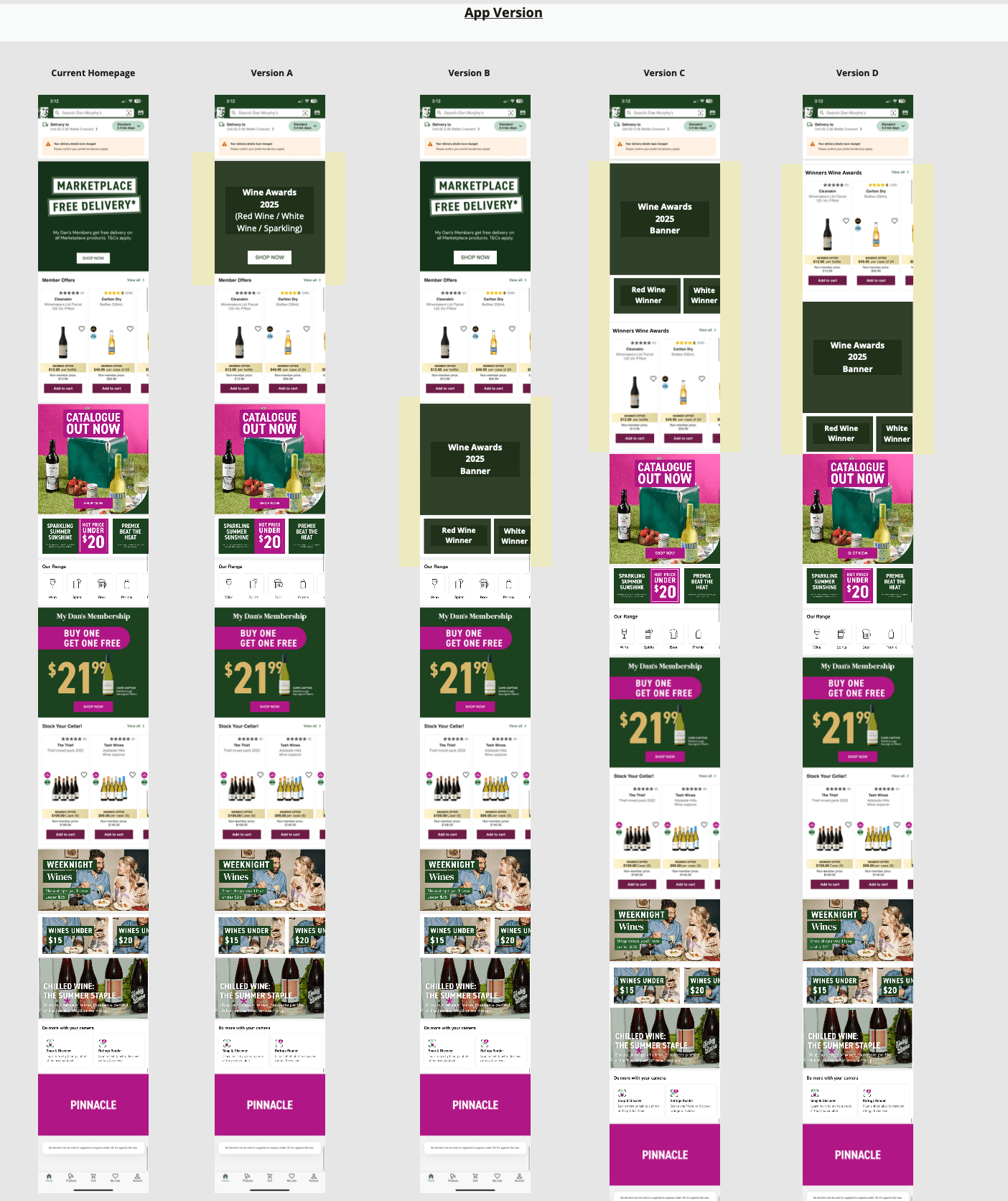
The final design featured a hero carousel highlighting all winning products at the top, followed by intuitive product tiles that directed users to category-specific list pages - ensuring ease of navigation and strong product visibility for mobile users.
Present
I presented the final designs back to key stakeholders, walking through the rationale behind each decision—grounded in data, user insights, and business needs.
This culminated in a broader PCA (Post Campaign Analysis) meeting with the wider business, where I articulated our UX approach, explained how we addressed previous campaign pain points, and demonstrated how the simplified design would drive higher engagement and conversion.
The session ensured alignment across teams and validated our direction before development handoff.
Results and Learnings
Results
The 2025 Wine Awards campaign delivered standout results:
9.33% conversion rate (up from 5.8%)
58% more orders
46% increase in revenue.
App performance was particularly strong, with traffic up 22%, orders up 248%, and revenue up 282%, now contributing over 50% of total revenue and orders.
From a UX standpoint, several key decisions drove this performance:
Simplified navigation and layout helped customers immediately discover key products like Best, Best Value, and Best International winners.
Mission-led content structure made the campaign more scannable and purpose-driven, avoiding component bloat like video modules or flippy cards that previously caused drop-off.
Mobile-first optimisation ensured a frictionless app experience, leading to significant growth in app-based sales.
Accessible category breakdowns (Red, White/Rosé, Sparkling) made wine easier to explore for hesitant shoppers.
Product-focused hero and carousels provided clear paths to purchase, with tiles overperforming compared to passive product displays in previous years.
Overall, the UX strategy of clarity, simplicity, and conversion focus helped capture user intent and drive measurable results across devices.
Learnings
Limited Testing Due to Resourcing: Time constraints and limited team resources meant we couldn’t conduct usability testing or additional rounds of design critique. Incorporating even quick guerrilla testing would’ve strengthened our confidence behind key design decisions.
CRO Constraints Affected Experimentation: Our sole CRO specialist was on extended medical leave halfway through the campaign, which impacted our ability to validate design hypotheses through A/B testing or performance tracking. Greater CRO collaboration would have allowed for more iterative, data-led enhancements.
Platform Limitations Restricted Innovation: Operating within AEM’s existing component library limited opportunities to test or introduce more interactive or innovative modules. While sticking to proven elements helped preserve conversion, it restricted creativity and potential engagement features.
Despite these challenges, the project delivered strong results — but future campaigns could benefit from more dedicated time for testing, experimentation, and component innovation.