Deloitte
Consulting Assets Program

Bridging UX and service design to create a centralised, user-friendly hub for asset investment, performance management and go-to-market support.
Company
Client
Role
Timeframe
The Consulting Asset Program was designed to unify investment oversight, performance management, and go-to-market support into a single, cohesive platform for asset owners, portfolio managers, and the CAP team.
As the sole UX/UI designer embedded in a service design-led initiative, I worked across an 8-week engagement to streamline complex workflows, improve discoverability, and align internal teams.
Partnering closely with the Service Designer, I mapped end-to-end user journeys, supported co-design workshops, and delivered core UX flows across key areas including the Asset Store, Knowledge Hub, and team dashboards.
Key responsibilities included:
Discovery & Research:
Created and led the research plan including stakeholder interviews and user testing across key personas (Asset Team, Offering Portfolio Leads (OPLs) / Offering Portfolio Managers (OPMs)
Synthesised findings into actionable insights, personas, and journey maps
Audited current-state designs in Figma to understand the gaps
Design Facilitation & Collaboration:
Facilitated and led co-design workshops with stakeholders to validate opportunities
Co-led technical prioritisation sessions to assess features by impact and feasibility
Presented and iterated on designs daily with stakeholders, incorporating feedback in real time
Design Execution:
Designed low-to-mid fidelity UX flows and static prototypes in Figma to support service design outcomes
Mapped and integrated service touch points into journey maps and wireframes
Categorised opportunity areas and explored concepts to bring customer-centric ideas to life
Service Design Support
Collaborated with the service designer to define future-state experiences
Developed personas, moments that matter, and blueprint artefacts based on research synthesis
Miro, Figma, Powerpoint, Zoom
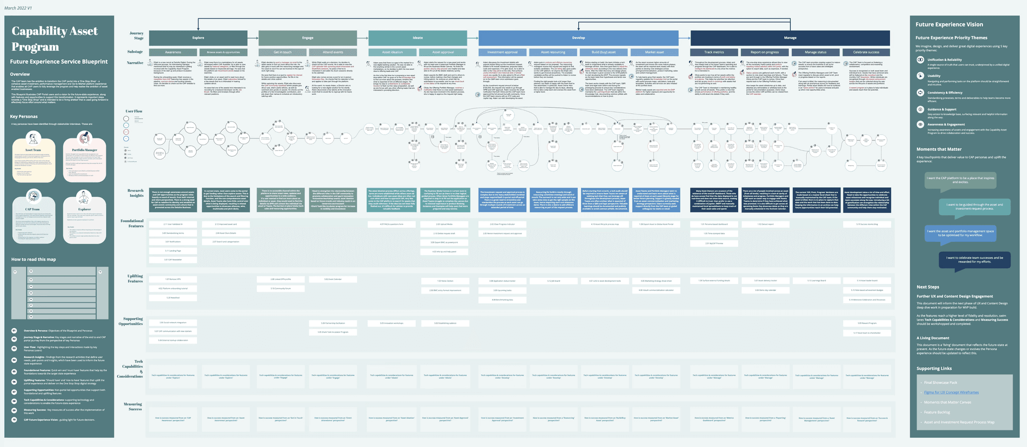
The Process
Problem Statement
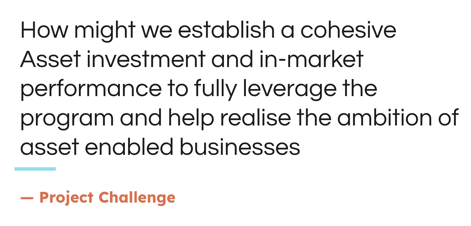
The Consulting Asset Program (CAP) team lacked a cohesive and user-friendly experience that connected asset exploration, asset investment, development, and performance tracking across the end-to-end journey.
Fragmented tools and inconsistent workflows made it difficult for stakeholders such as asset owners, Offering Portfolio Leads (OPLs), Offering Portfolio Managers (OPMs) and the CAP Team themselves to fully leverage the program and realise the ambition of asset-enabled business.
There was a clear need to flesh out and unify each stage of the journey, aka Explore, Engage, Ideate, Develop, and Manage, to create a more streamlined, intuitive One Stop Shop experience aligned with user needs and business goals.
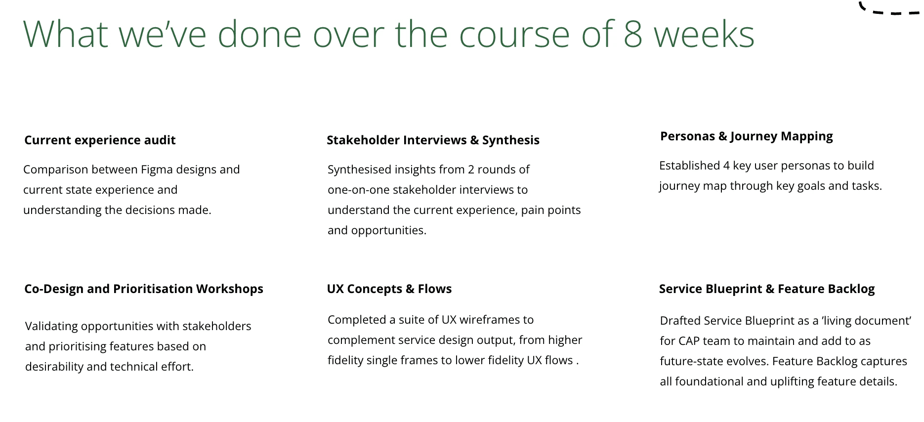
Discovery and Research
The process began by deeply understanding the current state through audits, stakeholder interviews, and journey mapping. We then led user research to uncover key pain points and surfaced five experience themes.
Understanding the Current State
To understand the current state, we took a multi-layered approach that involved reviewing key documents and conducting targeted activities.
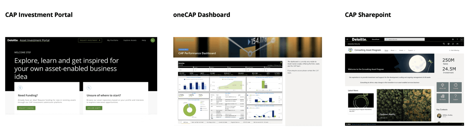
I began with a UX audit - comparing the Figma designs with the live CAP experience to uncover design decisions and gaps.
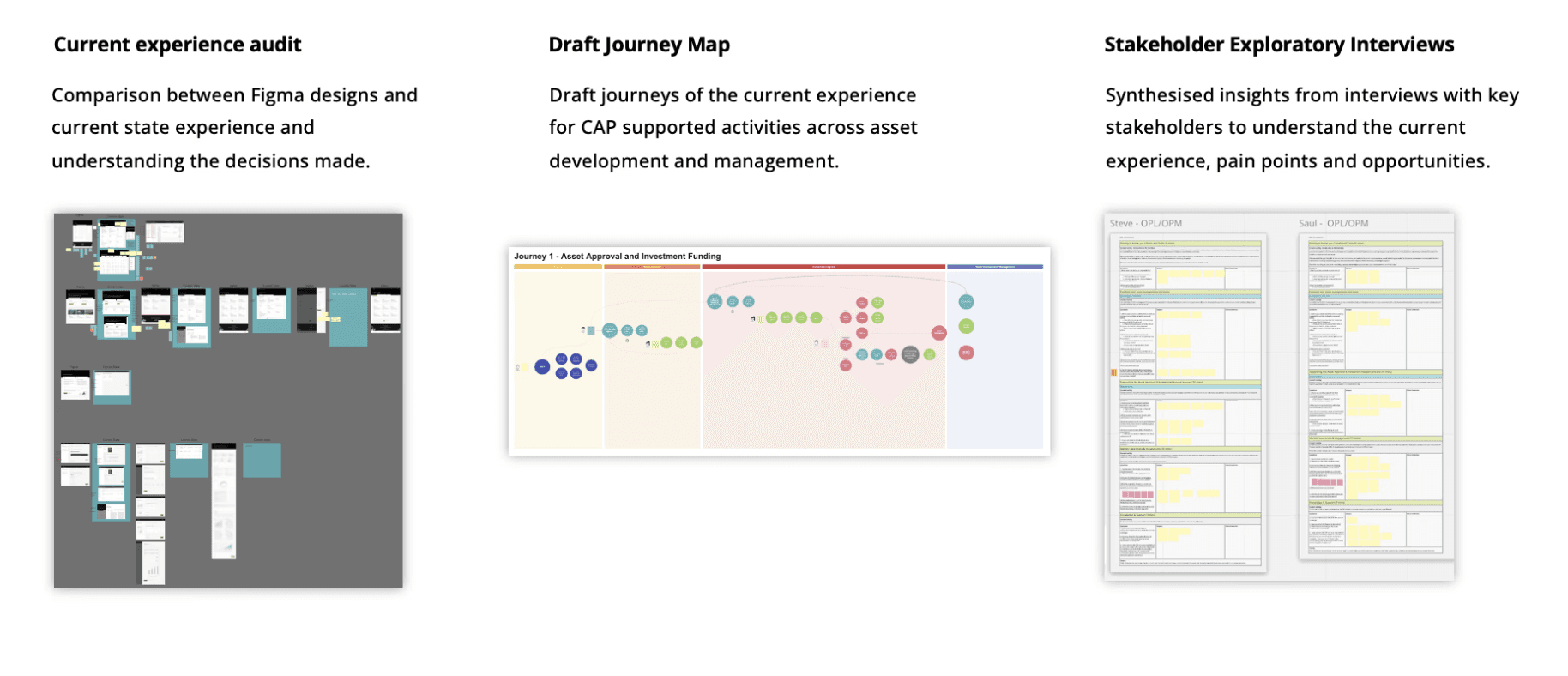
This was followed by mapping the current-state journey across asset development and management workflows.
I created and led the research plan, conducting in-depth interviews with key SMEs and running user testing across core personas including the Asset Team, Offering Portfolio Leads (OPLs), and Offering Portfolio Managers (OPMs), to surface pain points, goals, and experience opportunities.
Stakeholder Research, Insights & Personas
Stakeholder Research:
To uncover deeper user needs, we conducted 1-hour exploratory interviews via Zoom and captured insights collaboratively in Miro.
Our objectives were to:
Understand users’ key goals and tasks across the asset lifecycle
Explore their experiences and expectations when interacting with the CAP portal
Identify ways to enable a seamless “One Stop Shop” experience
Uncover opportunities to improve asset awareness and platform engagement
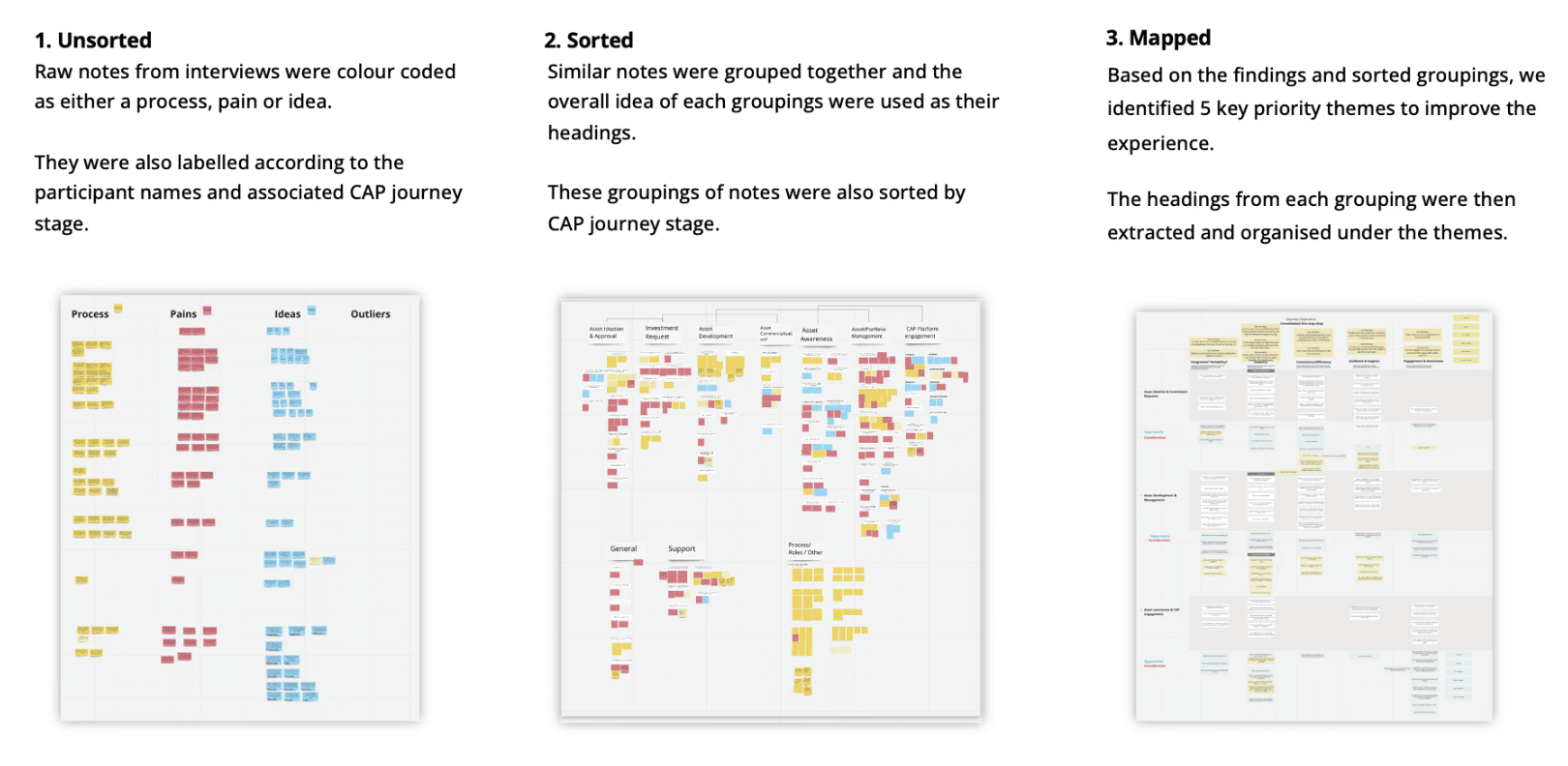
We followed a three-stage synthesis process:
Unsorted:
Raw notes were labelled by interviewee and journey stage, and colour-coded as Process, Pain, or Idea.
Sorted:
Grouped similar notes and aligned them to the CAP journey stages to uncover emerging patterns.
Mapped:
Extracted insights and organised them into 5 priority experience themes
Unification & Reliability
Usability
Consistency & Efficiency
Guidance & Support
Awareness & Engagement
Persona:
Interview insights were then synthesised to bring clarity to the distinct roles interacting with the CAP platform.
From this, we shaped four core personas, Asset Team, Portfolio Manager, CAP Team, and Explorer, each reflecting unique responsibilities, needs, and pain points.
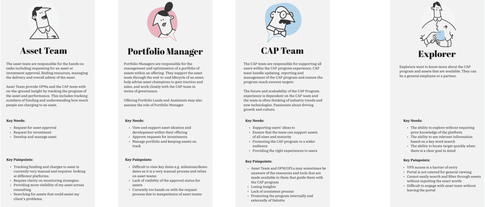
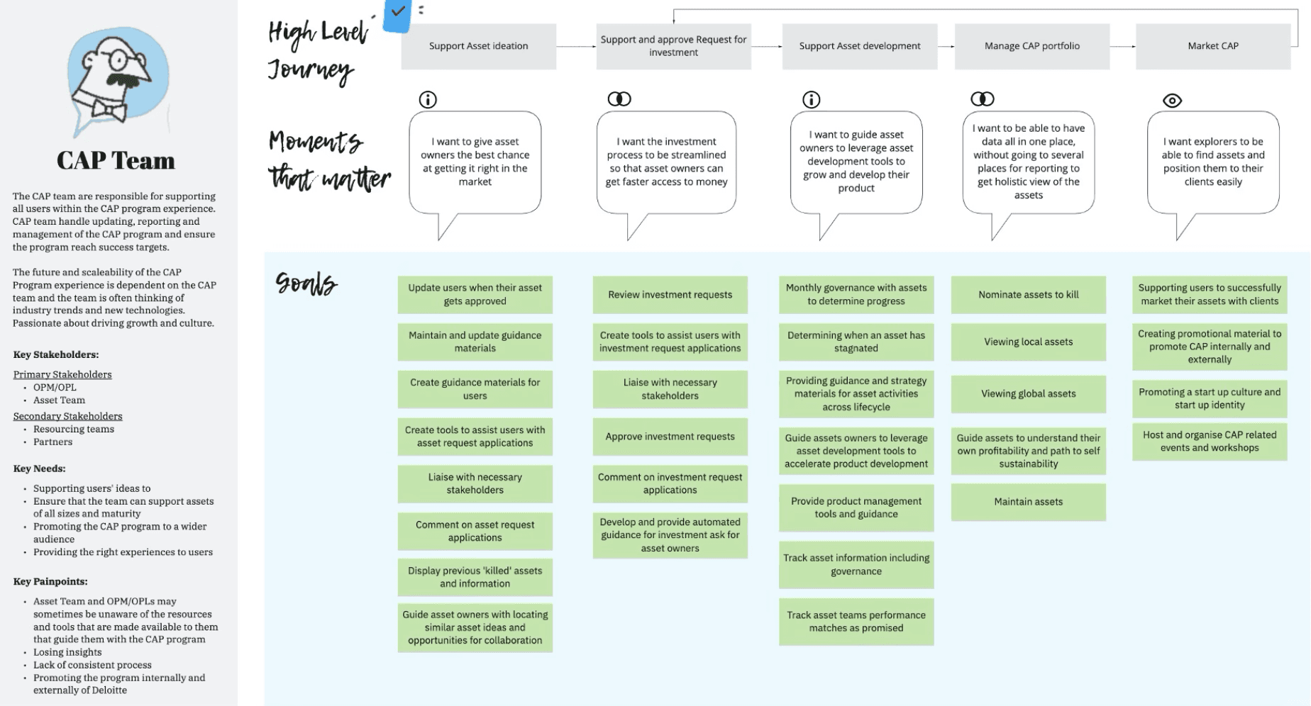
We broke down each persona, showing their high-level journeys, aligning each stage to the most relevant Moments that Matter and clearly outlining their goals.
The example shown for the CAP Team demonstrates how we mapped specific responsibilities and goals like supporting ideation, managing investment requests, and promoting the CAP program.
Define
We used further synthesis of the interviews to identify 5 priority themes - these helped lay the foundation for defining the moments that matter, future-state opportunities and guiding our design strategy.
Priority Themes
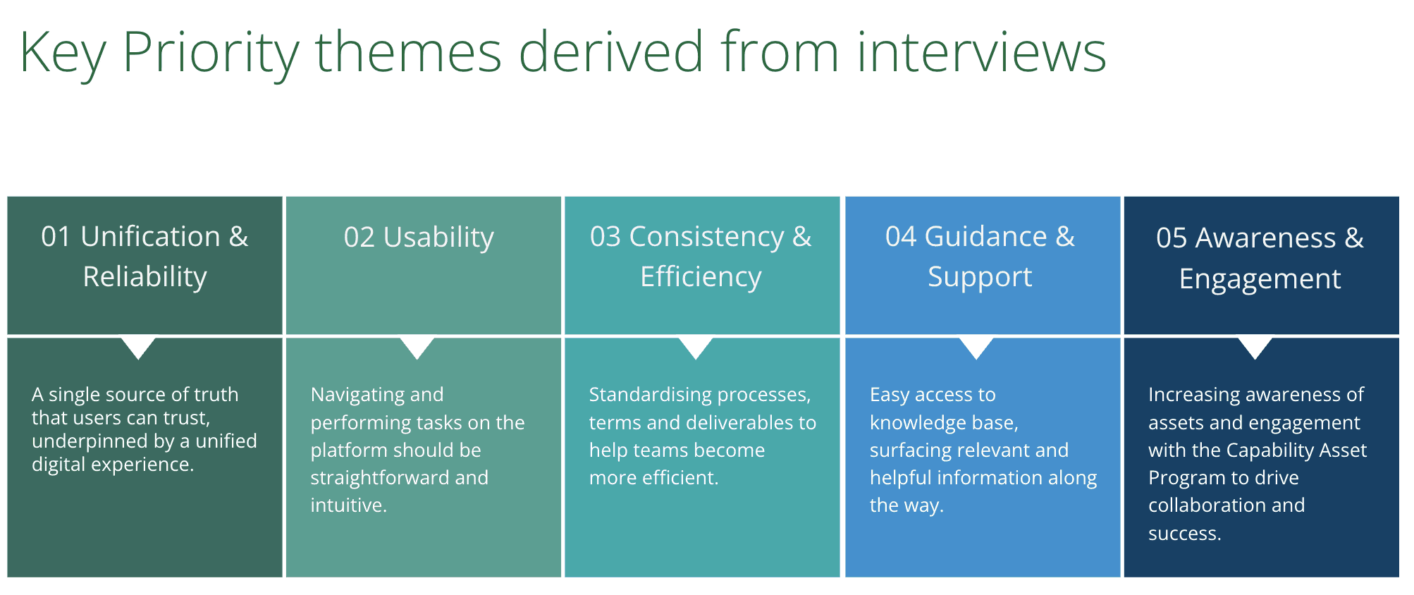
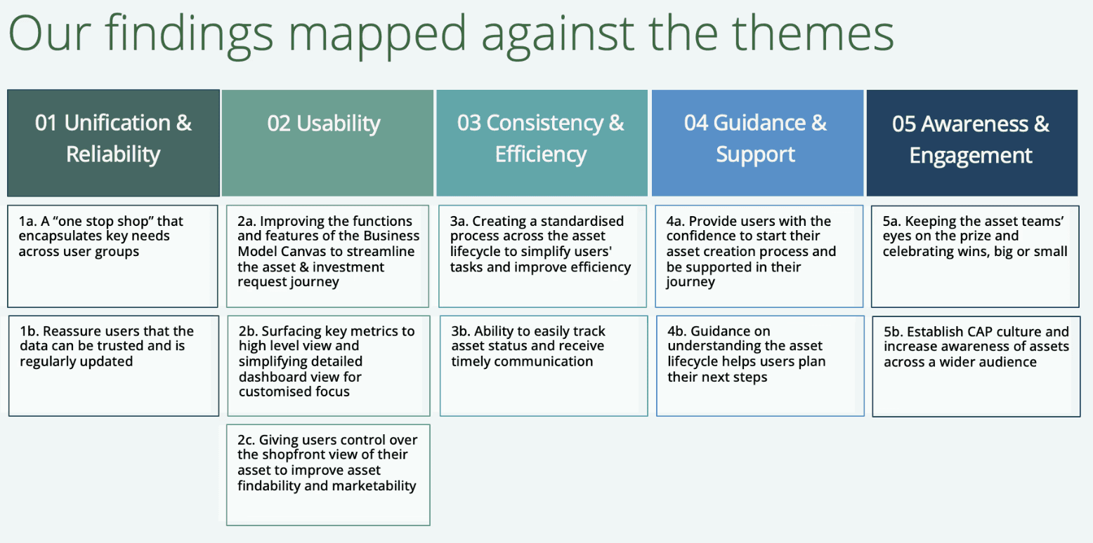
With the synthesis of the user interviews - we mapped our findings against five priority experience themes. This structured approach allowed us to distill insights from raw interview data into actionable categories, revealing patterns across user types and journey stages.
In the exploratory interview insights, we used direct verbatim from participants to explicitly illustrate user pain points and opportunities. Each insight was supported by quotes attributed to specific roles such as the Asset Owner, Portfolio Manager, and CAP team members - ensuring a diverse representation of perspectives.
This approach helped ground our design decisions in authentic user experiences while highlighting actionable ways to uplift the journey.
Shown below is a snapshot of '4a - Provide users with the confidence to start with their asset creation process and be supported in their journey' insight attached with the direct verbatim.
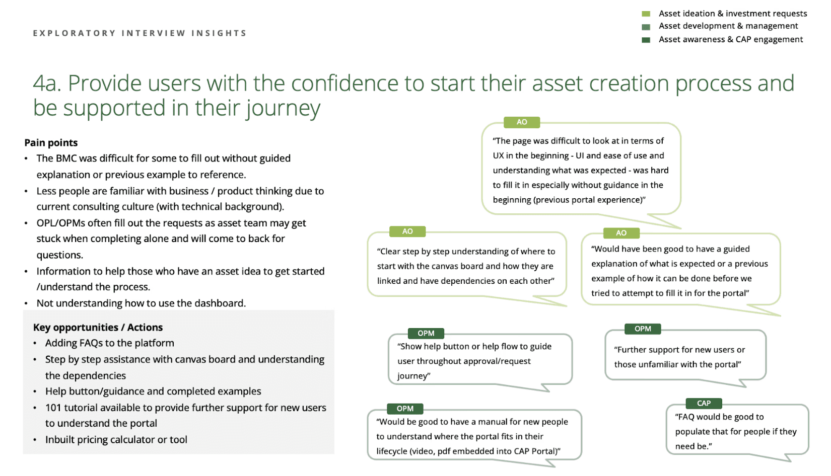
Key highlights include:
Dashboard was confusing and had little guidance
People had to consult with SMEs to complete some of the fields rather than being able to self serve
There was no guided explanation of how to complete some of the technical processes of the CAP journey
Creating "Moments that Matter"
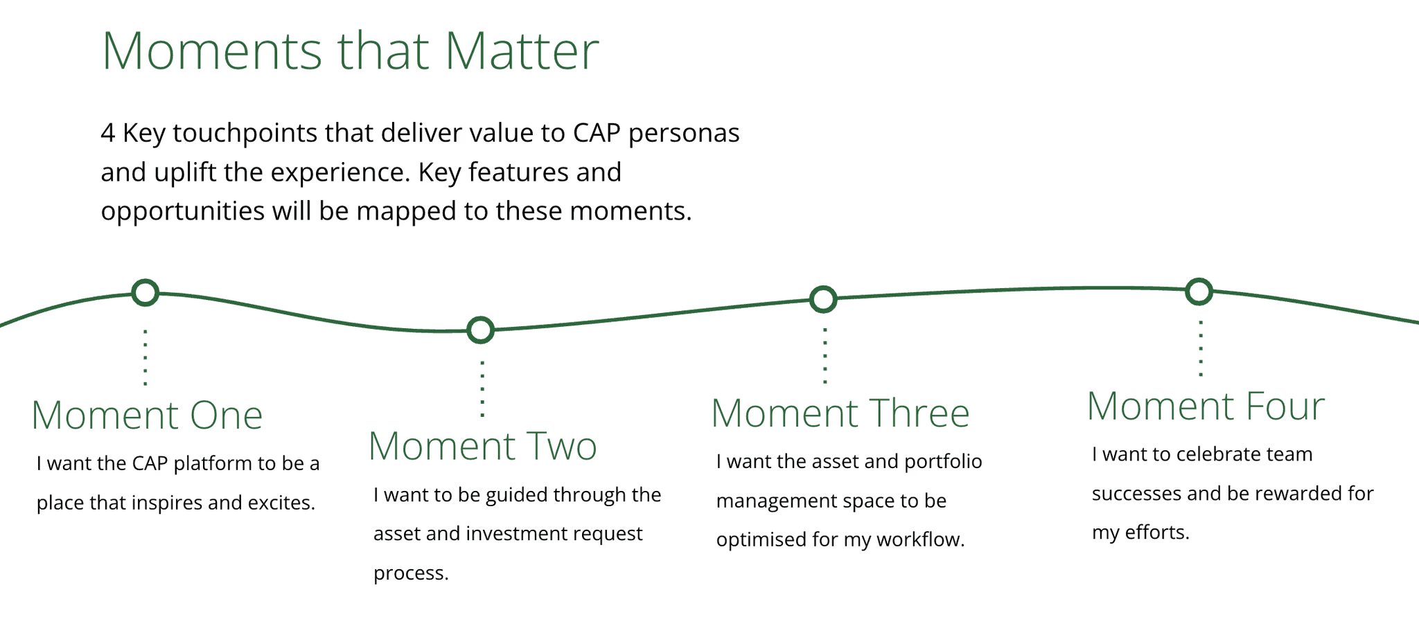
From our research, we identified four pivotal moments that encapsulate the most meaningful points in the CAP user experience. These “Moments that Matter” reflect emotional and functional user needs, guiding our design strategy and helping us align opportunities to real value:
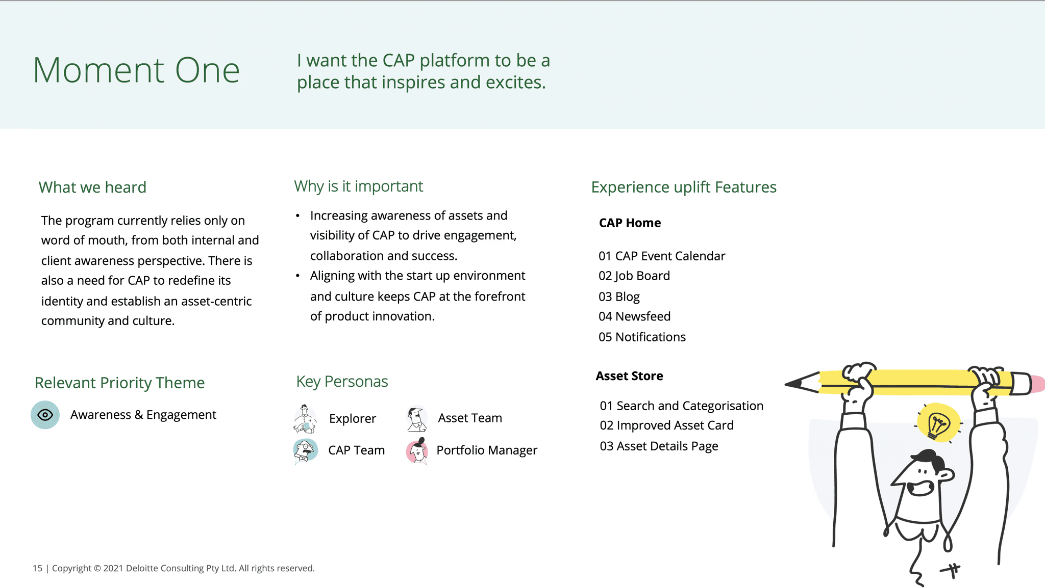
Moment One: “I want the CAP platform to be a place that inspires and excites.”
→ Focused on creating an engaging and motivating entry experience.
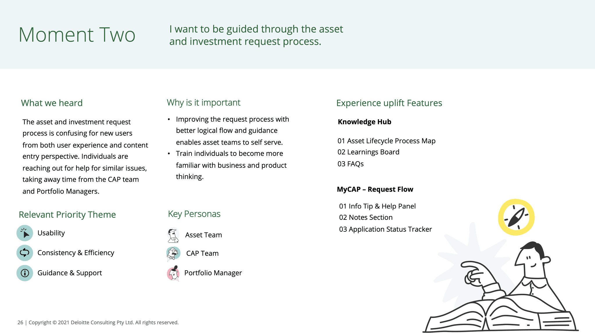
Moment Two: “I want to be guided through the asset and investment request process.”
→ Addressed the need for clarity, support, and structure in complex workflows.
Moment Three: “I want the asset and portfolio management space to be optimised for my workflow.”
→ Prioritised usability and alignment with everyday tasks.
Moment Four: “I want to celebrate team successes and be rewarded for my efforts.”
→ Recognised the importance of visibility, recognition, and motivation.
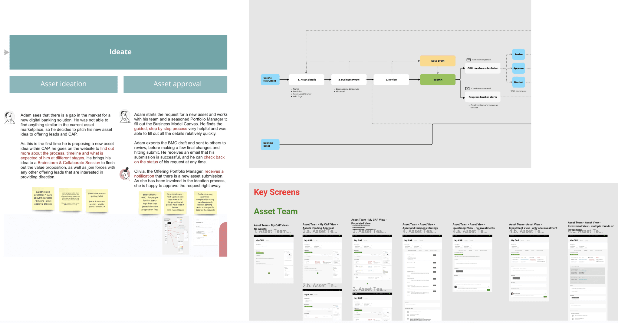
Ideate
Defining the Journey
Building on the Moments that Matter, I shaped the future-state journey stages in collaboration with the service designer. These simplified stages Explore, Engage, Ideate, Develop, and Manage mapped closely to user needs and platform interactions.
This co-designed journey view not only reflected how users think and work, but also provided a clear structure for guiding the service blueprint alignment.
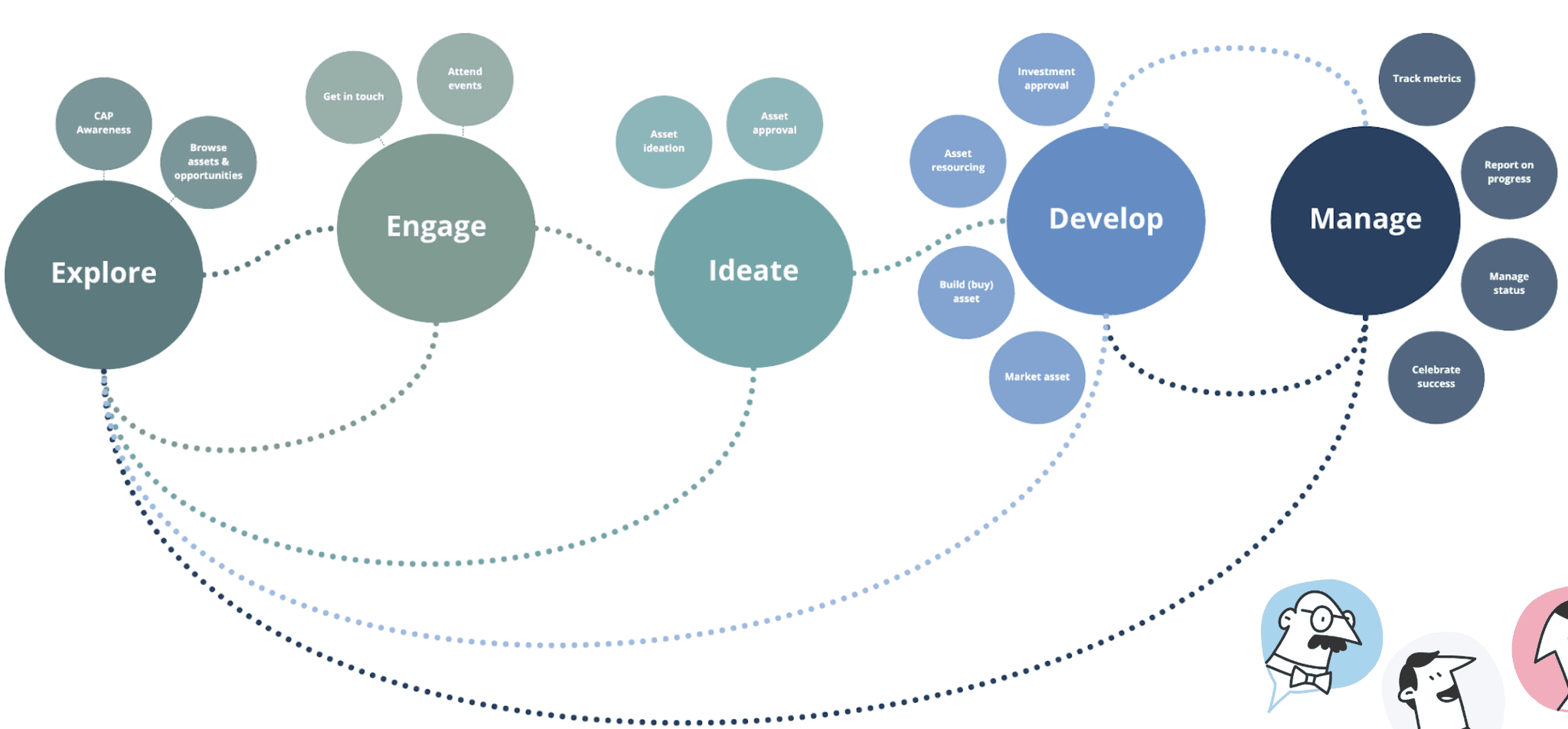
The journey designed view also directly informed the service designer’s blueprint.
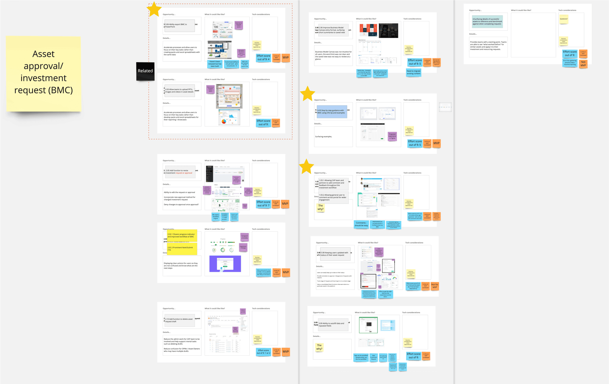
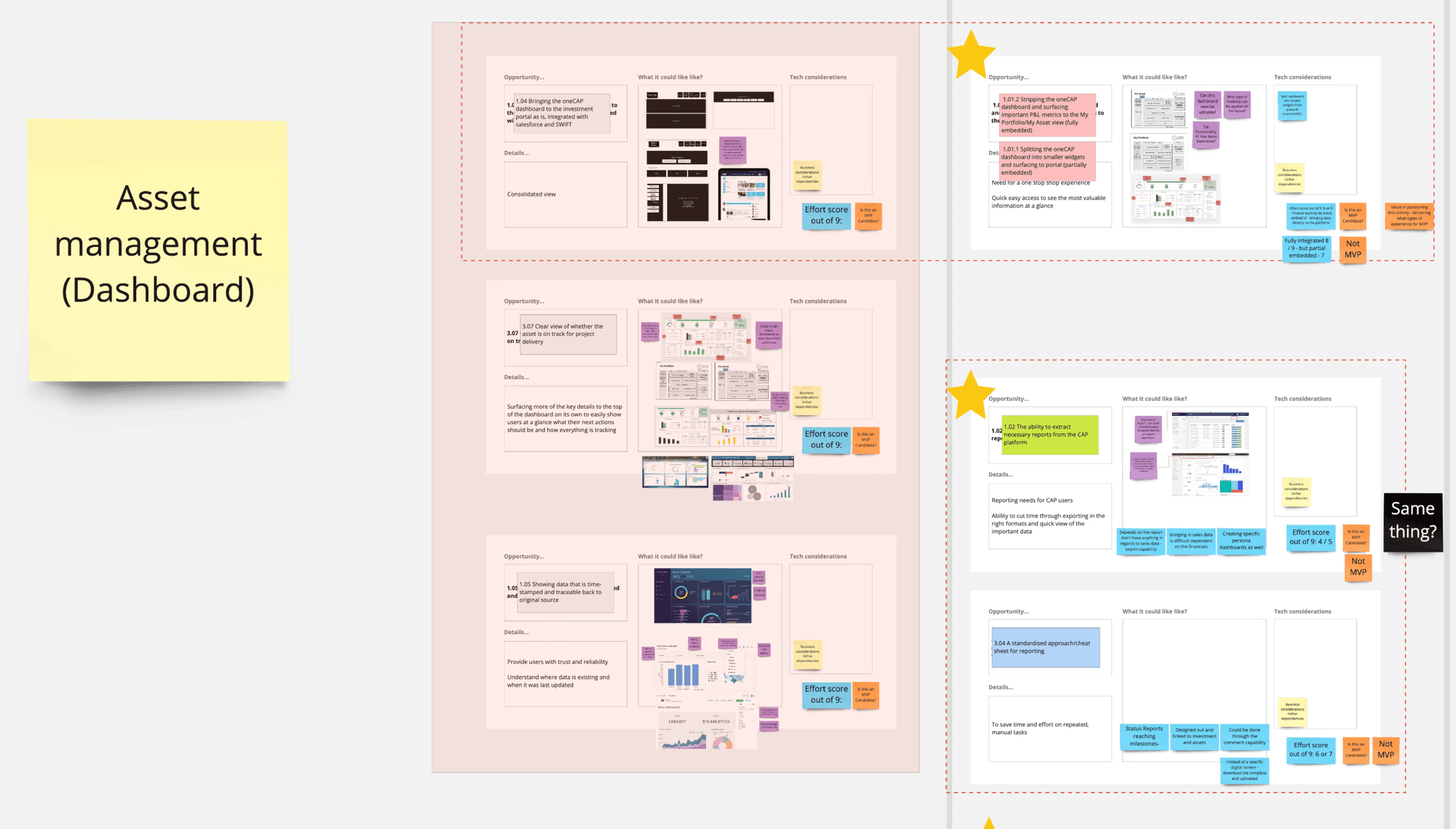
Understanding MVP Approach and Feature Backlog
During this stage, we ran a co-design session with key stakeholders including 2 from the Asset Team, 2 Portfolio Managers, and 4 members of the CAP Team to prioritise our opportunities that were identified.
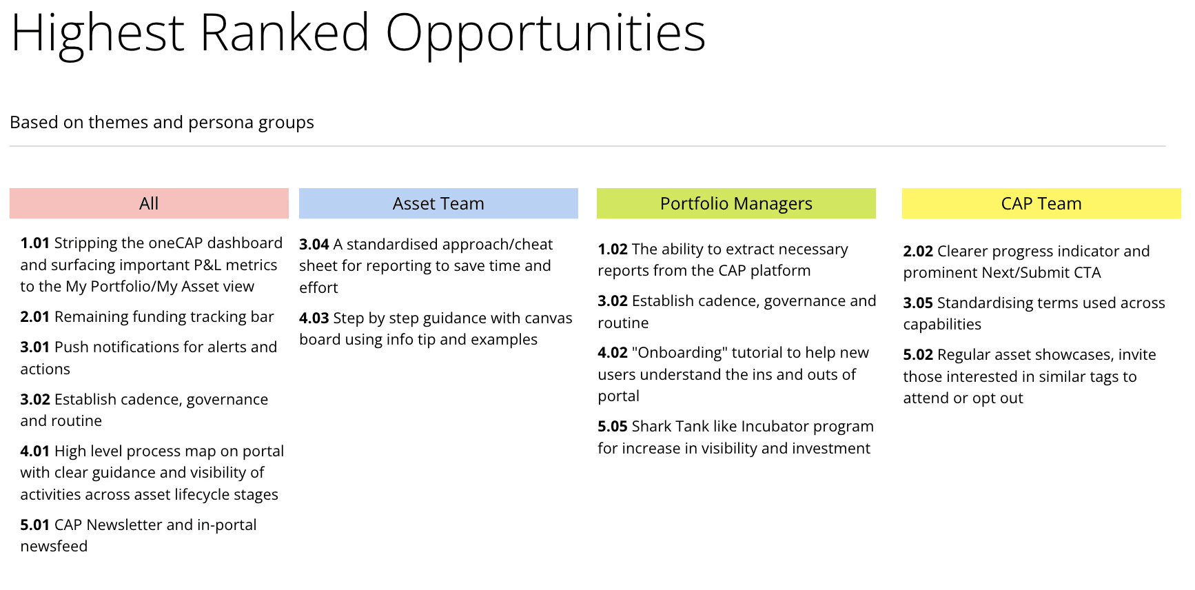
During the session, participants were invited to rate each proposed opportunity based on perceived value and impact.
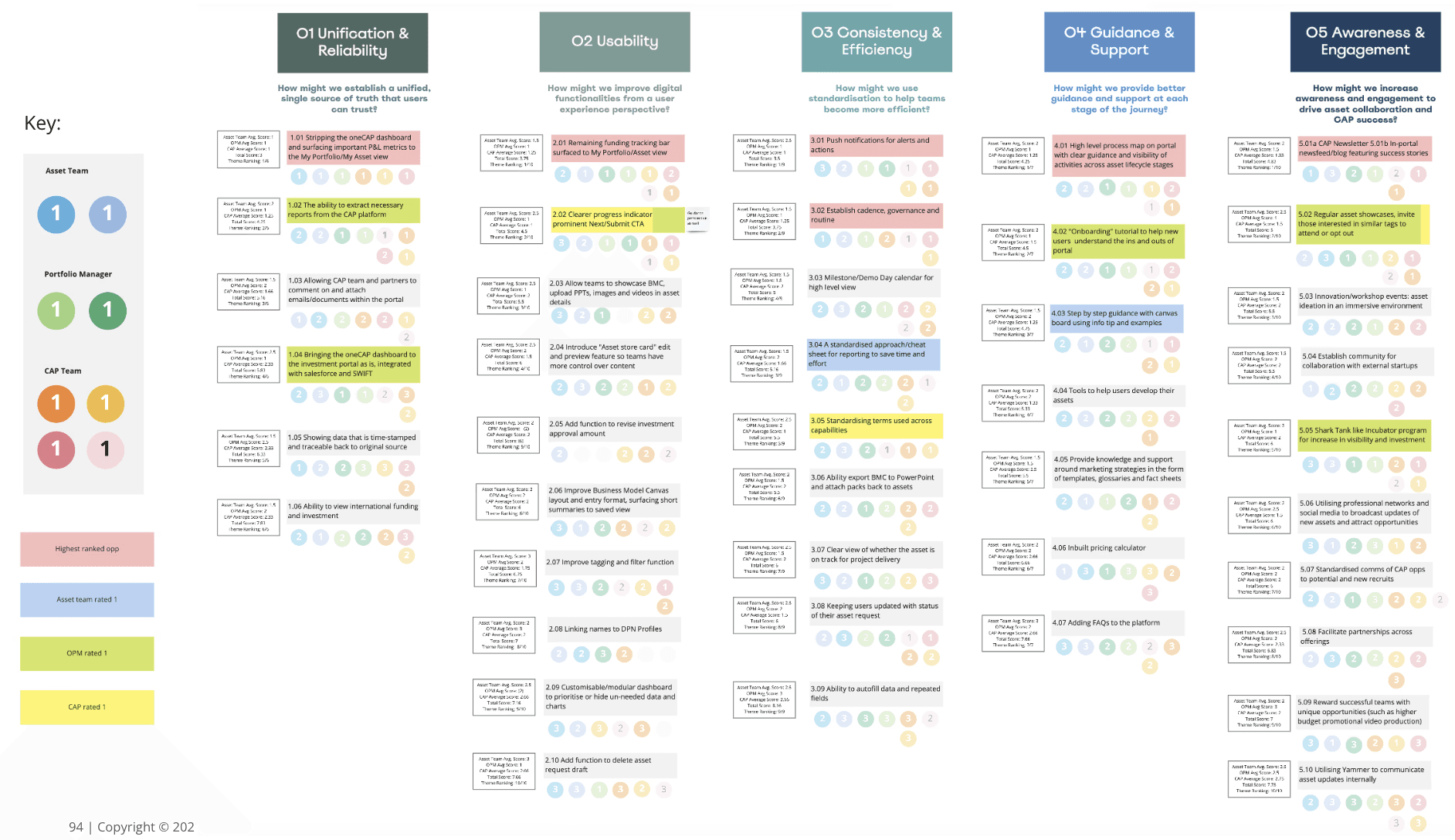
This collaborative exercise helped validate our direction, surface stakeholder priorities, and ensure alignment across roles. By analysing the ratings, we identified the highest-ranked opportunities for the Asset Team, Portfolio Managers, CAP Team, and the common themes across all personas.
For example, features like stripping the oneCAP dashboard to surface key Profit & Loss metrics, a remaining funding tracking bar, and the CAP Newsletter and in-portal newsfeed were consistently ranked high across all roles, highlighting a shared demand for visibility, efficiency, and clarity.
To further prioritise features for MVP we mapped all the features gathered from our insights, research, from the moments that matter and journey stages into the MoSCo (Must have, Should have, Could have) framework.
This helped us categorise features into three experience pillars, Seamless, Supported, and Uplifted, based on urgency, impact, and feasibility.
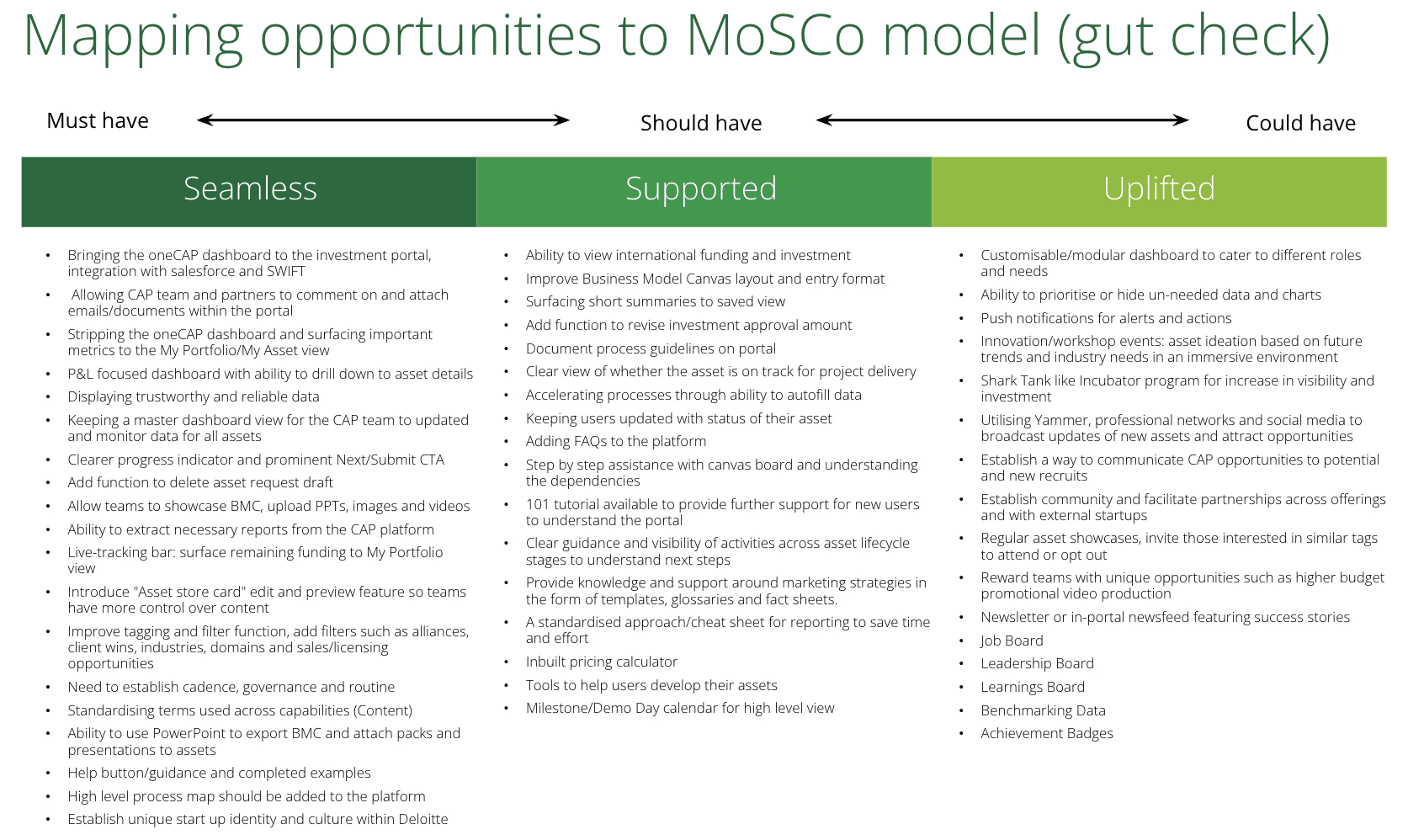
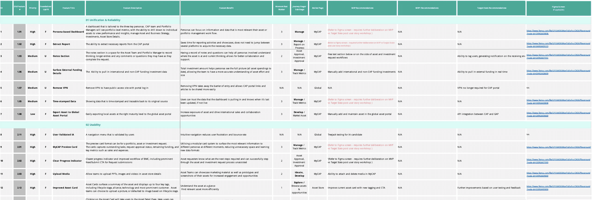
We then tracked these priorities in a consolidated Feature Backlog, detailing foundational and uplift features across all key CAP pages, ensuring alignment across UX and service design deliverables.
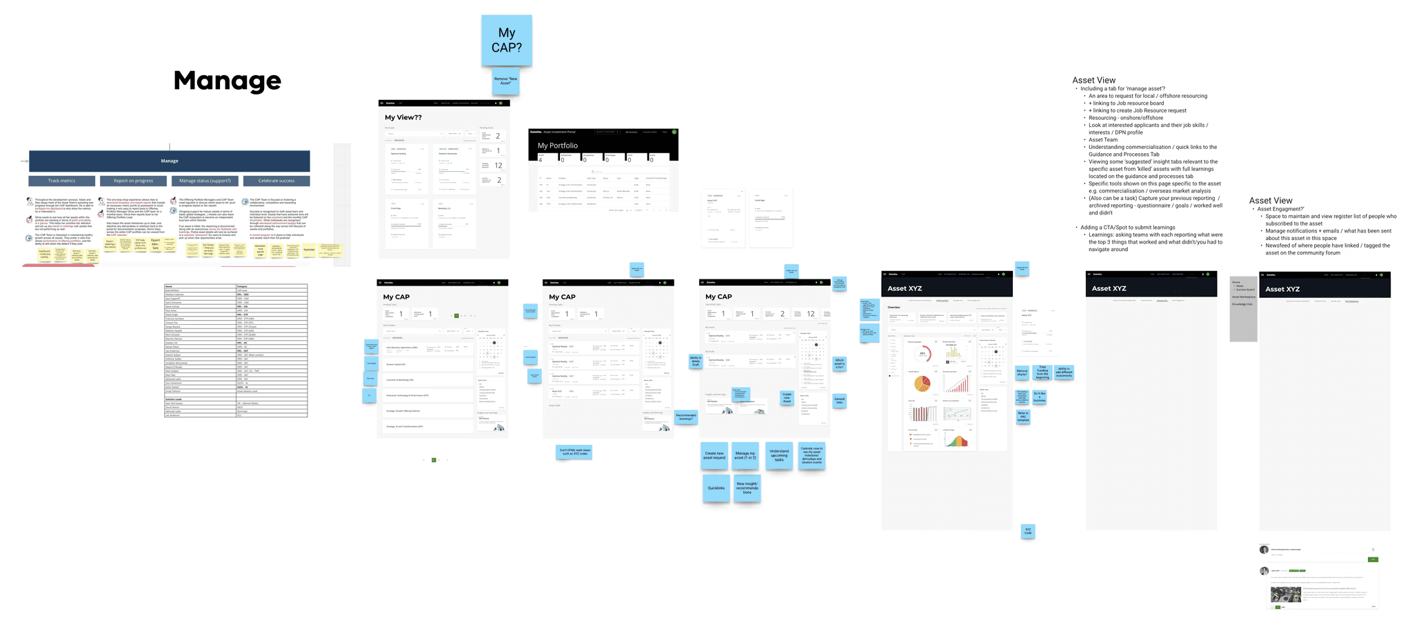
Design
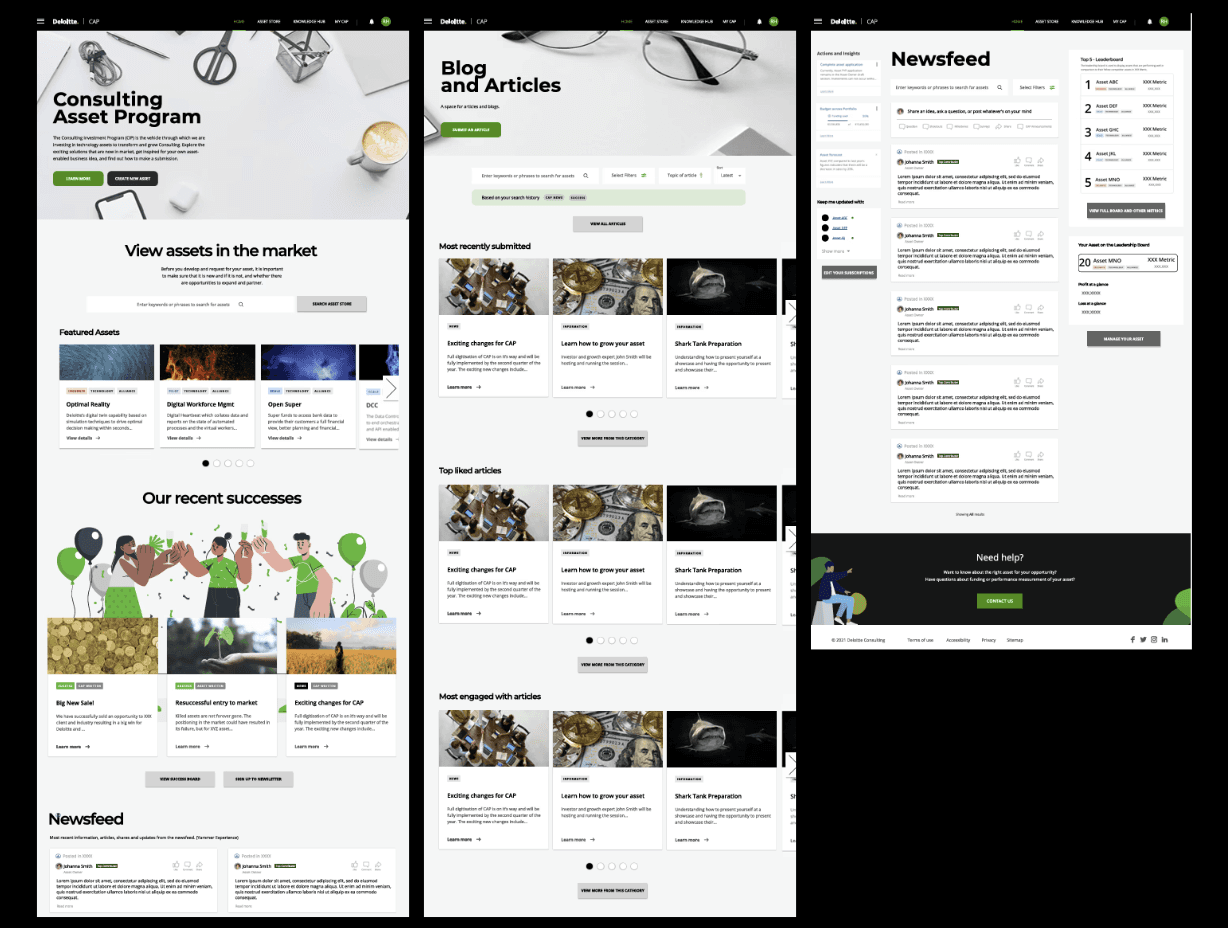
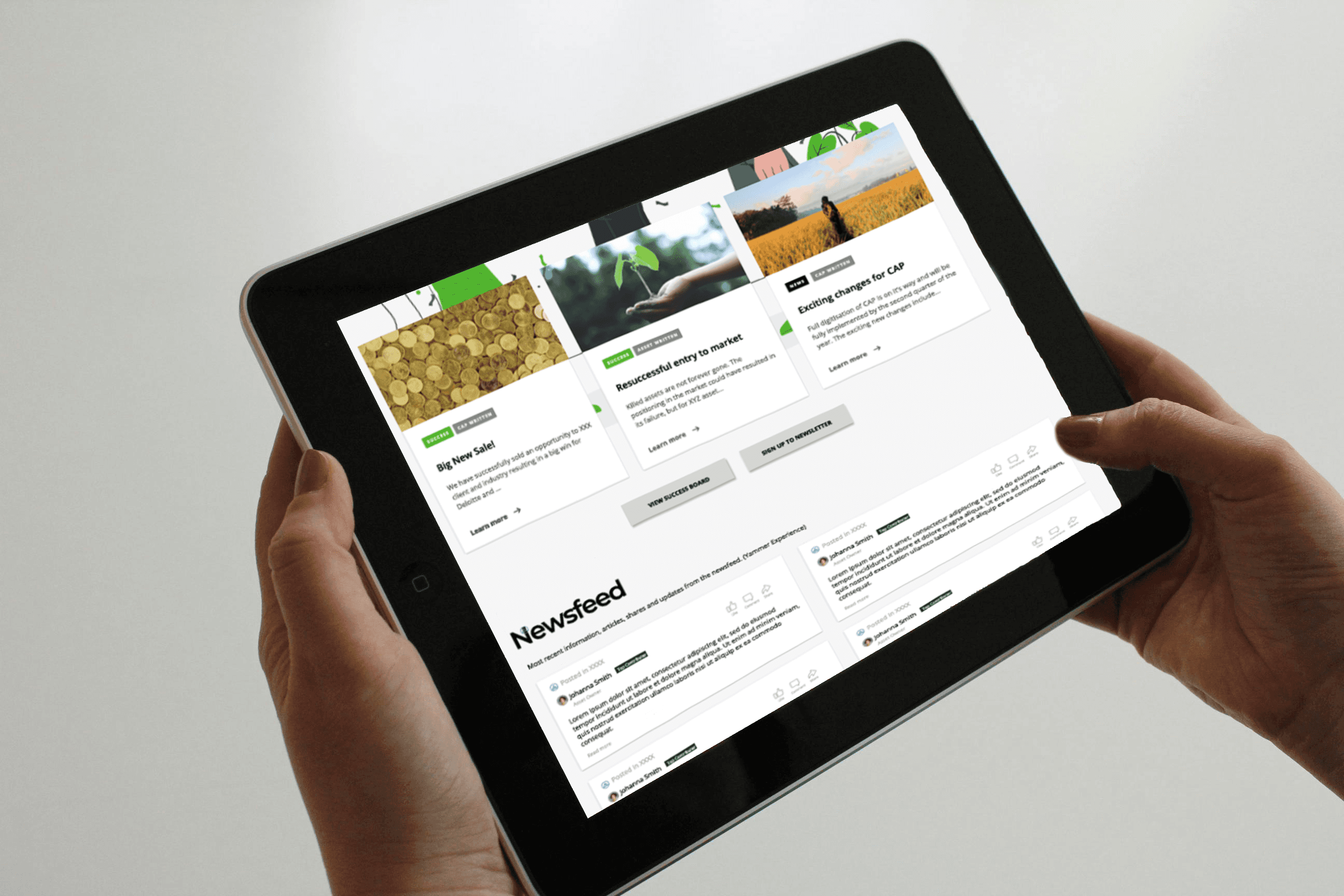
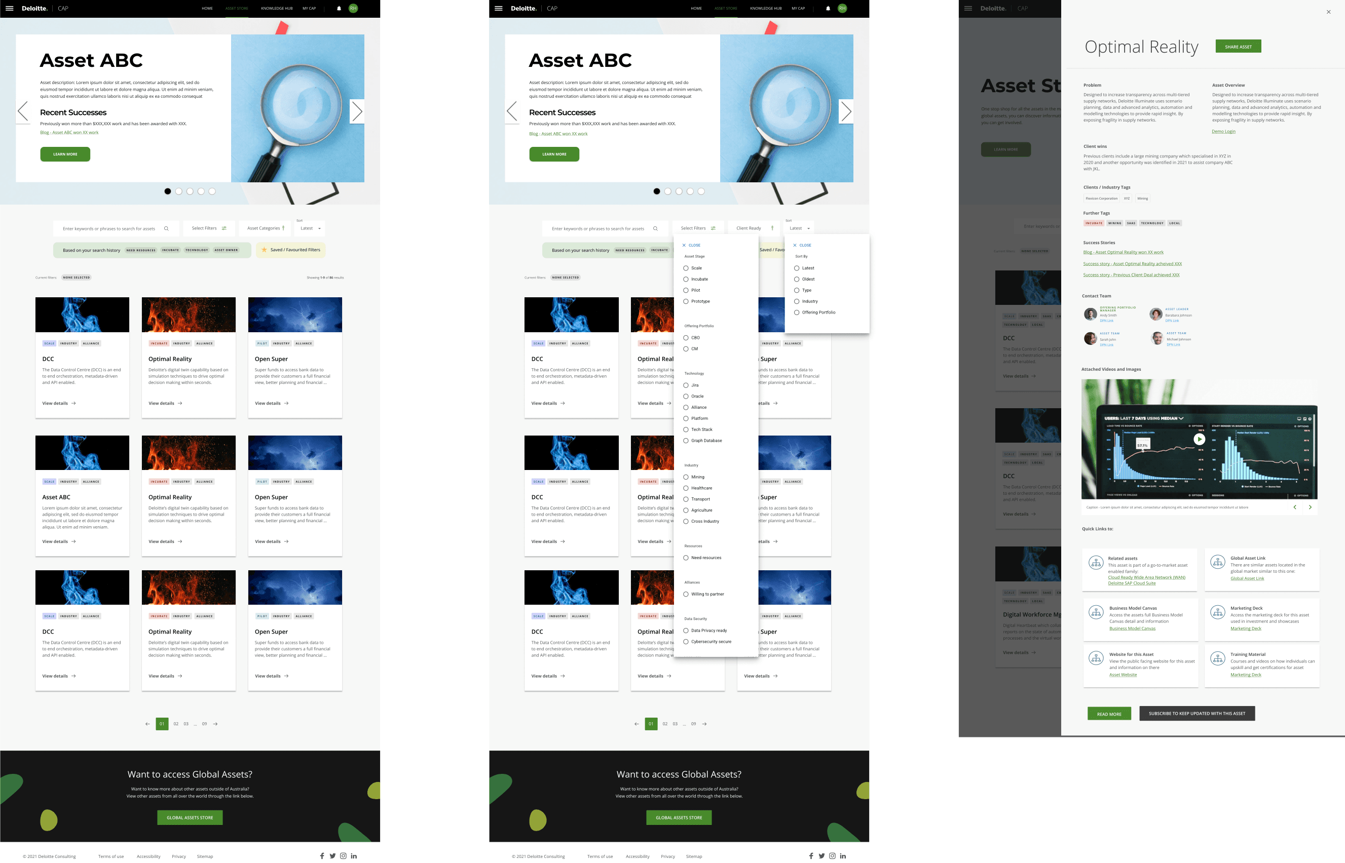
Key Page Concepts and Low Fidelity Design Flows
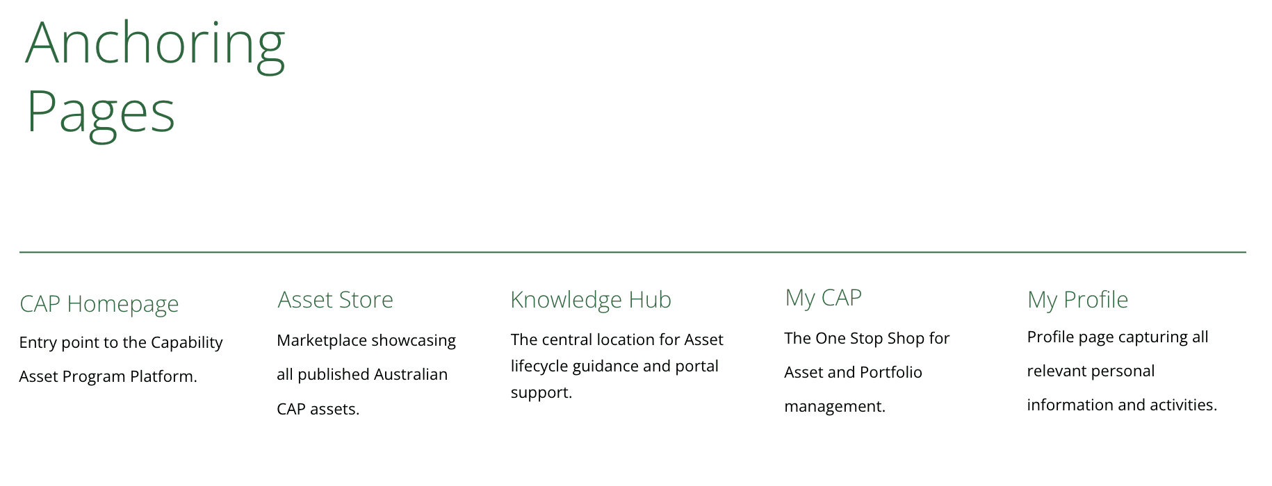
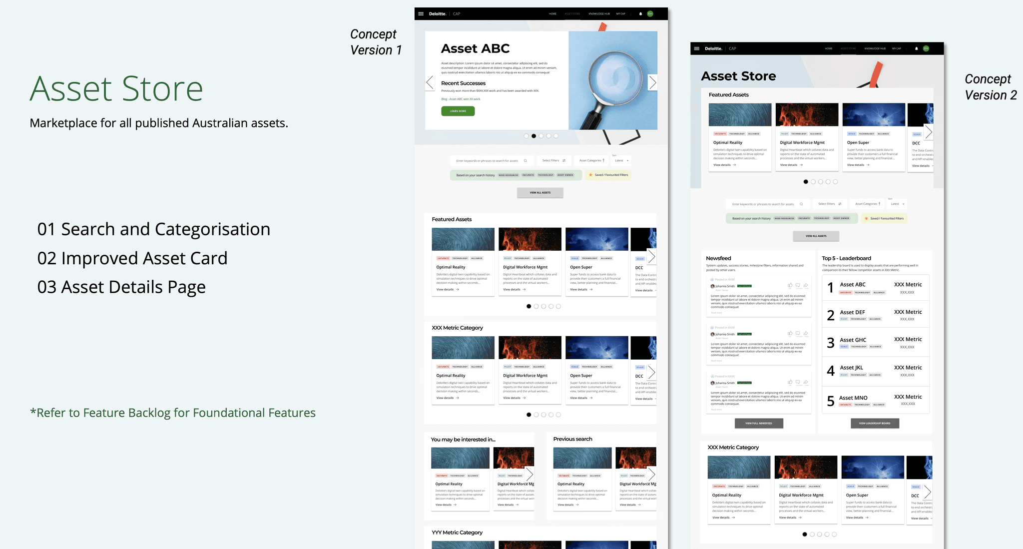
Building on all prior research, personas, moments that matter, feature prioritisation, and stakeholder input, I began developing the future-state website experience anchored around five key pages: CAP Homepage, Asset Store, Knowledge Hub, My CAP, and My Profile.
I mapped UX concepts and feature ideas directly to the Moments that Matter and high-priority opportunities identified in co-design sessions.
To kick off the design phase, I reviewed the existing CAP platform screens and reused elements where appropriate to maintain familiarity. I then created low-fidelity wireframes to explore layout, structure, and functionality across the anchoring pages.
Co-Design Sessions + Facilitation
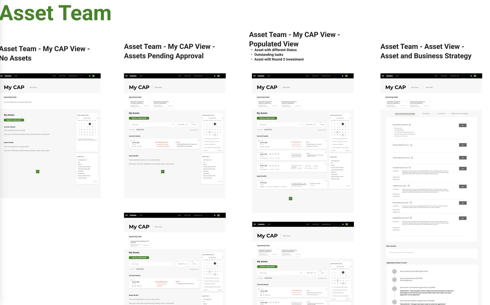
I facilitated co-design sessions with stakeholders to collaboratively shape concepts aligned to key moments. For Moment Two “I want to be guided through the asset and investment request process” I worked closely with the CAP team, Asset Team, and Portfolio Managers to unpack the complexity of the asset approval and investment workflows.
Using Miro, I ran interactive sessions to explore how users currently manage assets, what pain points exist, and what an ideal dashboard experience could look like. Together, we brainstormed guidance features, workflow enhancements, and layout ideas.
Iterative Design + Feedback
Following the co-design sessions, I led multiple rounds of feedback with stakeholders to iterate on the proposed flow. These sessions were crucial for validating that the asset and investment request journey accurately reflected real-world processes.
Stakeholders provided insights that helped refine feature placement, clarify user pathways, and ensure the design aligned with both user needs and business requirements.
This iterative approach allowed us to evolve low-fidelity concepts into confident, experience-led flows ready for mid-fidelity development.
I repeated the process again until I had completed all the MVP features that were on the 'Moments that Matters' and created mini prototypes for the completed flows. I also ensured that these were signed off by the stakeholders before our final showcase presentation and design handover.
Present
Showcase Presentation and Handover
With all the processes defined, I collaborated closely with the service designer to integrate the UX concepts into a cohesive presentation.
This joint presentation showcased how UX and service design worked in tandem to address pain points, elevate the experience, and deliver a clear future-facing vision for the CAP platform.
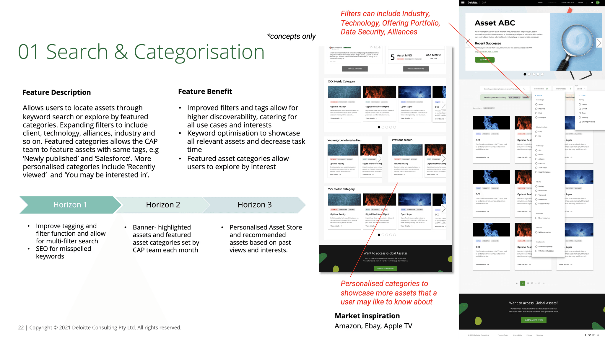
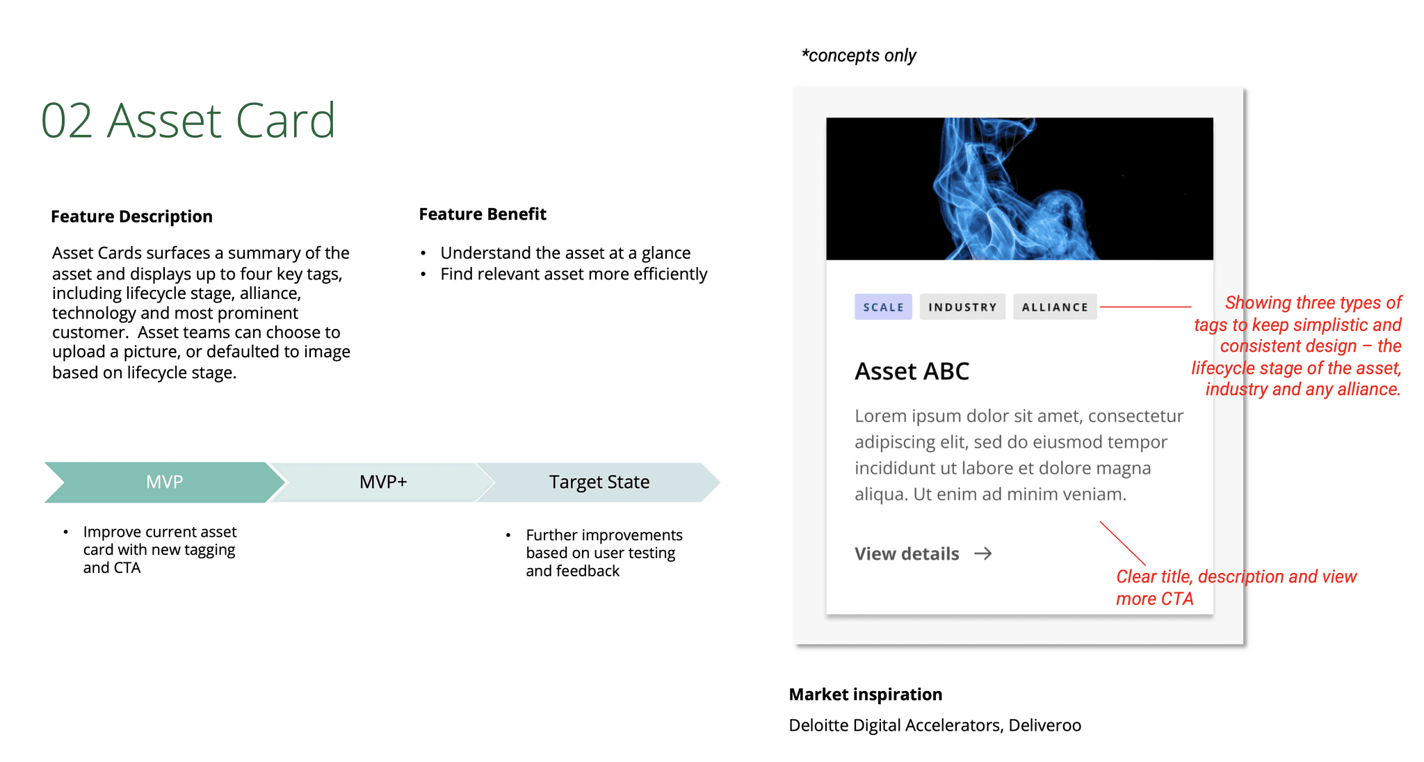
One display of this includes for 'Moment One' - I want the CAP Platform to be a place that inspires and excites. This is where I detailed the designs for the Asset Store and the features for Search and Categorisation, Improved Asset Card and Asset Details Page.

Results and Learnings
Results
Delivered a clear, research-backed future-state vision for the CAP platform through UX concepts, journey mapping, and service blueprinting.
Aligned five core CAP pages with prioritised features tied to key user moments and needs.
Successfully engaged stakeholders across all phases, resulting in strong alignment and satisfaction with the final presentation.
Created a comprehensive feature backlog to guide MVP and future-state development
Set a strong foundation for the next phase of detailed design and implementation, with validated concepts ready for handover to product and development teams.
Learnings
Facilitating with flexibility
Workshop participation was a challenge due to last-minute dropouts and shifting team availabilities. A key learning was the need to engage the stakeholder group early, not just for input, but to help champion and coordinate session attendance.
Clarifying UX intent and expectations
Stakeholders initially had differing expectations around the fidelity and purpose of UX deliverables. It took several rounds of clarification and iteration to align on which flows needed detailed design vs. which could remain low fidelity (e.g. homepage vs. process flows)
Navigating UX vs. Service Design
This project reinforced the distinct roles of UX and service design, where UX focused on user interaction and detail, service design stayed high-level and operational. Learning to balance both lenses was critical to delivering a cohesive outcome.
Stakeholder alignment drives success
Because stakeholders were embedded throughout the process from research to co-design to playback, the final presentation was met with enthusiasm and alignment. This helped build momentum and laid the groundwork for the next phase of detailed design and development.