National Disability Insurance Scheme

Simplifying NDIS Access with Inclusive, Participant-First Design. Improving usability and accessibility through content-led, tested experiences tailored to real participant needs.
Company
Client
Role
Timeframe
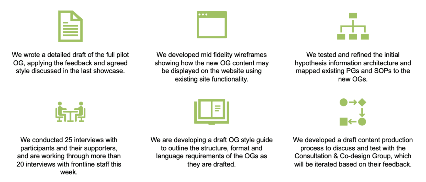
Over a focused 4-week sprint, I supported a UX Manager and Senior UI Designer as the UX Designer on a project aimed at improving the accessibility and usability of the NDIS Operational Guidelines (OGs).
Our goal was to simplify content and structure through inclusive, participant-first design.
We developed and tested mid-fidelity wireframes, restructured the information architecture, and ran extensive user interviews - ensuring that the revised guidelines met the real needs of participants, supporters and frontline staff.
The work also included drafting a content production process and style guide to support ongoing delivery.
Roles & Responsibilities
Led user testing sessions by re-engaging participants and conducting interviews to gather feedback on Operational Guideline (OG) documents, Treejack navigation tests, and clickable prototypes.
Tested a variety of materials with users, including high-fidelity prototypes, PDF documents, and digital tree tests to assess usability and content findability.
Captured and processed user feedback, recording verbatim responses in Excel and organising them in Miro for collaborative synthesis.
Extracted key insights from qualitative data, synthesising findings to identify usability issues and content clarity gaps.
Compiled research insights into structured PowerPoint reports to support team alignment and stakeholder presentations.
Supported UI efforts by contributing to the creation and refinement of high-fidelity clickable prototypes.
Excel, Miro, Microsoft Teams, Figma
The Process
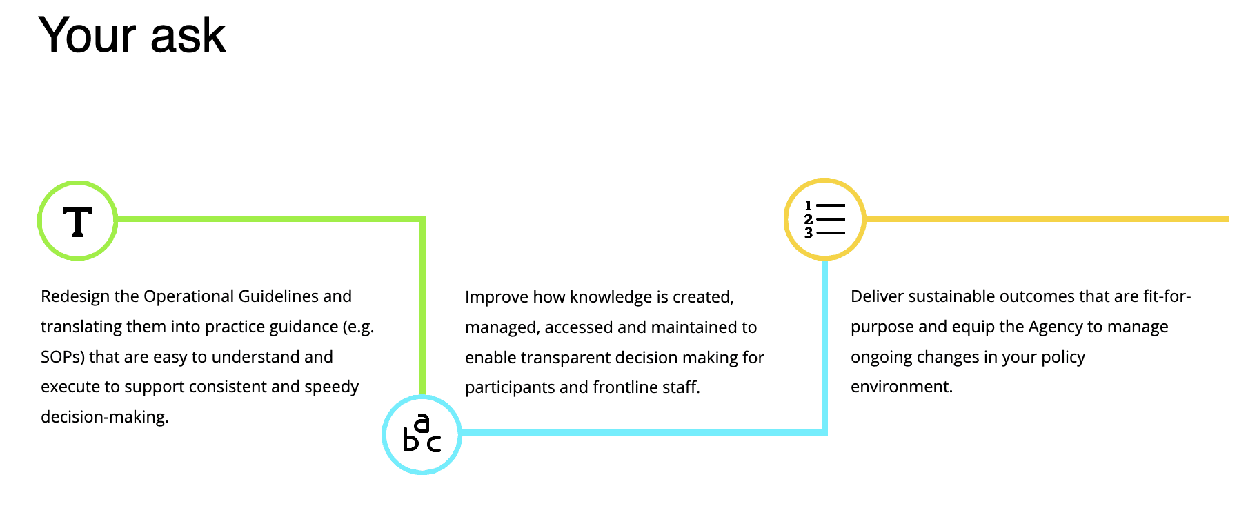
Problem Statement
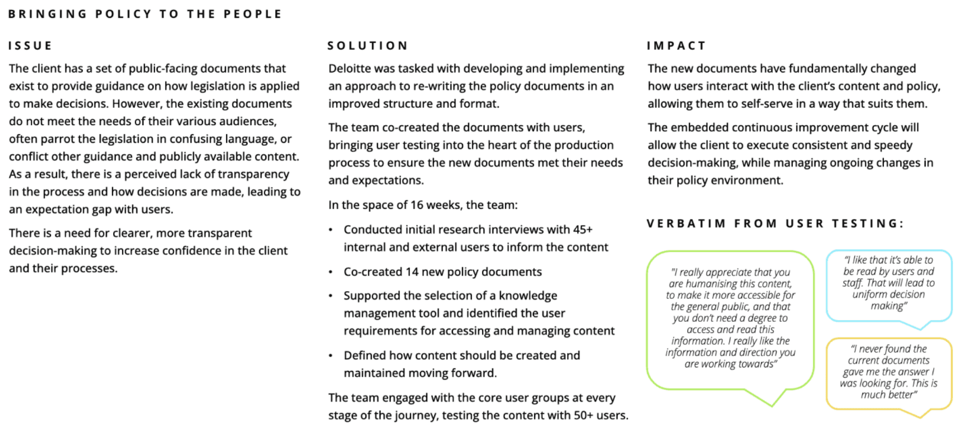
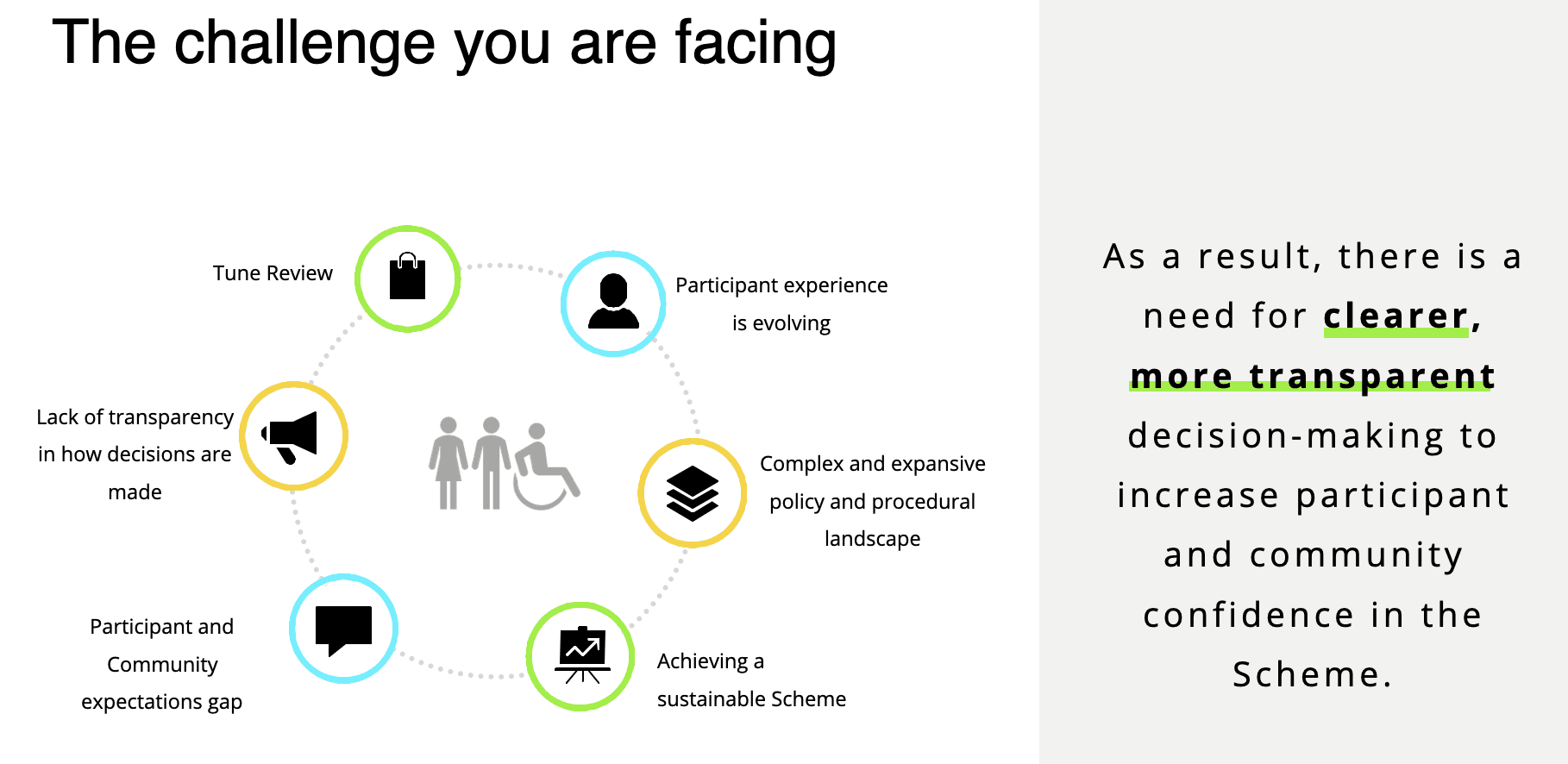
The existing NDIS Operational Guidelines were difficult to navigate, overly complex and written in inaccessible language that mirrored legislation rather than supporting real user understanding.
This created confusion, reduced transparency and left both participants and staff struggling to find clear, actionable guidance.
There was a need to redesign the content and structure to better support inclusive, participant-first experiences and improve trust, usability and access across the board.
Discovery and Research
Usability Testing Approach
I joined during the latter half of the project to support additional rounds of user testing with NDIS participants and staff who had previously taken part in earlier phases. My focus was on re-engaging these users to validate updated iterations of specific Operational Guideline (OG) documents and the original Treejack navigation test.
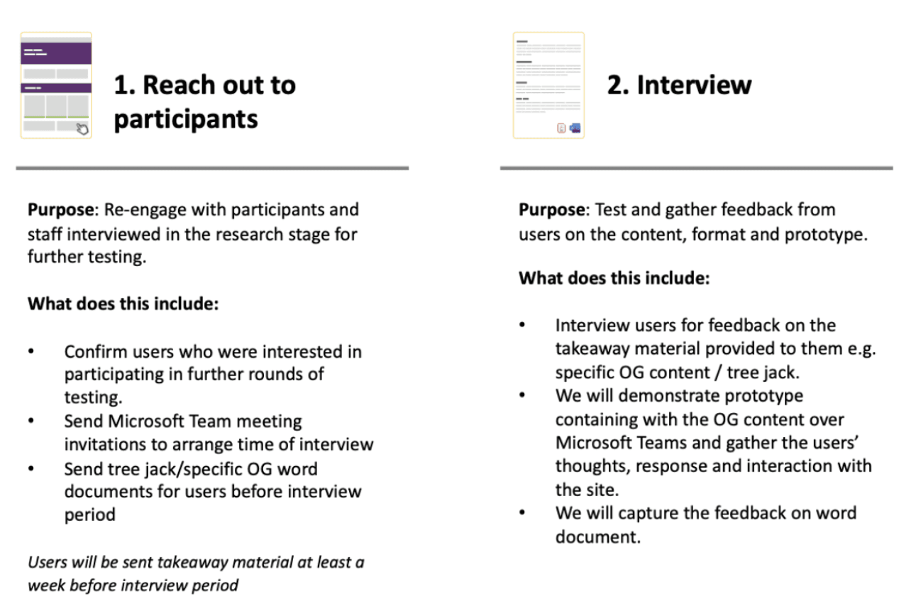
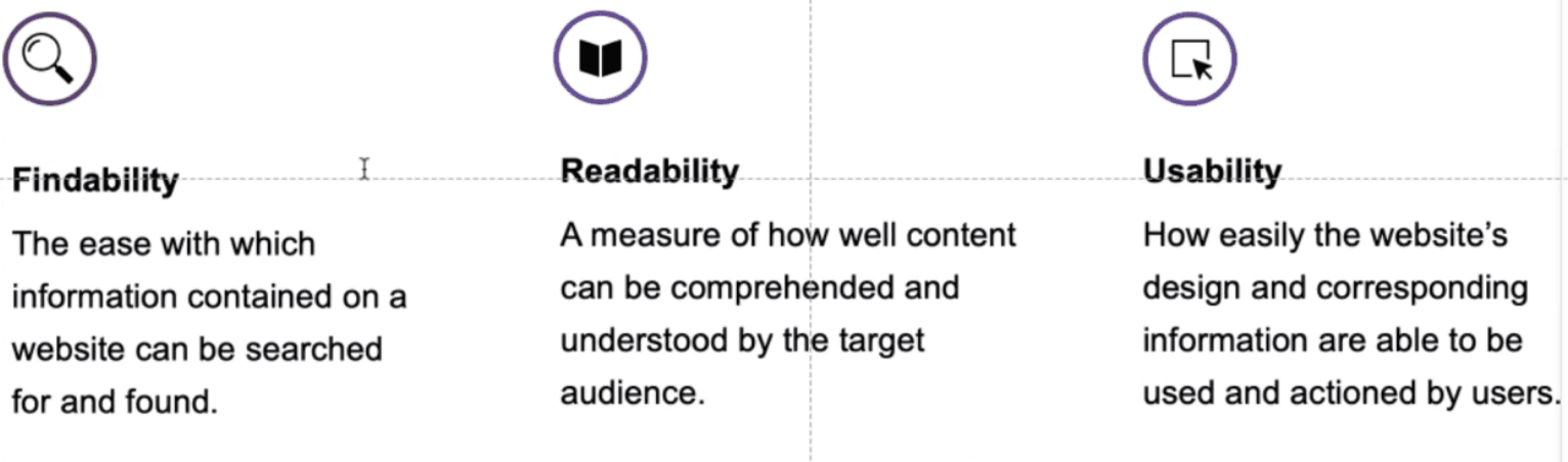
I collaborated on developing an interview plan (Interview Guide) that targeted key research objectives - testing findability, readability, and usability across three content formats and clearly outlined our objectives in each part of the document or journey of the prototype testing.
These interviews were designed to validate our design hypotheses and assess how well the content was meeting participant needs.
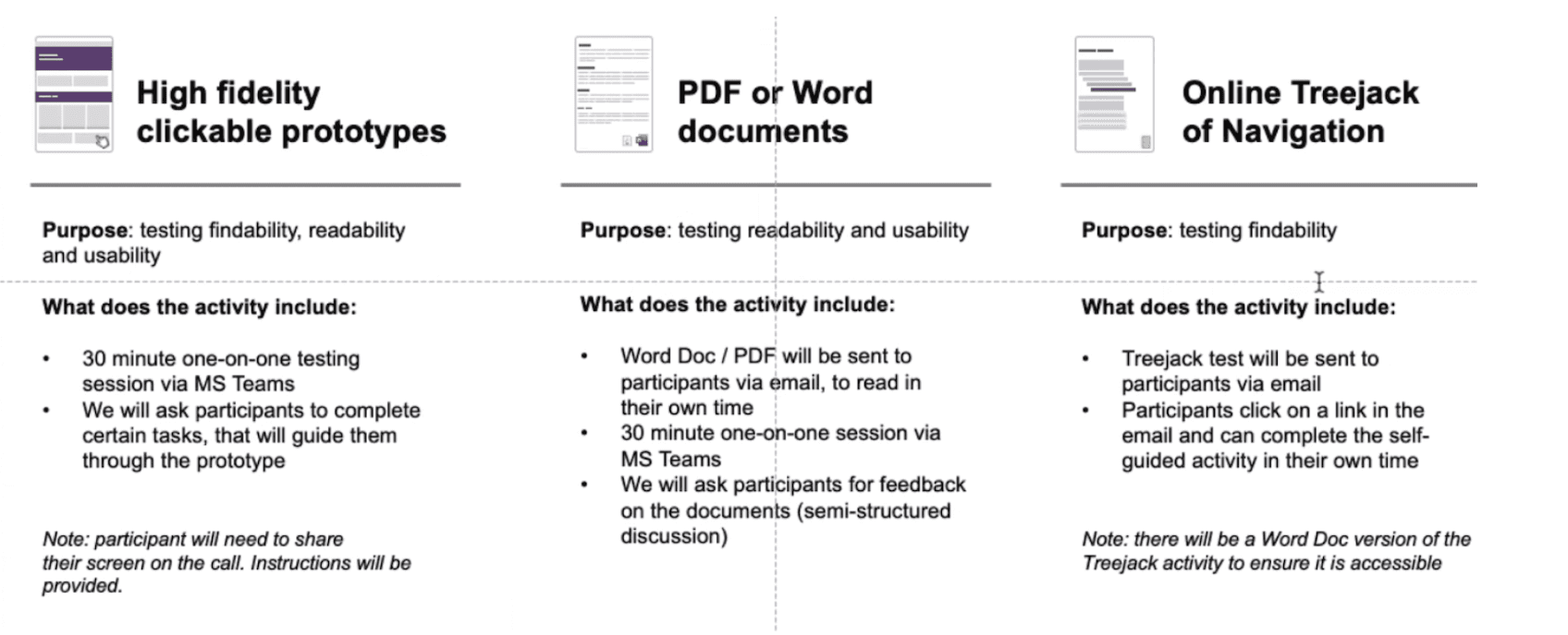
We ran three distinct types of testing with participants:
High-fidelity prototype testing: 30-minute one-on-one moderated sessions conducted via Microsoft Teams, focusing on interaction, usability, and layout.
Document readability testing: 30-minute one-on-one sessions where participants provided feedback on Word documents they had pre-read before the session.
Treejack testing: An unmoderated online test sent via email, allowing participants to assess content findability and navigation in their own time.
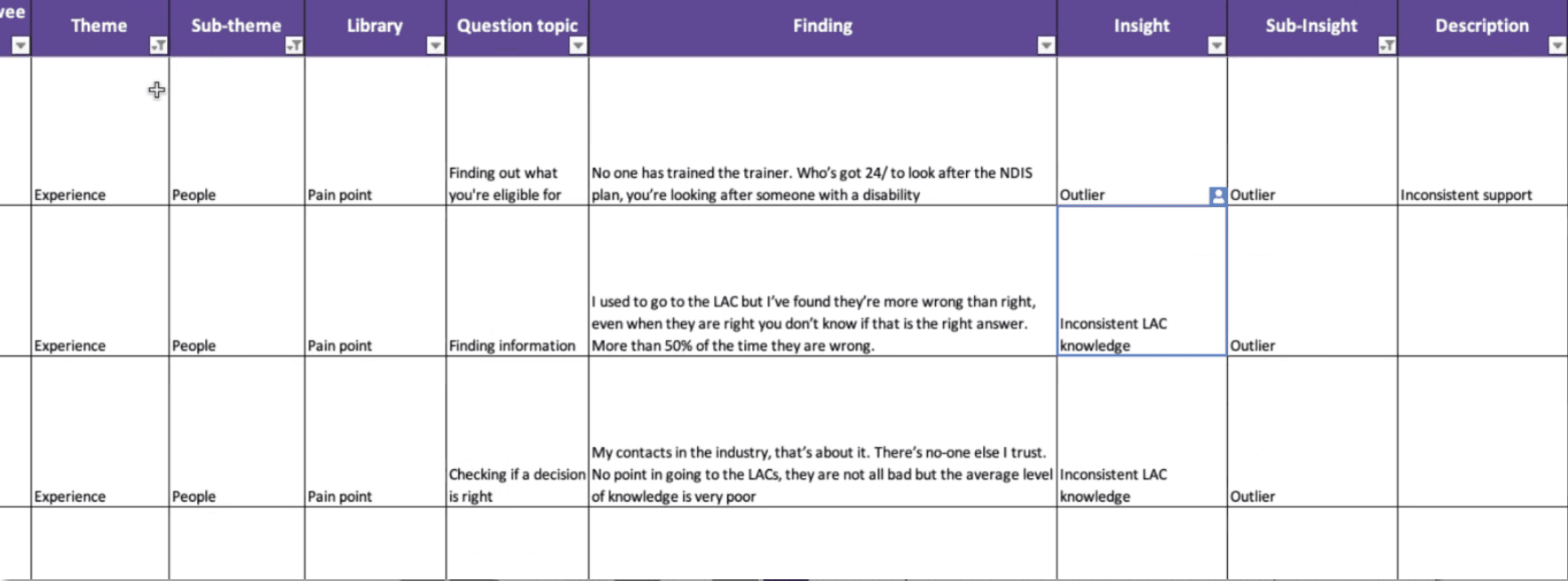
To streamline the synthesis process for the one on one calls, I created a structured Excel template to capture detailed feedback. The sheet included fields for:
Theme and sub-theme
Pain point, opportunity, or neutral
Question topic
Key findings, insights, sub-insights
Verbatim descriptions
This setup ensured consistency in data capture and made it easier to draw actionable insights during analysis.
Participants & Ensuring Accessibility
We engaged a diverse mix of participants and stakeholders to ensure the updated content and design solutions were inclusive, accessible, and grounded in real-world needs.
NDIS Participants
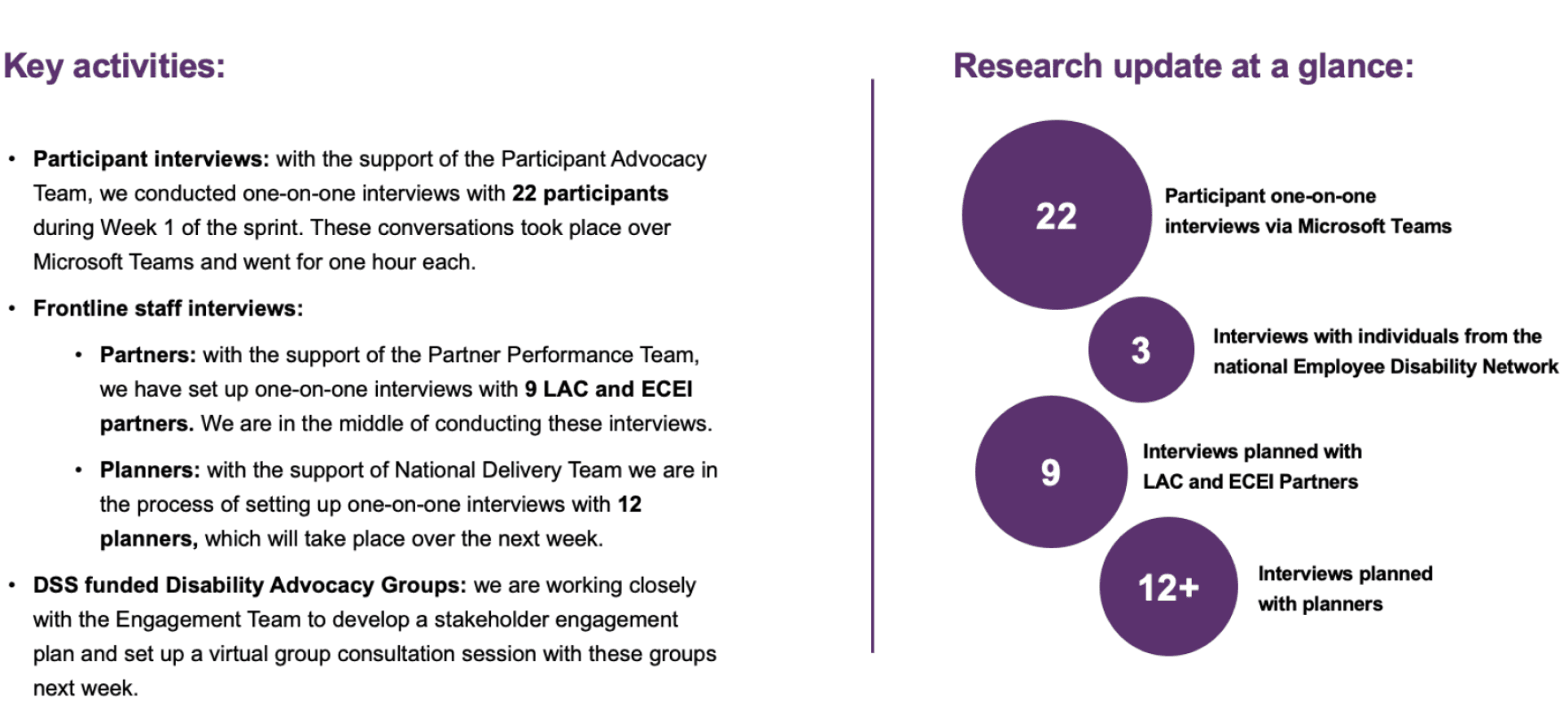
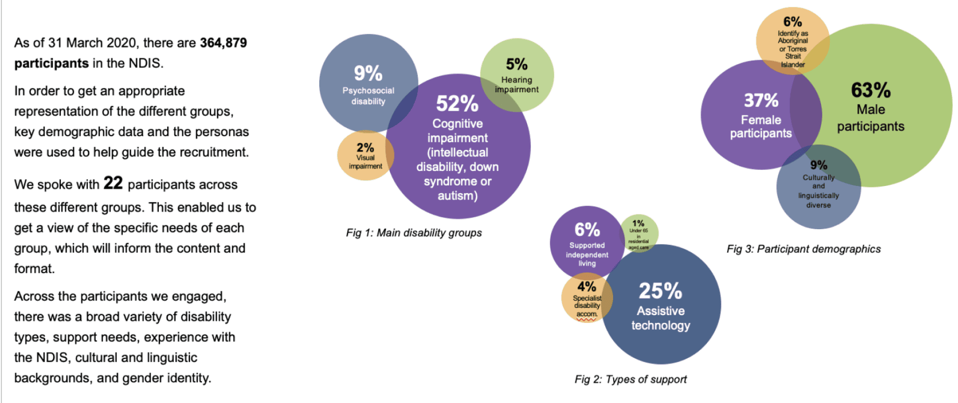
We conducted one-on-one interviews with 22 participants, recruited with the support of the Participant Advocacy Team. Participants were selected using demographic data and personas to reflect a broad range of experiences and accessibility needs.
Key participant diversity included:
Disability types: 52% cognitive impairment, 9% psychosocial disability, 5% hearing impairment, 2% visual impairment (including screen reader users)
Support needs: 25% required assistive technology
Demographics: 63% male, 37% female, 9% culturally and linguistically diverse, 6% Aboriginal or Torres Strait Islander
This ensured that content readability, digital accessibility, and inclusive language were validated across different user contexts.
Frontline and Support Staff
To complement participant insights, we also conducted or planned:
9 interviews with LAC and ECEI partners
12 interviews with NDIS planners
3 interviews with individuals from the National Employee Disability Network
Disability Advocacy Groups
In collaboration with the Engagement Team, we established a stakeholder engagement plan with DSS-funded Disability Advocacy Groups, facilitating a virtual group consultation session to incorporate the voices of advocates and supporters.
This comprehensive recruitment approach ensured robust feedback from across the NDIS ecosystem—participants, staff, and advocates—driving more inclusive, accessible content outcomes.
Define
To make sense of the diverse feedback gathered, I led the process of capturing and synthesising data from user interviews and testing sessions.
Focused analysis around three key experience pillars:
Findability – how easily users could search for and locate the right information
Readability – how well users could understand the language and structure of the documents
Usability – how well users could navigate and act on the information presented
Captured and structured raw feedback using Excel, tagging each response by theme, sub-theme, pain point or opportunity, and aligning it to testing objectives (e.g., findability, readability, usability).
Organised qualitative data in Miro, clustering insights to identify key themes such as inconsistent support, content overload, unclear navigation and accessibility barriers.
Synthesised insights to highlight common usability issues such as difficulty finding the right document, overly technical language and inconsistent terminology.
This stage laid the foundation for content improvements and design updates, ensuring we addressed the real needs of participants and frontline staff.
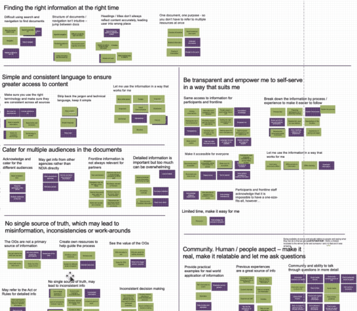
Key Insights from Participants
Through synthesis of testing and interviews, several consistent themes emerged around what participants needed from the Operational Guidelines:
Find the right information at the right time
Users wanted content to be easy to locate, well-structured, and clearly signposted to reduce confusion and save time.
Use simple and consistent language
Participants emphasised the need to strip back jargon and use clear, accessible language to ensure broader understanding.
Be transparent and empower self-service
Users wanted to feel confident navigating the content independently, with clear guidance that enabled informed decision-making without needing additional support.
Cater to multiple audiences
The documents needed to be useful for both participants and frontline staff, while also being relevant and clear for partners and external stakeholders.
Establish a single source of truth
Participants flagged issues with misinformation, outdated processes, or workarounds due to fragmented or conflicting content—highlighting the need for one consistent, reliable reference point.
Ideate
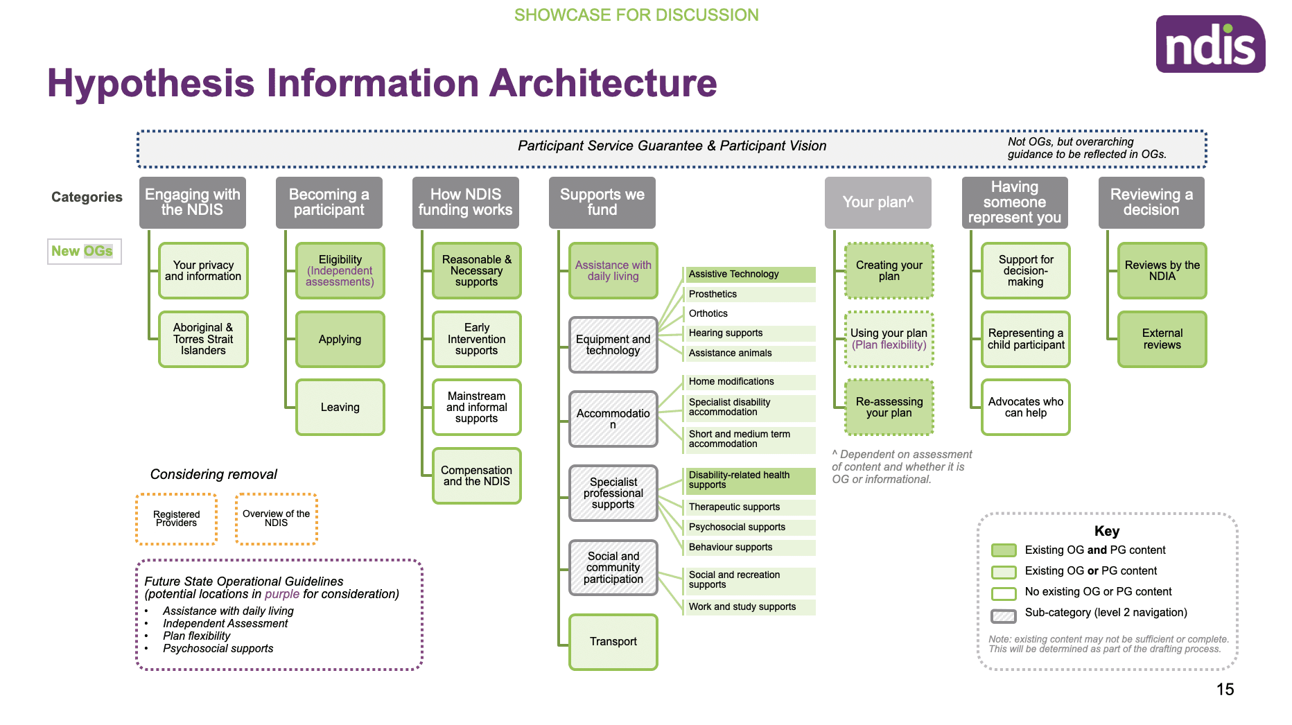
We used insights from the Treejack testing to evaluate how well users could navigate the proposed information architecture (IA). The results highlighted key issues with content labelling, navigation clarity, and section placement.
Several tasks showed high failure rates and low directness, indicating users were often unsure where to find content or misunderstood section headings.
The IA lacked clear signposting and intuitiveness, especially for core user tasks like understanding funding or becoming a participant.
Based on this analysis, we identified specific pages and headings that required renaming, repositioning, or restructuring.
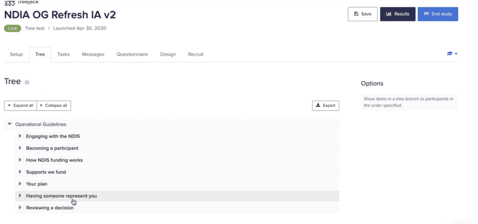
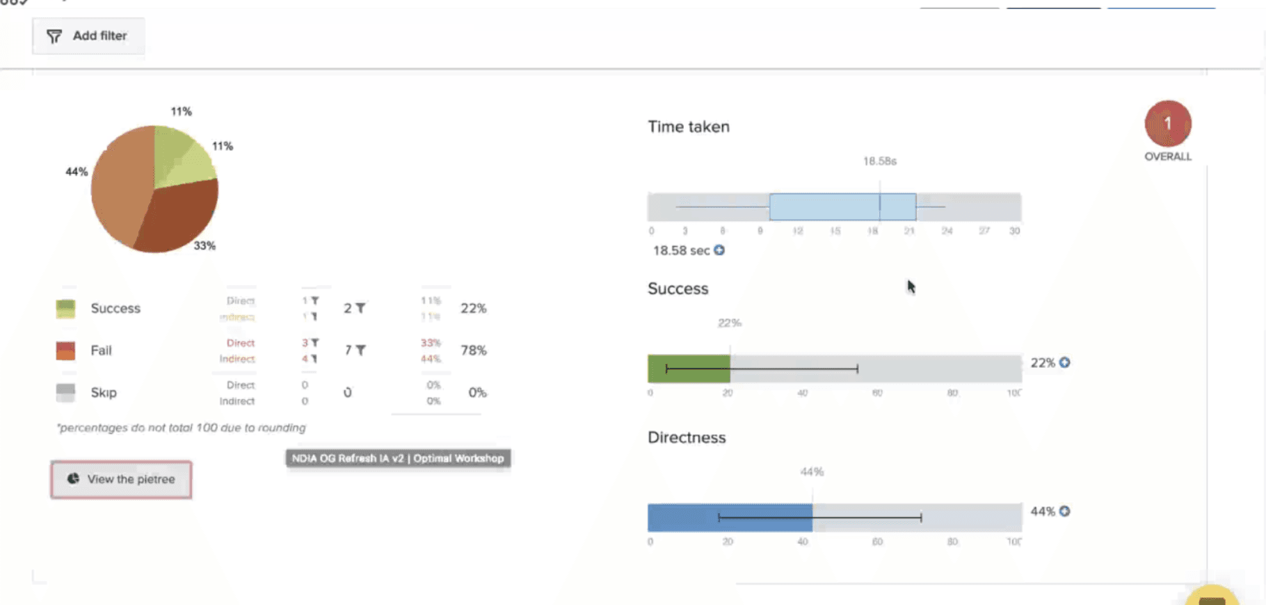
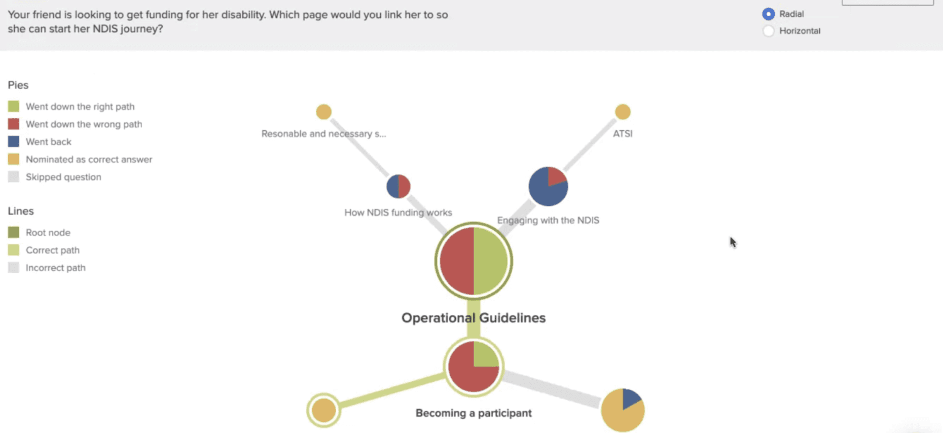
These findings directly informed the next round of design iterations and guided improvements to the IA, helping ensure content was both more intuitive to navigate and easier to understand.
Analysis and Themes
Following the Treejack testing and one-on-one interviews, we synthesised key findings into five core themes - each highlighting critical areas for improvement.
Across all themes, one insight was consistent: accessibility underpins everything.
To reinforce these themes and maintain a strong user voice throughout the project, we attached verbatim quotes to each theme. This helped drive home the impact of accessibility and user-centred content.
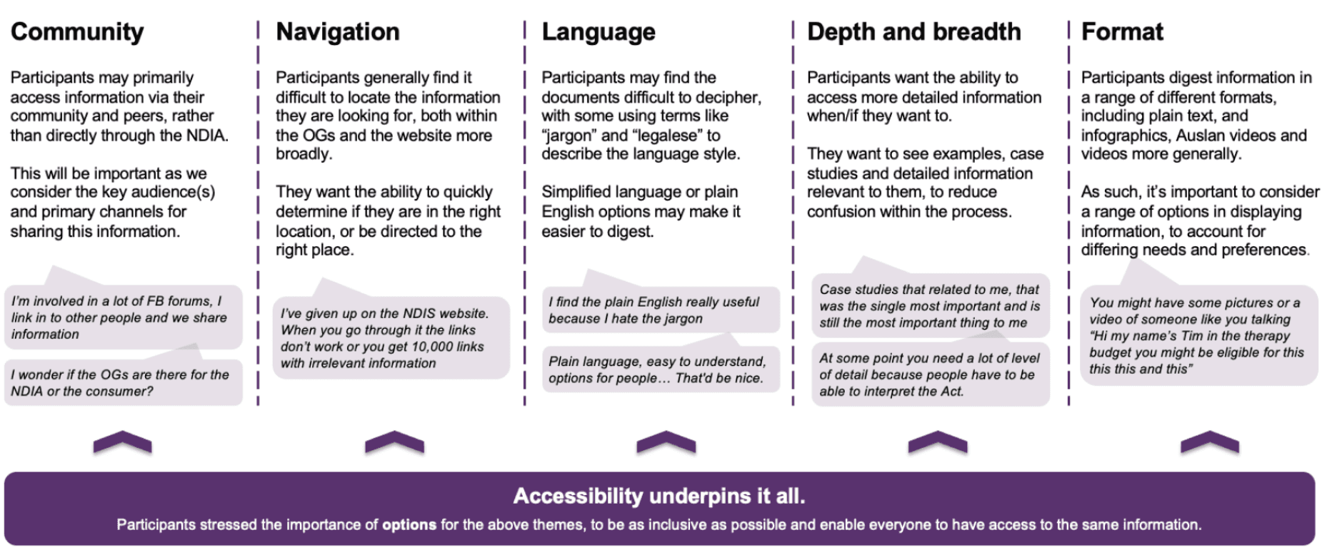
Across all themes, accessibility was the foundation, influencing how participants found, understood, and trusted the information. These insights directly informed the next round of content and IA design.
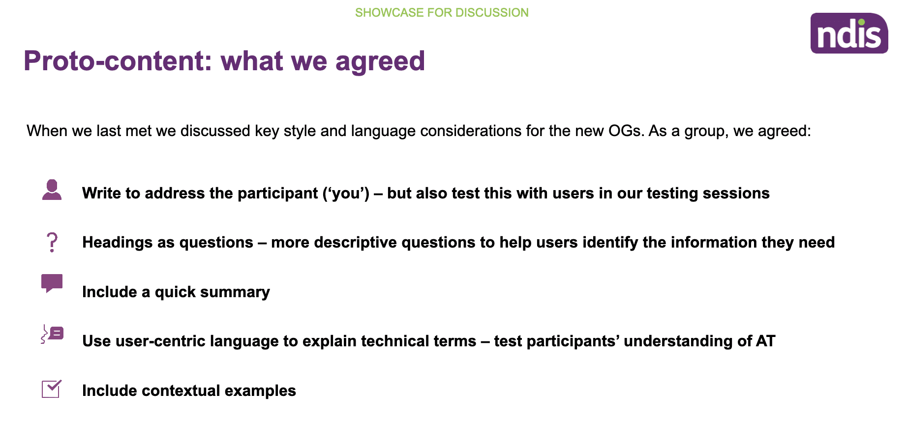
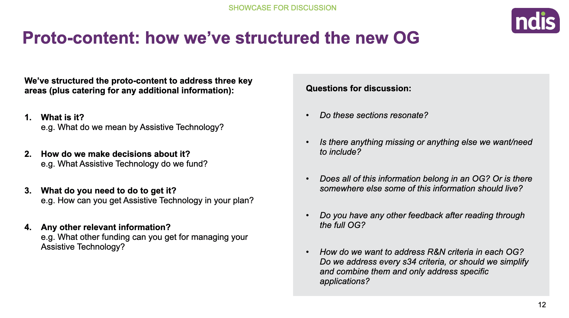
Design
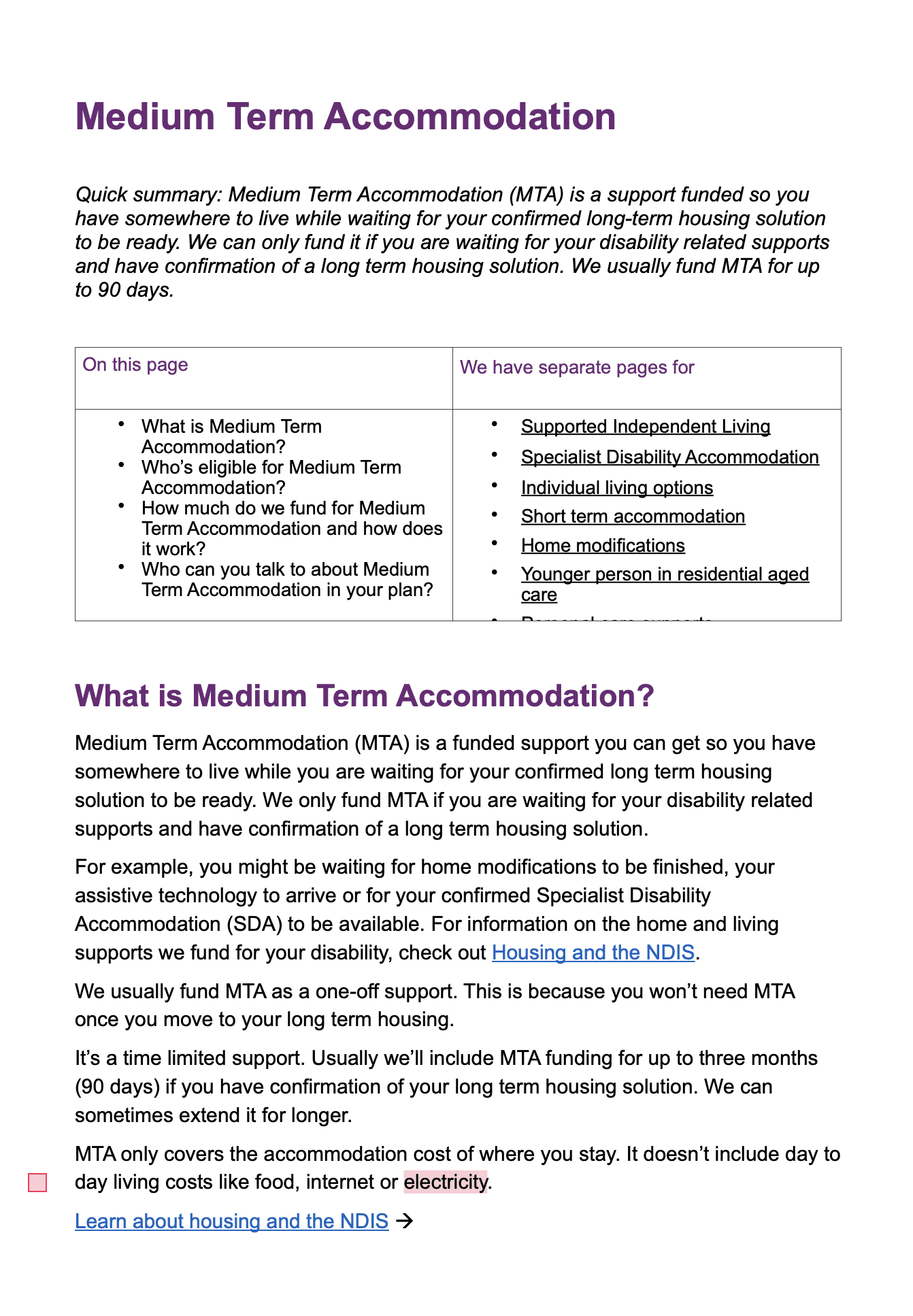
Working in close collaboration with content consultants, we worked on the OG documents and revised the content ensuring that it was easily readable, clear and concise. We also ensured that the language was not overly complicated and could be easily understood.
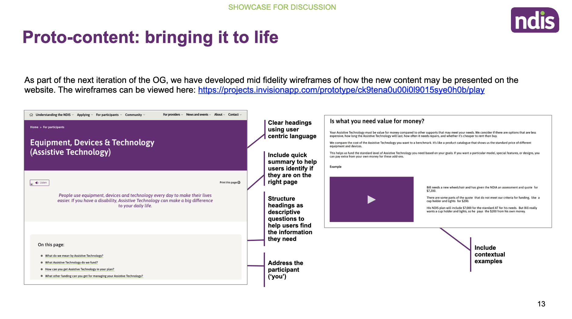
We then iterated on high-fidelity designs in Figma to reflect the specific user feedback and legislative documents tested during earlier research.
Key UX enhancements included:
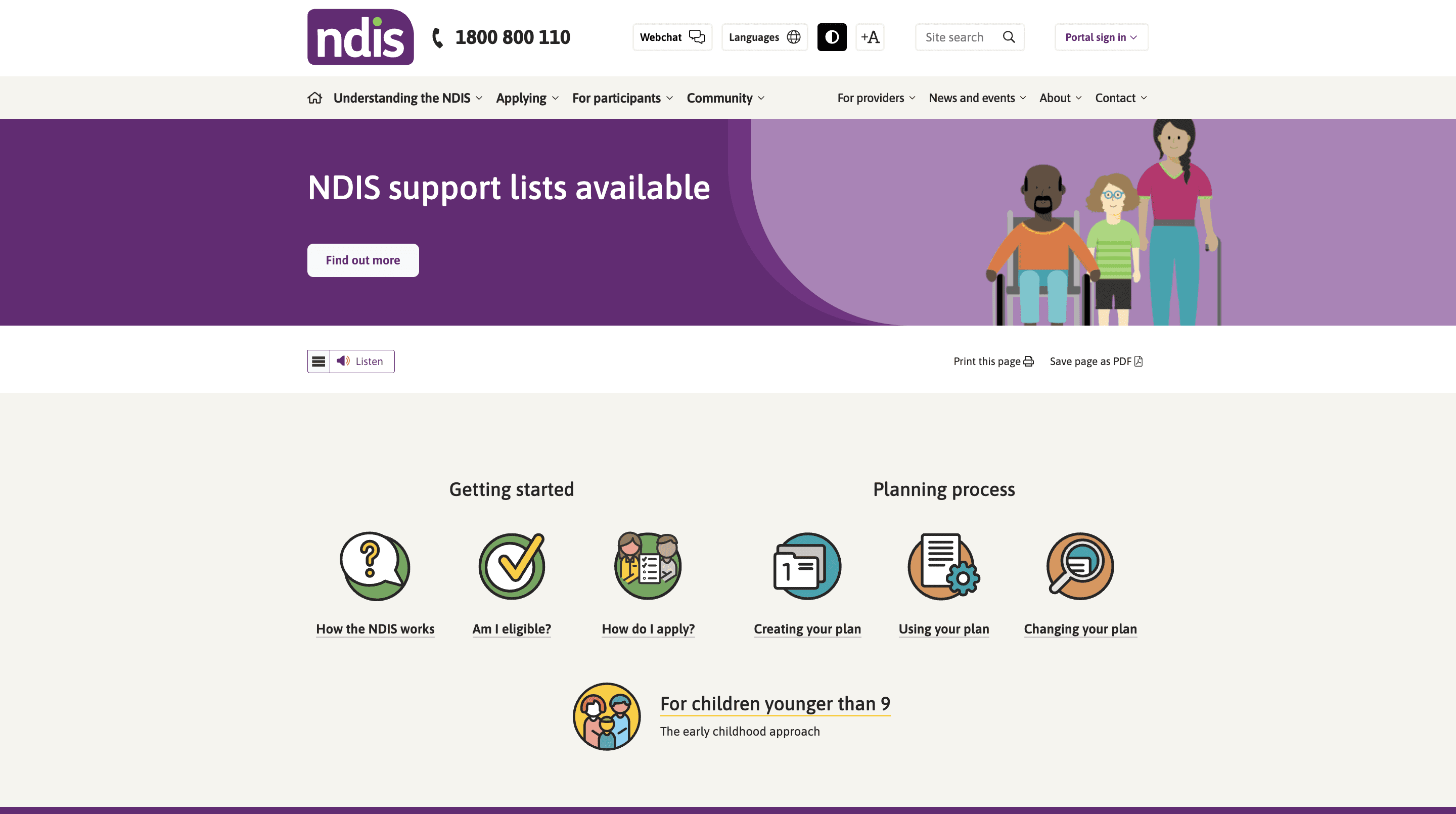
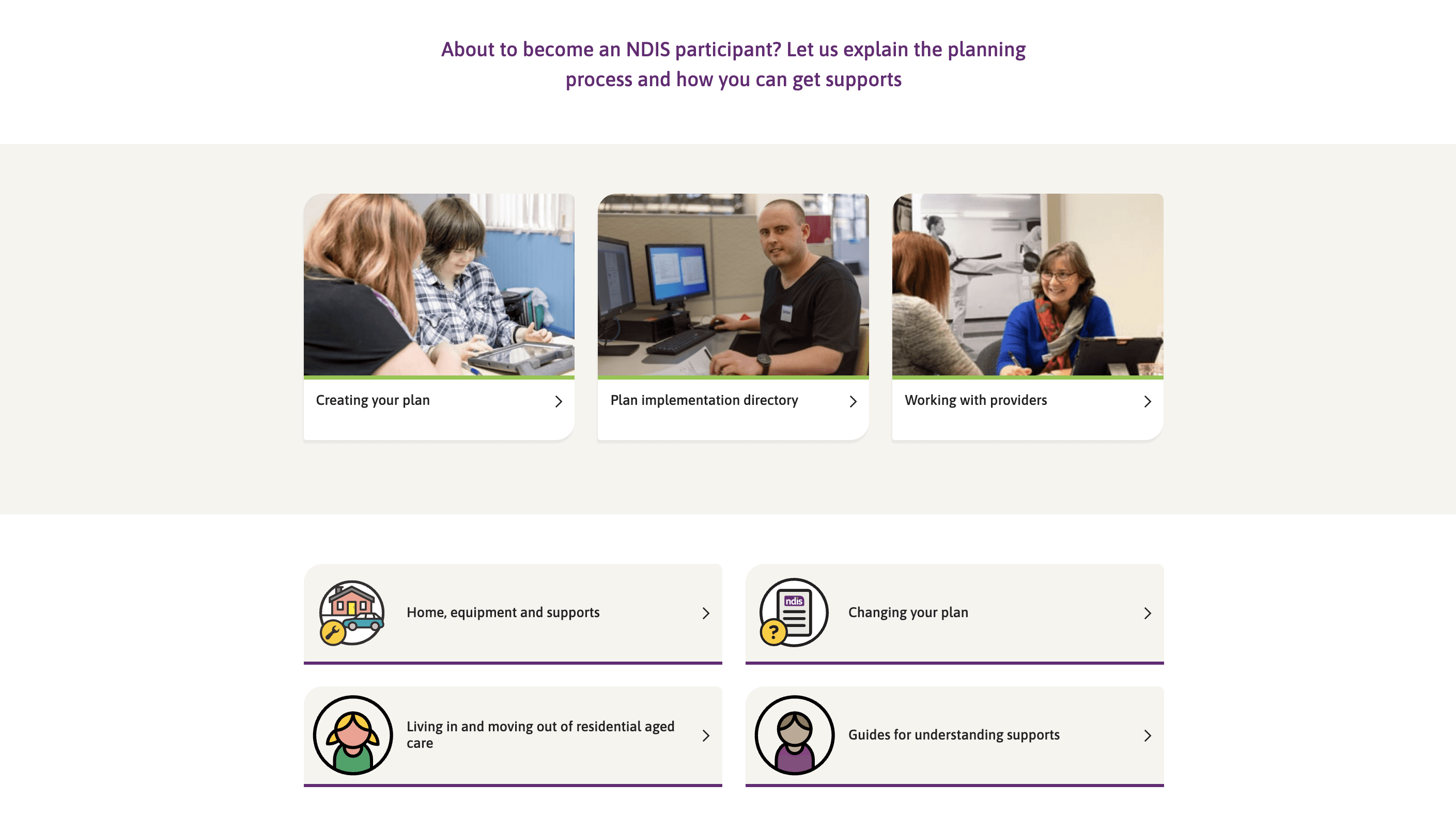
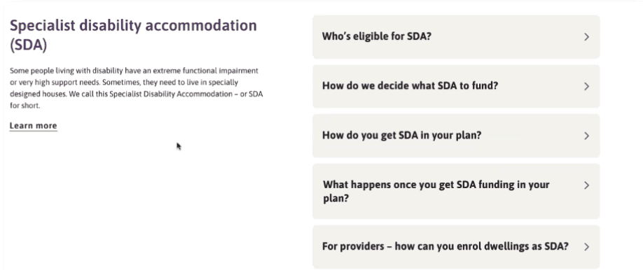
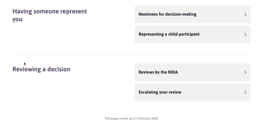
"On this page" navigation: Added a scannable summary at the top of each page to help users quickly assess whether the content was relevant to their needs.
Clear, question-based headings: Framed all sections as commonly asked questions, improving clarity and making it easier for participants to locate and understand information.
Hierarchy through typography: Used large, bold headings for main topics and slightly smaller (but still prominent) subheadings to improve readability and content structure.
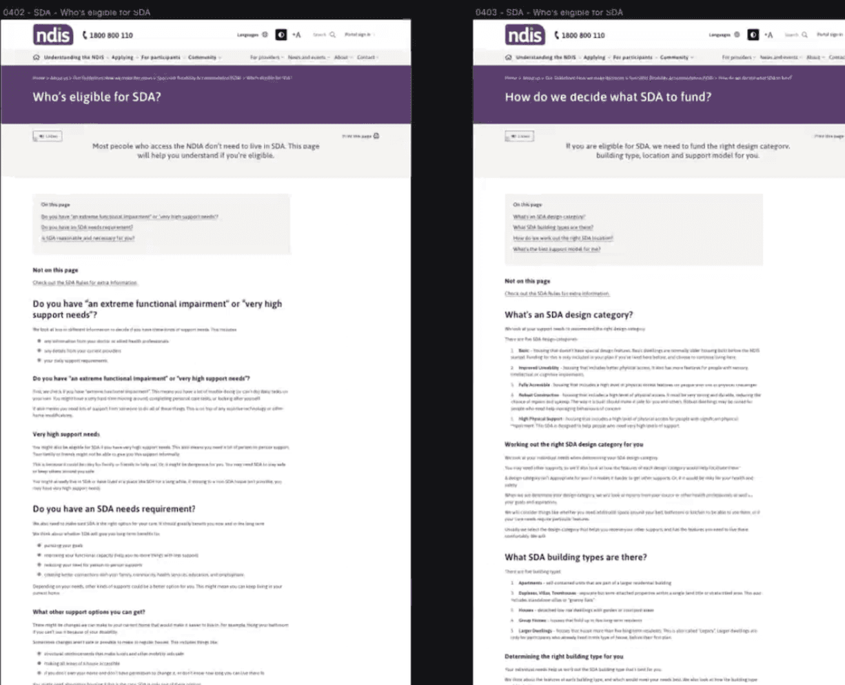
Quick links and landing pages: Enabled fast access to key sections and created simplified landing pages to direct users to the appropriate Operational Guidelines.
Accessible components: Implemented WCAG-compliant accordions to present detailed content in a manageable and screen-reader–friendly way.
Content freshness indicator: Included a visible “Page is current as of [date]” label to build trust and help users understand the recency of the legal information.
These updates ensured that the documents were not only compliant but also accessible, intuitive, and easier for participants to use independently.
Present
After iterating on the high-fidelity designs based on user feedback, we worked closely with developers to implement the updated content structure and usability enhancements on the NDIS website.
To ensure alignment and transparency:
Compiled and synthesised research findings into clear, evidence-backed PowerPoint reports, mapping insights directly to design and content updates.
Presented the refined designs and implemented features - such as improved IA, “on this page” summaries, question-based headings and accessibility components to internal stakeholders and cross-functional teams.
Used structured storytelling to connect user pain points with design rationale, helping stakeholders understand the why behind each improvement.
This process ensured shared understanding, secured buy-in for the new direction, and set a strong foundation for future improvements to the Operational Guidelines experience.
Results and Learnings
Results
Results
Delivered a comprehensive research report to support ongoing decision-making and validate future design directions.
Defined the user testing framework, including interview guides and a repeatable approach for future usability testing.
Refined the Operational Guidelines (OGs) and accompanying style guide, based on validated user insights around accessibility, clarity, and structure.
Identified key content gaps and prioritised OG updates, while beginning exploration into future formats for Standard Operating Procedures (SOPs).
Improved transparency and trust, helping make the scheme more accessible and easier to navigate for participants and the broader community.
Tested and evolved the information architecture, ensuring it could accommodate existing PGs and SOPs while being scalable for future content.
Created a content style guide, defining structure, tone, and language principles to support consistent, user-friendly drafting of OGs.
Developed a draft content production process, designed in collaboration with the Consultation and Co-design Group, ready for further iteration and testing.
These outcomes laid a strong foundation for long-term content governance, accessibility, and participant-first design across the NDIS experience.
Learnings
Accessibility is essential and deeply human
One of the most impactful moments during this project was hearing a participant describe the difficulty of navigating content with a screen reader due to poor site compatibility.
It was a powerful reminder that not everyone experiences the web the same way—and just because something doesn’t affect you directly, doesn’t mean it doesn’t exist.
Inclusive design isn’t a nice-to-have; it’s a necessity.
User research brings clarity and truth
The value of face-to-face participant interviews and usability testing was undeniable.
Many assumptions we had—especially around information architecture and document placement—were challenged or disproven through research.
Without engaging directly with users, we would have missed critical barriers to comprehension and access.
Hearing from those who actually use the site kept our solutions grounded in real needs.
Synthesis takes time—and patience
Synthesising large volumes of qualitative data was overwhelming at first. There was so much rich insight from participants, including sessions I wasn’t part of.
What helped was reading all interview summaries, forming a holistic understanding, and then beginning to group feedback into broad themes.
The process became clearer over time—sometimes synthesis reveals itself through doing, not just planning.
These experiences not only strengthened the final design but also reinforced the importance of empathy, research rigour, and iterative analysis in inclusive UX work.