IOOF
Financial Insights App

Shaping IOOF’s Open Banking journey - combining trust, mobile simplicity, and personalised financial insights.
Company
Client
Role
Timeframe
I was resourced as the sole UX designer to explore and shape a holistic mobile app experience for IOOF, focused on integrating Open Banking features and leveraging Personetics’ data-driven financial insights.
The project aimed to validate the technical feasibility and user desirability of these features within a compressed 3-week timeframe.
A critical challenge was identifying and addressing potential trust barriers around Open Banking adoption - ensuring users felt safe and in control of their financial data.
Led end-to-end UX design as the sole designer on the project, with light-touch senior guidance (1 day/week).
Created and analysed a Microsoft Forms survey with 43 participants, synthesising user responses into actionable insights.
Facilitated a design jam and co-design workshop with 8 SMEs to define the problem space and shift the concept from financial education to personalised financial insights.
Prioritised stakeholder-requested features by mapping them into a scalable information architecture and content model structured around five user-focused tabs.
Designed mid-fidelity wireframes and flows in Figma, covering:
Global components and navigation
Onboarding experience
Article viewing and content surfaces
Account settings and live chat
Open banking journeys
Key UX patterns including session expiry and email verification
Miro, Figma, Powerpoint

The Process
Problem Statement
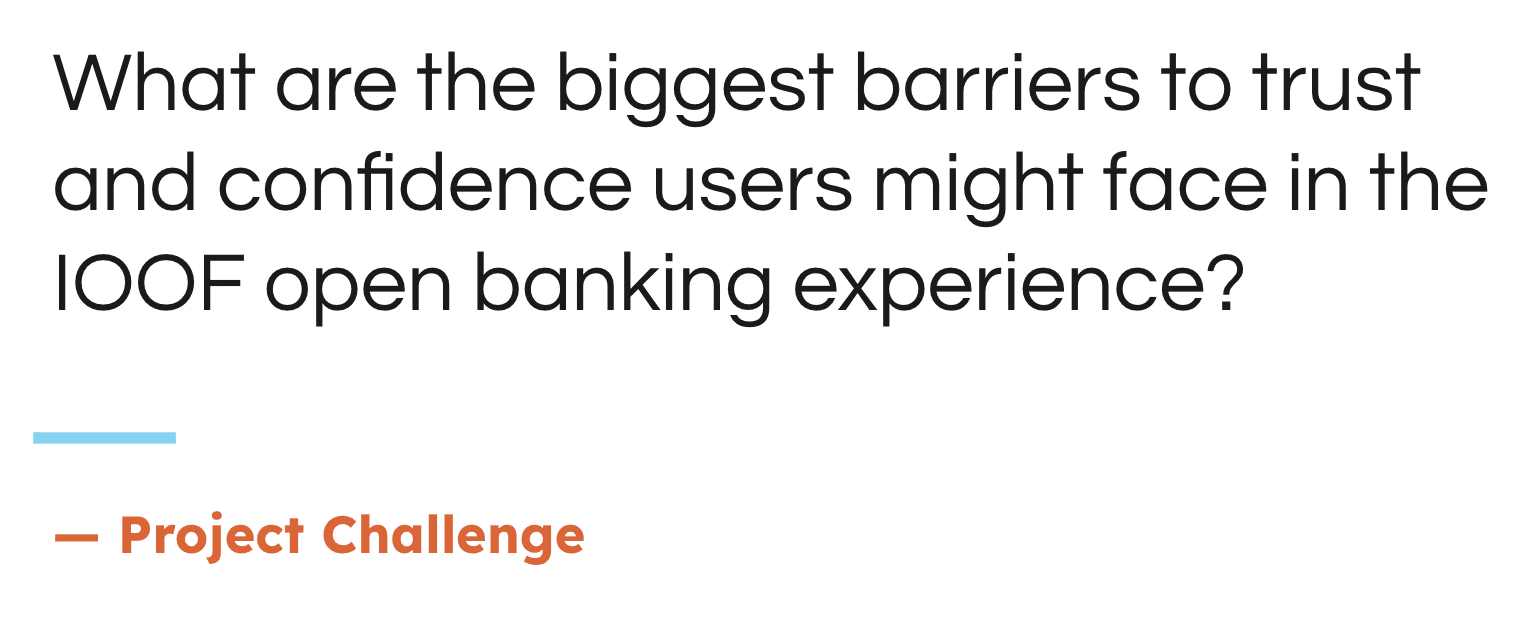
To this challenge "What are the biggest barriers to trust and confidence users might face in the IOOF open banking experience? I used initial user testing and co-design with staff and SMEs to help understand the problem.
Users are hesitant to engage with Open Banking features due to low trust and confidence in how their financial data will be accessed, used, and protected.
IOOF needed to identify the key barriers to adoption, such as data transparency, perceived security, and lack of control, through initial user research and co-design sessions with SMEs, in order to design an experience that builds trust, empowers users, and encourages engagement with data-driven financial insights.
Discovery and Research
IOOF project was a pre-agreed piece of work outlined in the statement of work, with defined timelines and deliverables.
Scope of Work and Alignment with Stakeholders
To ensure clarity on my role and responsibilities, I had session with the UX Manager to understand expectations and align on the design approach.
We held a dedicated kick-off session where I was briefed on the strategic goals, feature priorities, and technical considerations, giving me the context needed to confidently lead the UX design and deliver impactful outcomes within the 3-week sprint.
Initial User Research
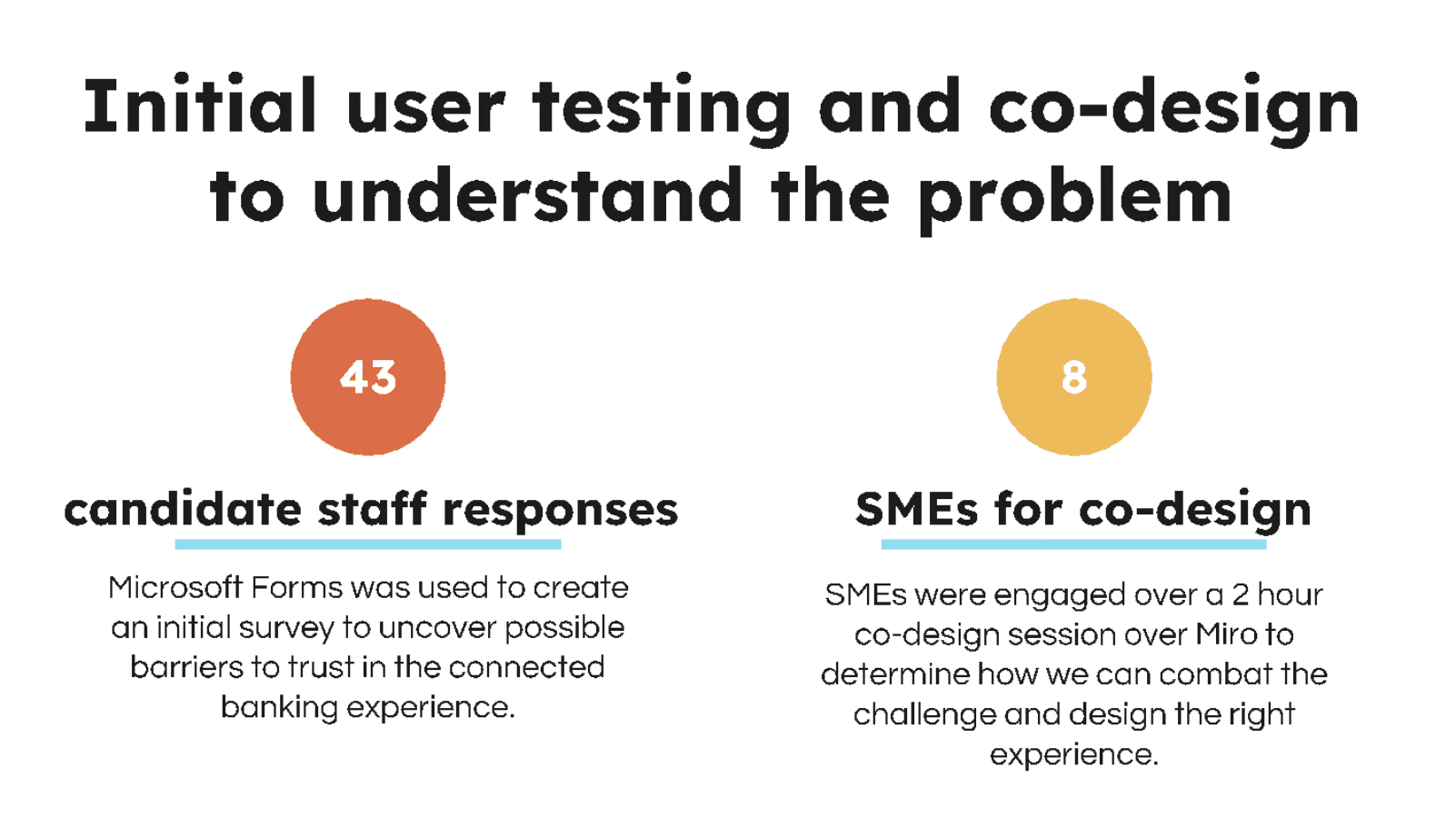
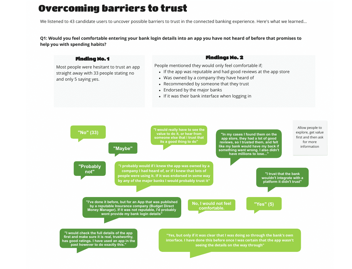
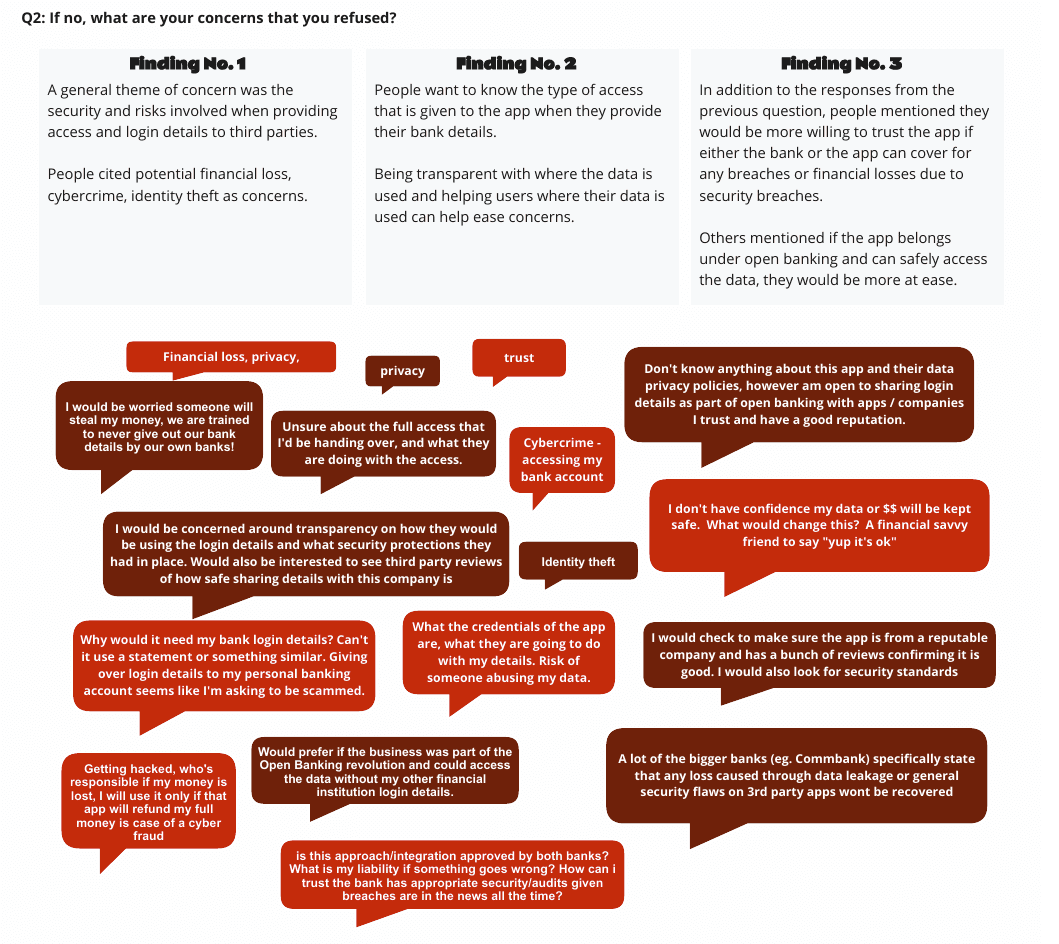
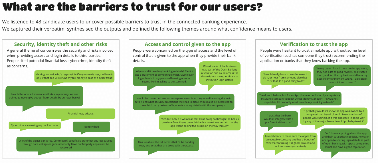
To uncover barriers to trust in IOOF’s Open Banking experience, I initiated early user research by deploying a Microsoft Forms survey, gathering 43 responses from internal candidate staff.
This helped surface initial perceptions, concerns, and misconceptions around data sharing and financial connectivity.
I extracted and presented verbatim responses from the user survey to help stakeholders understand key barriers to trust in the app.
These included concerns around potential financial loss, clarity on data sharing, and whether the bank would cover losses in the event of a security breach. Sharing direct user language helped ground design decisions in real customer fears and highlight the importance of transparent communication within the Open Banking experience.
Define
Co-Design and Synthesis
Following the Microsoft Form Survey, I facilitated a 2-hour co-design session with 8 subject matter experts (SMEs) via Miro.
The session focused on mapping out key friction points and brainstorming opportunities to build user confidence.
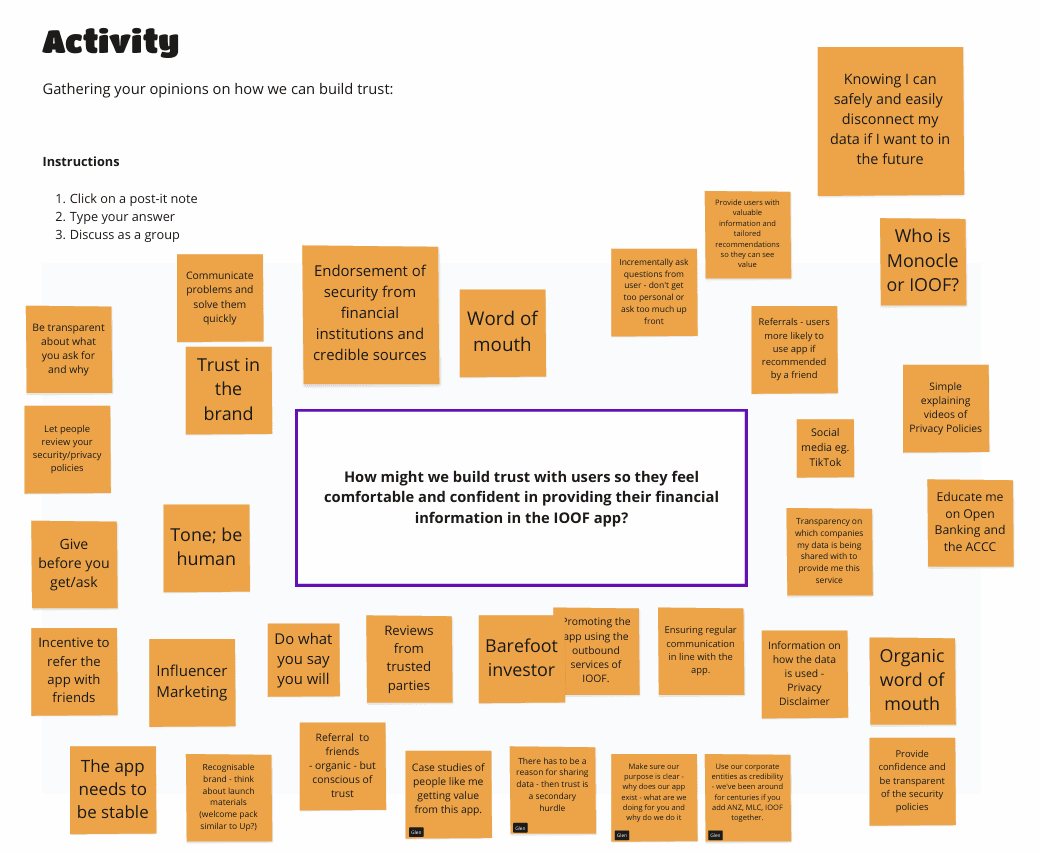
Insights from both the Microsoft Form and the Co-design Workshop were synthesised into actionable themes, which directly informed the design decisions and prioritisation of trust-building features in the app experience.
In the end, there were 6 clear themes that would ground our design and thinking (shown in the next two images below).
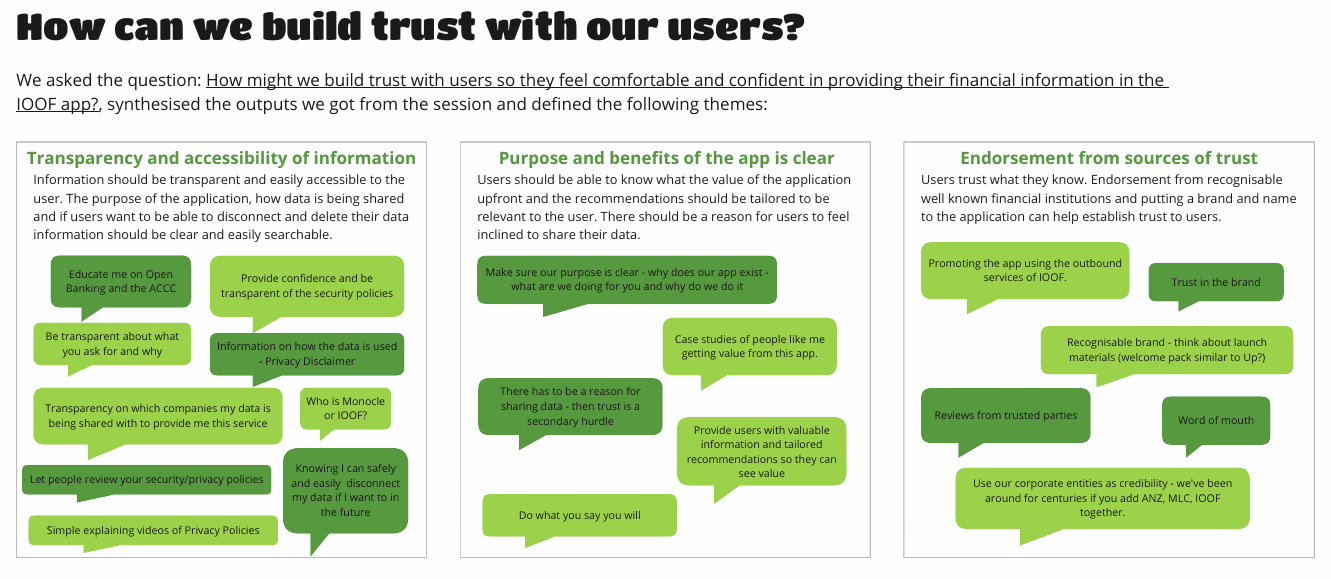
The main themes I found for ensuring that we can build trust with our users were
Ensuring transparency and accessibility of information
Make the purpose and benefits of the app clear
Leverage brand names and sources of trust to establish trust
Ideate
Concept & Feature Prioritisation
The early co-design workshop session was also a great opportunity to develop early concepts of what some of the functionalities could look like and determine which ideas needed to be prioritised when going into design.
I facilitated a collaborative activity where stakeholders sketched quick design concepts using sticky notes on Miro. These ideas focused on potential features and experiences for the app. We then held a voting session to identify the concepts that resonated most, helping align the group around shared priorities and spark early buy-in for the design direction.
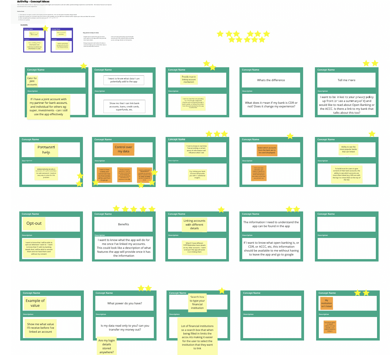
I also ideated on what would be the focus of the app – if the stakeholders were considering to make the mobile application still focused on its original intent (such as more financial teaching and learning) or focused on the users financial position and provision of insights.
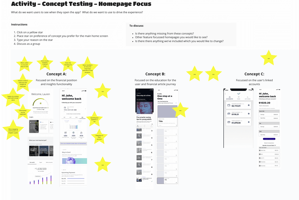
What won was the Dashboard and the desire to showcase the company’s partnership with Personectics and leverage of functionality.
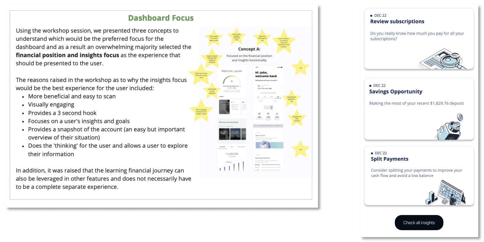
The Personectics insights looked like this:
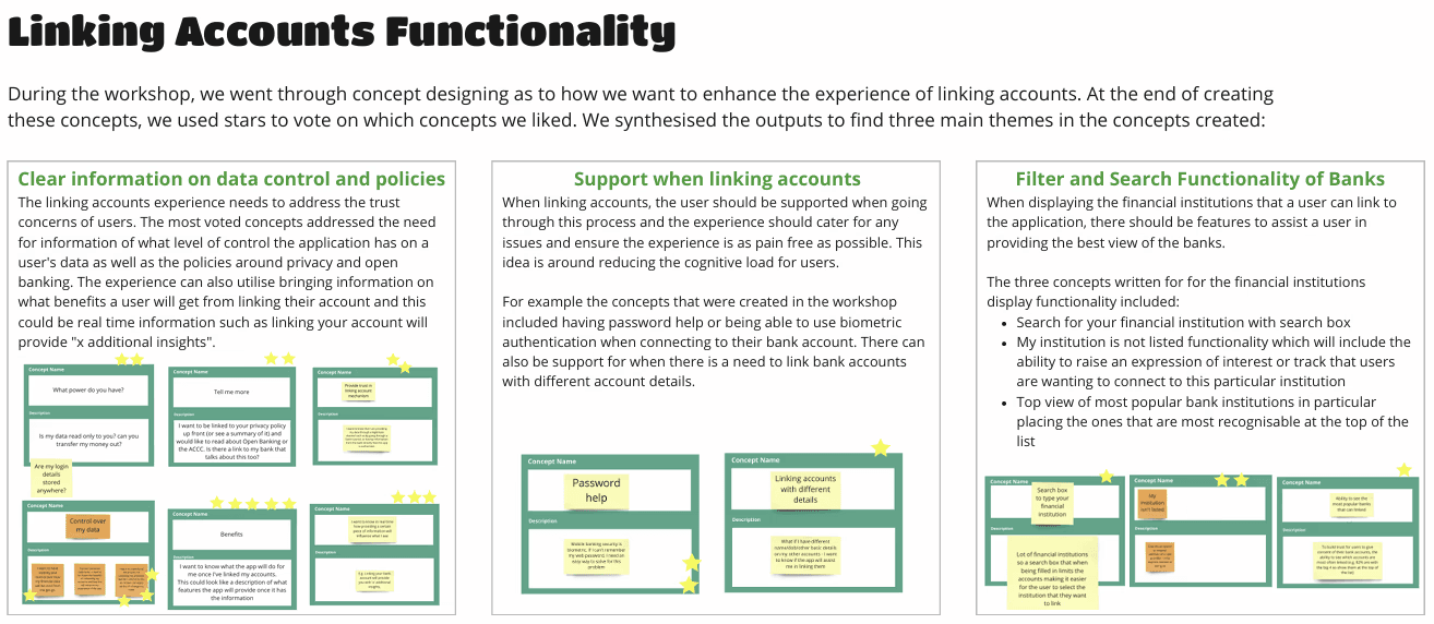
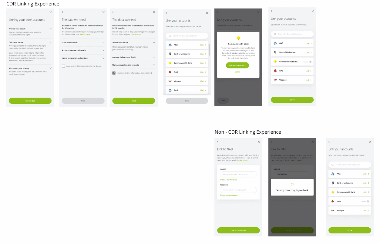
At the end of the session, the outputs were synthesised into insights which shaped the direction of the design. I looked specifically at Linking Accounts Functionality and Insights & Transactions.
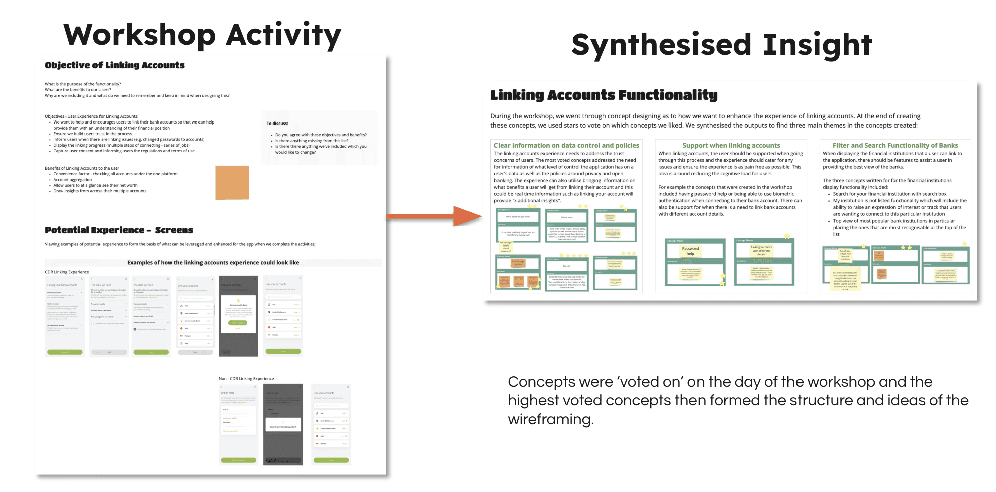
Account Linking: Linking external accounts was a core expectation for users.
Key themes included:
The need for clear communication around data control and privacy policies
A desire for support during the linking process to build confidence
The ability to search and filter financial institutions easily within the app
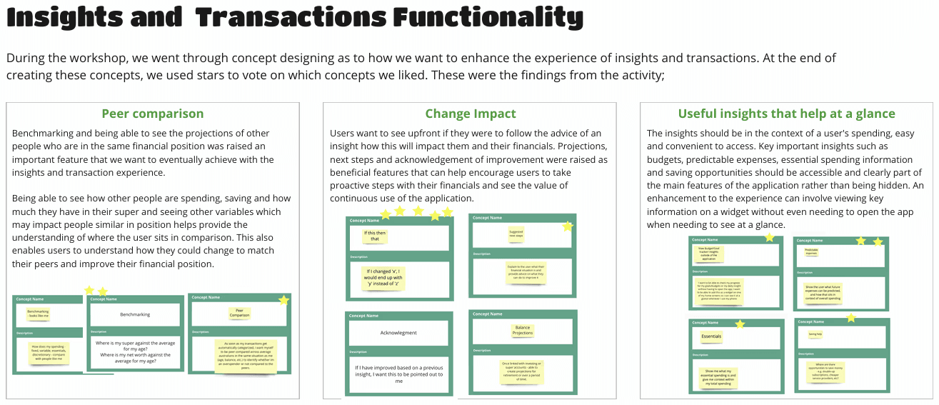
Insights & Transactions: I applied the same concept design process to features like insights and transactions with a focus on clarity and user value:
Users wanted to compare their spending habits with peers in similar financial situations
They wanted to understand the benefits of engaging with Personetics-driven advice
Users preferred at-a-glance insights that helped them quickly interpret their spending patterns and uncover saving opportunities
Concept & Feature Prioritisation
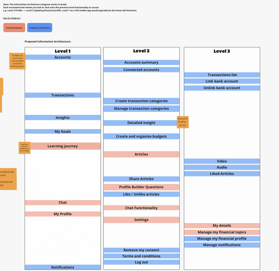
I had to also sort through the abundance of features that were required from the stakeholders to ensure the main features would be prioritised and grouped accordingly in an IA that would:
Make sense
Be future proof and allow for further enhancements in the future.
Initial proposed Information Architecture before we realised further work needed to be done to determine the exact features that were to be included.
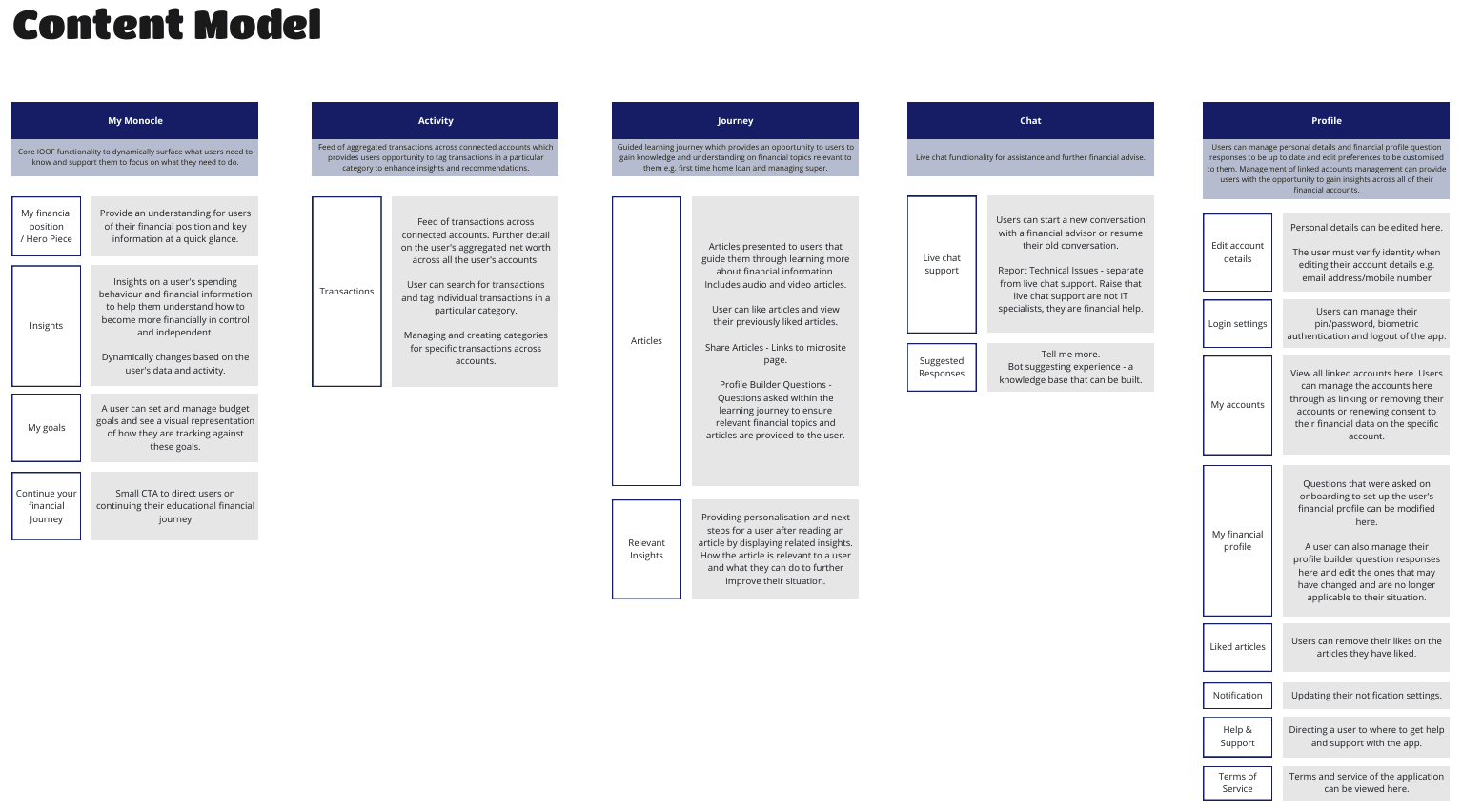
Once the IA was refined and features finalised, I created a content model that grouped functionality into five distinct tabs, each representing a unique user journey. This structure helped clearly separate tasks and goals, making navigation more intuitive and purpose-driven.
Design
Low to Mid Fidelity Wireframes & Flows
I then began developing design concepts informed by both the survey insights and workshop outputs, ensuring the solutions directly addressed user concerns and aligned with the themes identified during co-design. I started with Low Fidelity and then continued to Mid Fidelity when they were approved and continously had checkins with the stakeholders.
I also reviewed industry examples and best-in-class experiences to identify patterns we could leverage or enhance in the app.
Throughout the process, I had close alignment with the stakeholders and ensured they reviewed the progress and agreed on the designs and that the designs aligned with the original strategic goals. These check-ins helped validate direction, gather feedback early and maintain alignment across teams.
Present
At the end of the engagement, I presented the final insights and design outcomes to stakeholders and senior leadership. I walked through the end-to-end journey, using user research and data insights to clearly articulate the rationale behind key design decisions, ensuring agreement, transparency and confidence in the proposed direction.
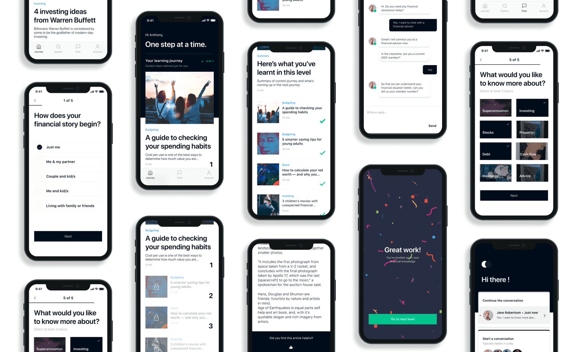
These were the following journeys that I had mocked up and presented to the stakeholders at the end of the engagement.
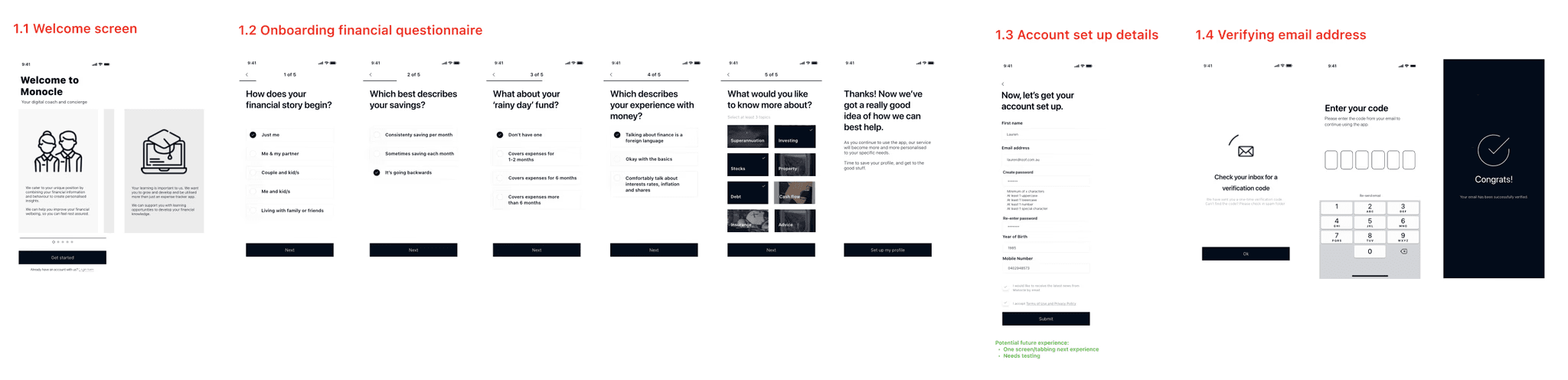
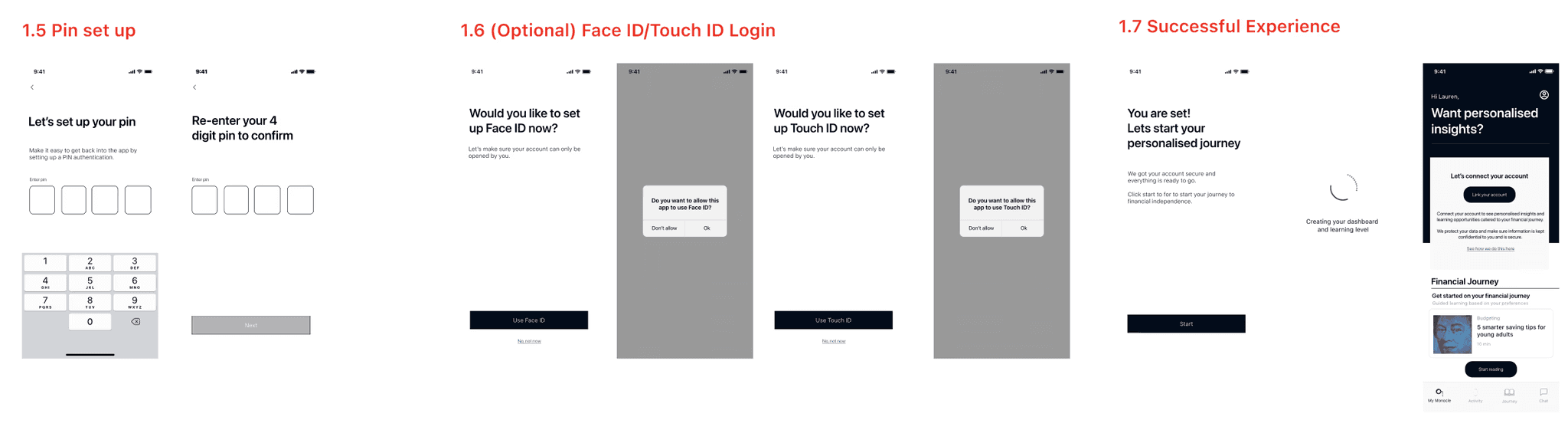
Onboarding Experience - New Member Experience
Features includes:
Welcome Screen
Onboarding Financial Questionnaire
Account Set Up Details
Verifying Email Address
Pin Set Up
Face ID / Touch ID Login
Successful Experience
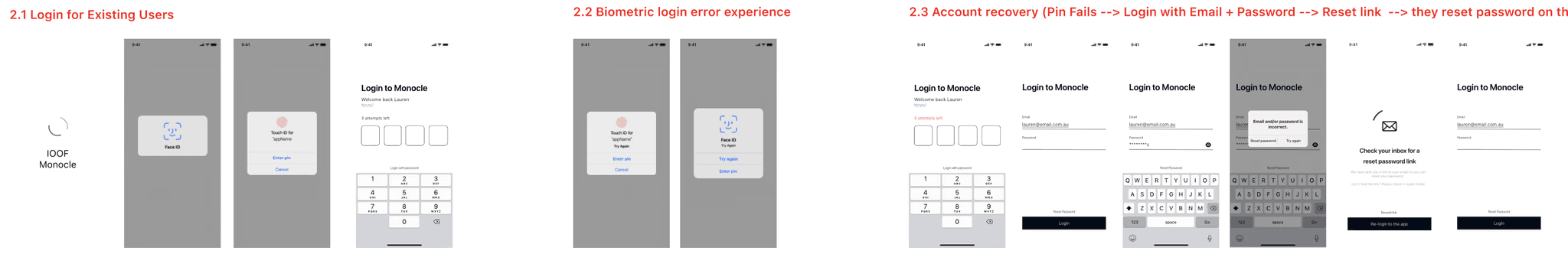
Existing Member Login
Features included:
Login for Existing Users
Biometric Login
Error Experience
Account Recovery
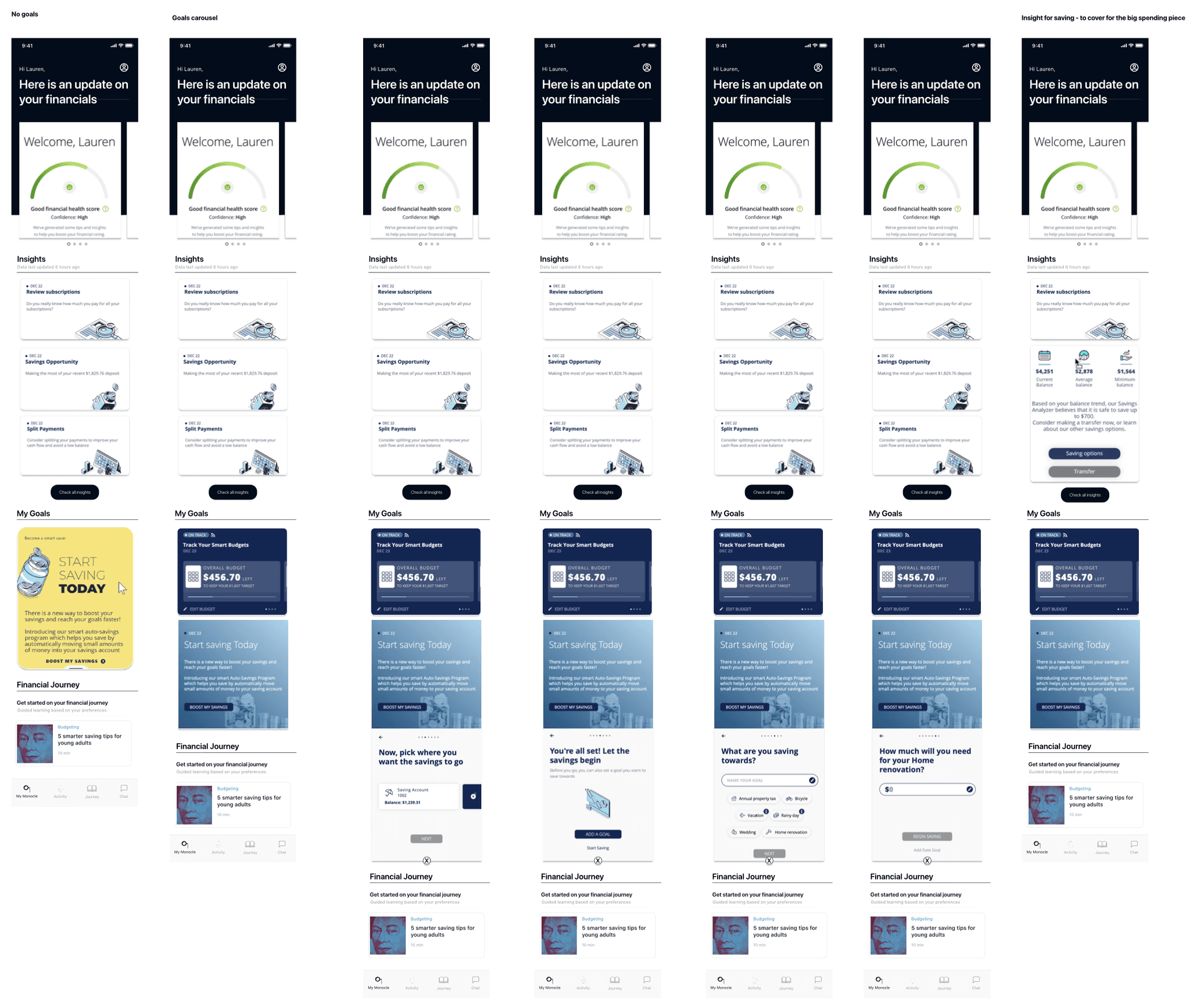
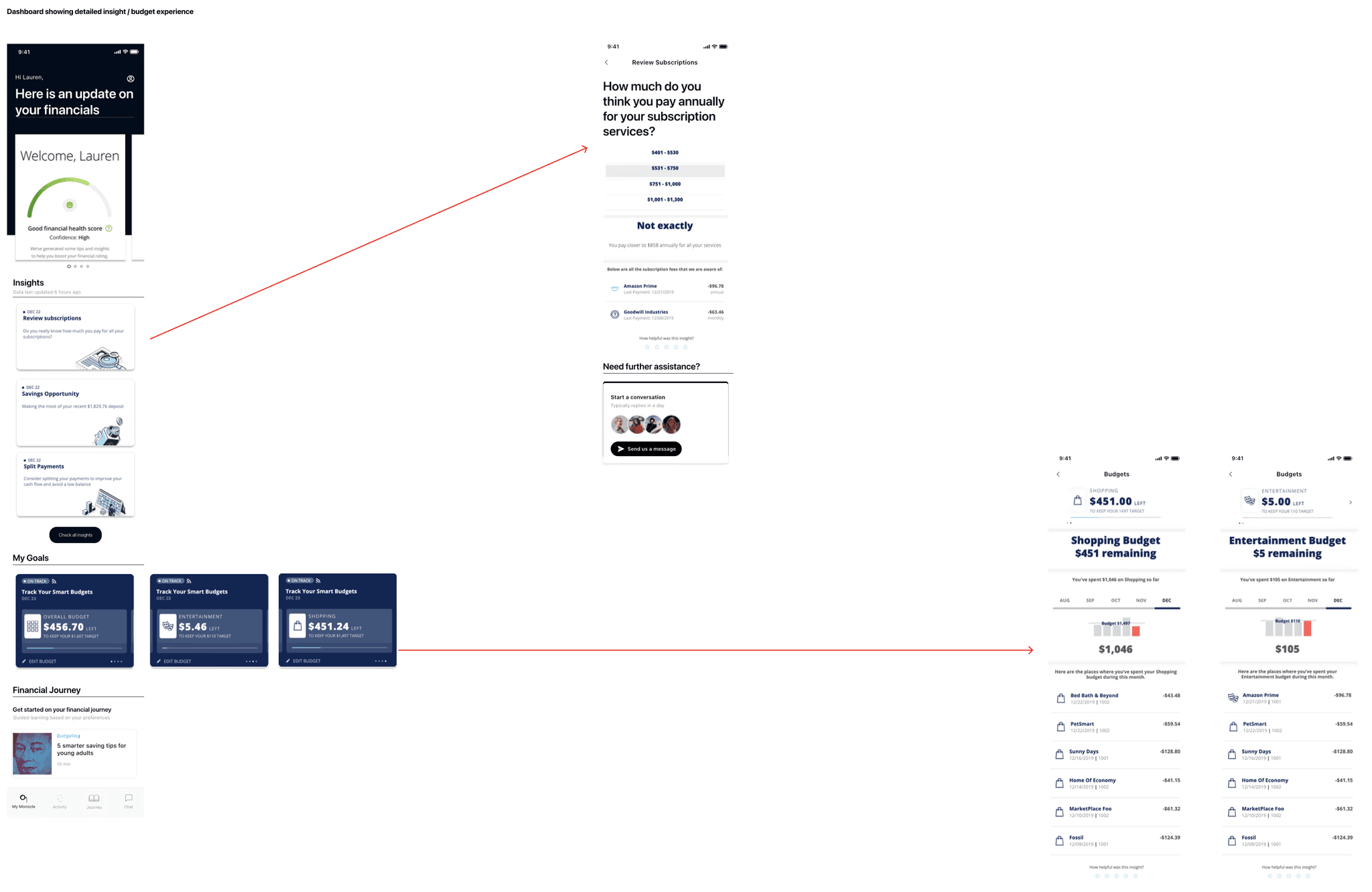
Existing Member Dashboard
Features included:
Dashboard Concepts for Logged in user
Detailed flow for insight
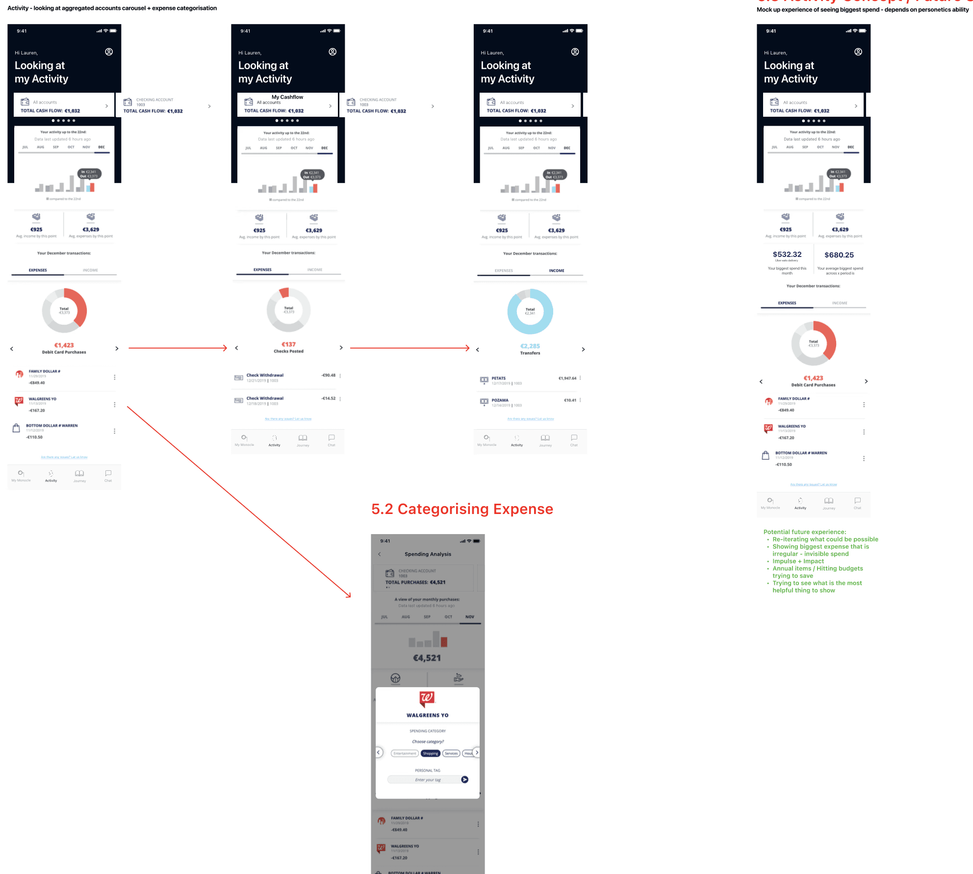
Activities and Transactions
Features included:
Activities landing carousel
Activities concept / future state
Categorising expense
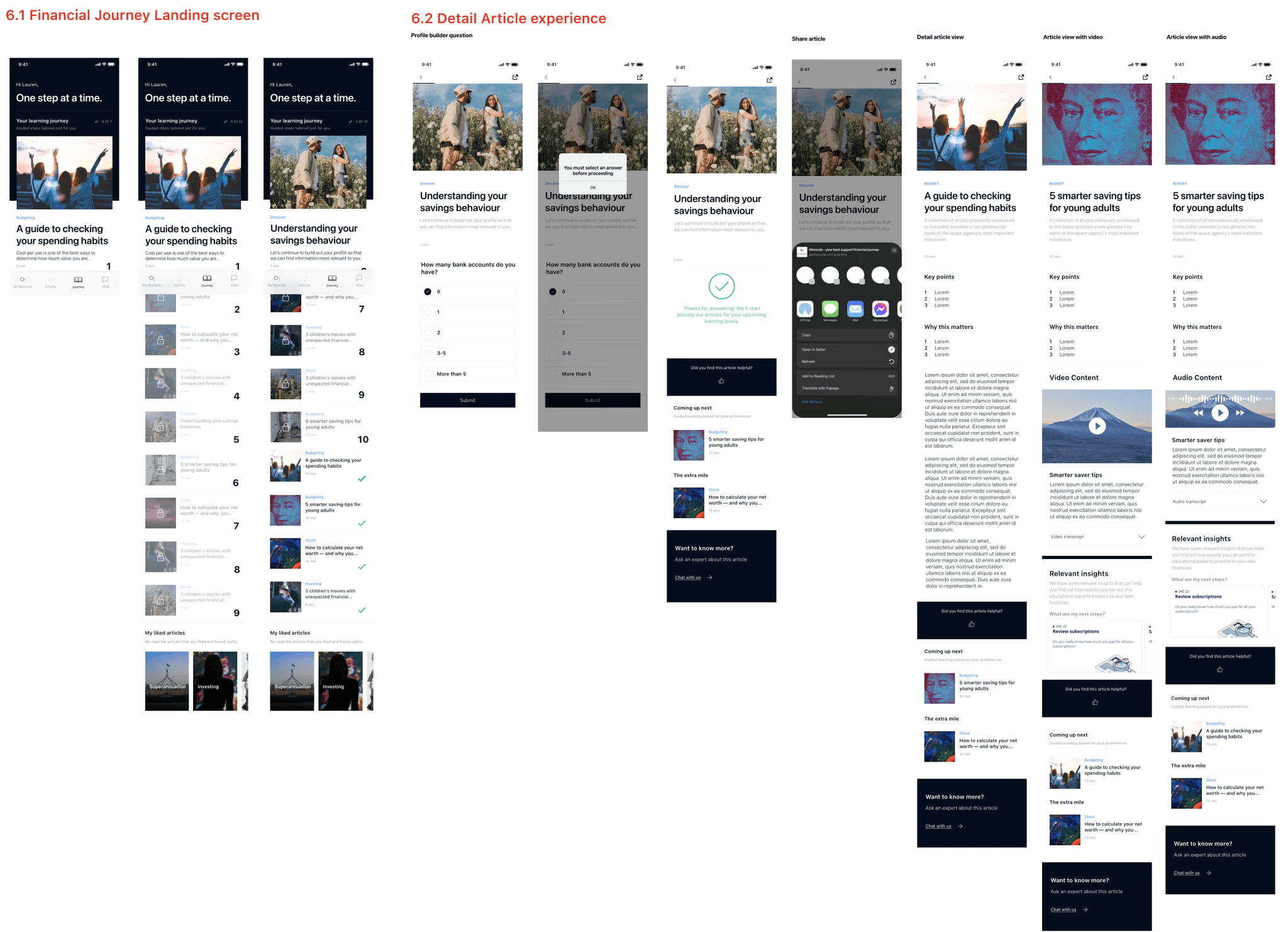
Financial Article Journey
Features included:
Financial Journey Landing screen
Detailed Article experience
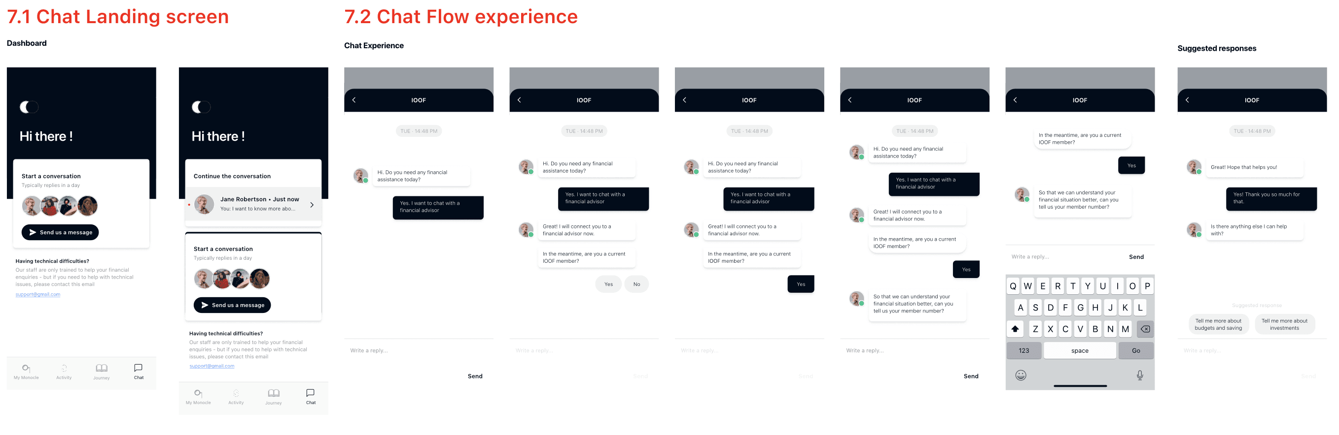
Chat Functionality
Features included:
Dashboard
Chat Flow Experience
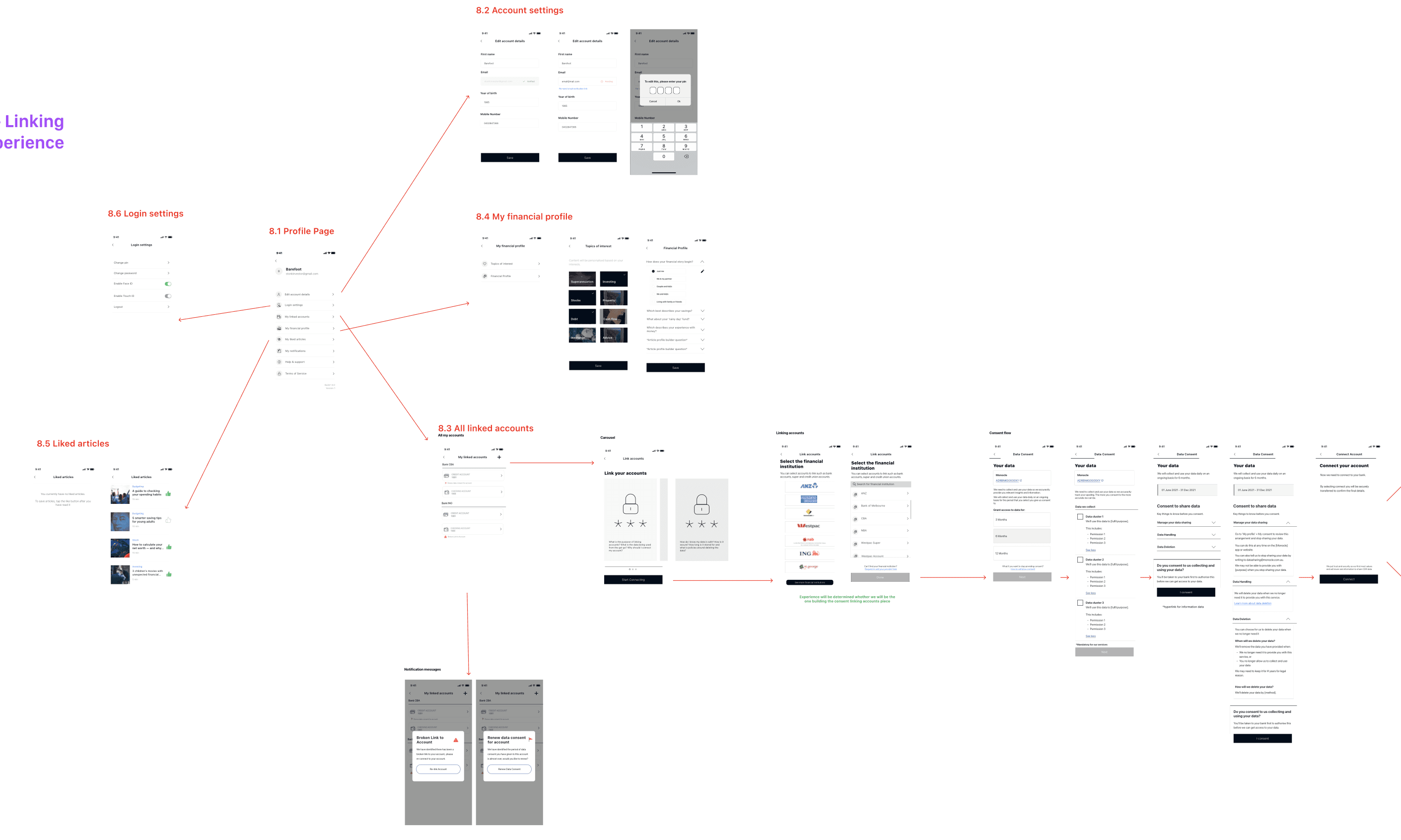
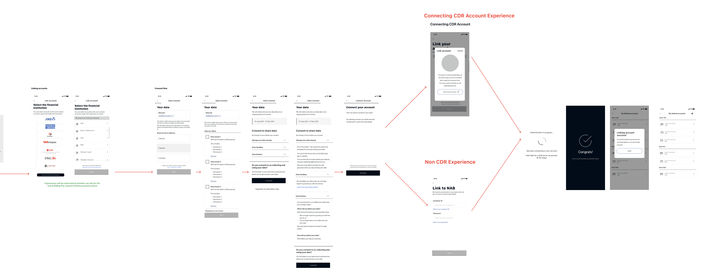
Modifying Accounts + Linking Accounts Experience
Features included:
Profile Page
Account Settings
Linked Accounts
My Financial Profile
Liked Articles
Login Settings
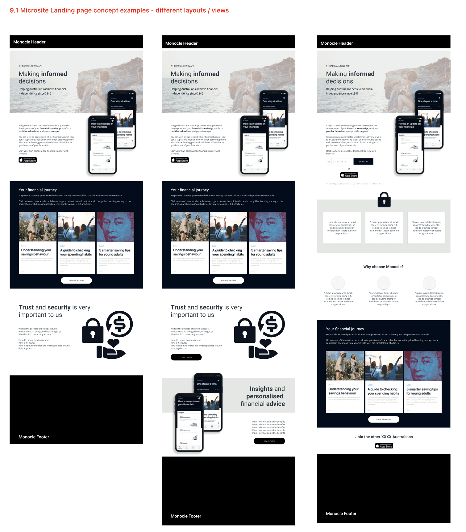
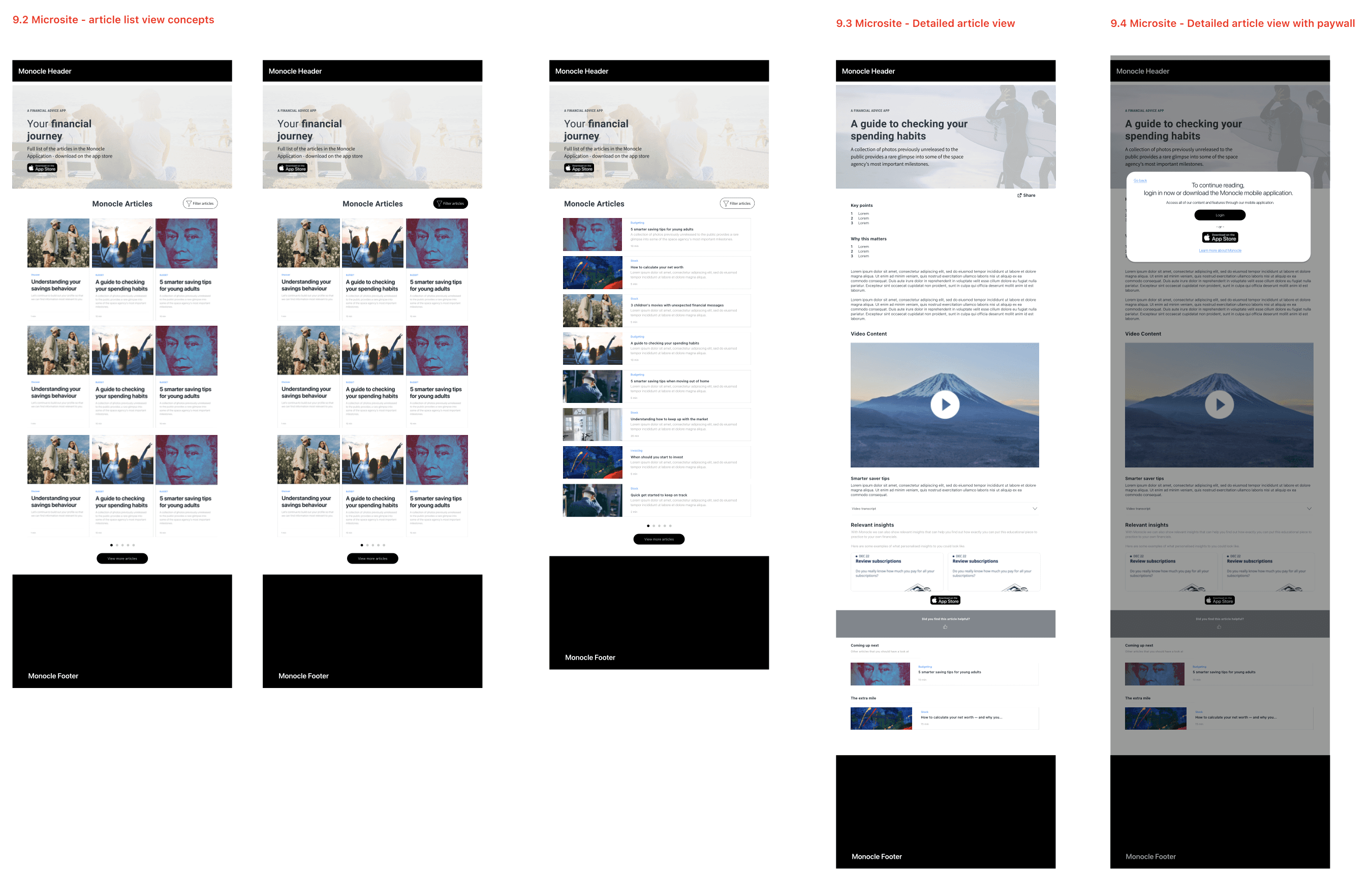
Microsite
Features included:
Landing Page
Article List View Concept
Detailed Article View
Detailed Article View with paywall
Results and Learnings
Results
Defined a clear UX direction for IOOF’s Open Banking integration, shifting the focus from passive education to personalised, insight-led experiences
Delivered validated mid-fidelity wireframes covering onboarding, account linking, insights, transactions, and core mobile UX patterns
Aligned cross-functional teams around a user-centred strategy, using co-design workshops, research synthesis, and feature prioritisation
Surface key user concerns around trust, data sharing, and security - ensuring future content and design decisions directly addressed these blockers
Built momentum for future delivery, with a clear IA, content model, and design foundation that could guide development and testing in future phases
Learnings
Power of Synthesis:
A well-structured synthesis e.g. grouping insights into clear themes with summaries and direct quotes significantly strengthened design decisions and built stakeholder confidence.
I continued to utilise this practice in further projects after IOOF.
IA Reworking:
Reworking the initial information architecture was also essential especially as it didn't align with the expectations in the first iteration.
By continuously engaging with SMEs and using the content model as a visual tool, I was able to clarify which functions belonged where and support a more intuitive structure.
Account Linking:
A personal challenge was grasping the technical aspects of the CDR and non-CDR account linking, which was new to me.
Through ongoing discussions with SMEs and guidance from the UX Manager, I was able to develop a solid understanding of the process and incorporate it confidently into the user experience.
SME Expertise:
Through this project, I realised how crucial it is to actively lean on SME expertise and continuously seek clarification, especially when navigating unfamiliar or technical areas.
Asking questions, even when unsure, ensured the designs were accurate, aligned, and grounded in real operational understanding.